
Villas Solterra
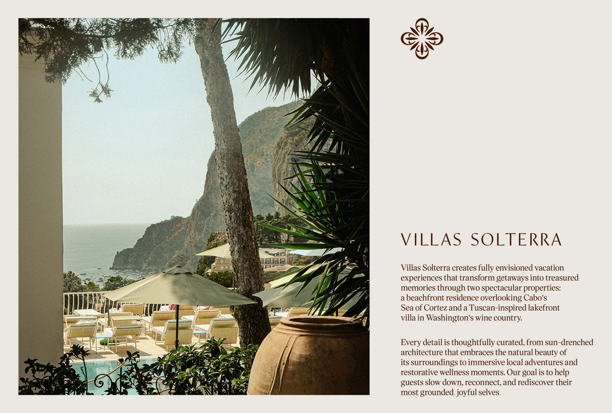
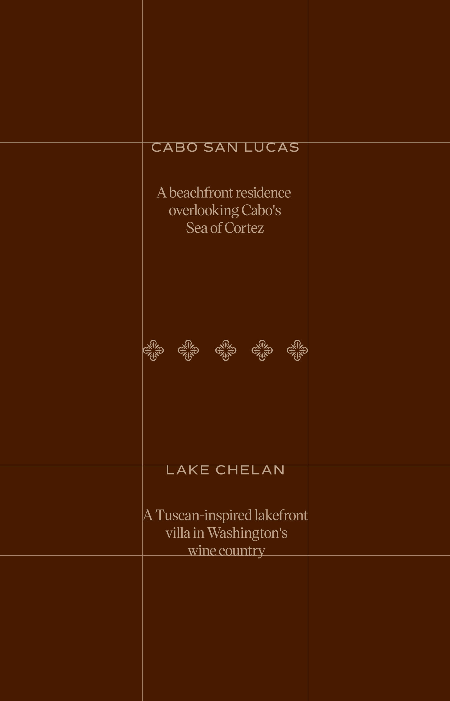
Villas Solterra creates fully envisioned vacation experiences across two spectacular properties: a beachfront residence overlooking Cabo’s Sea of Cortez and a Tuscan-inspired lakefront villa in Washington’s wine country. Built for discerning travelers who’ve moved past checking destinations off a list, the brand exists to help guests slow down, reconnect and rediscover their most grounded, joyful selves.
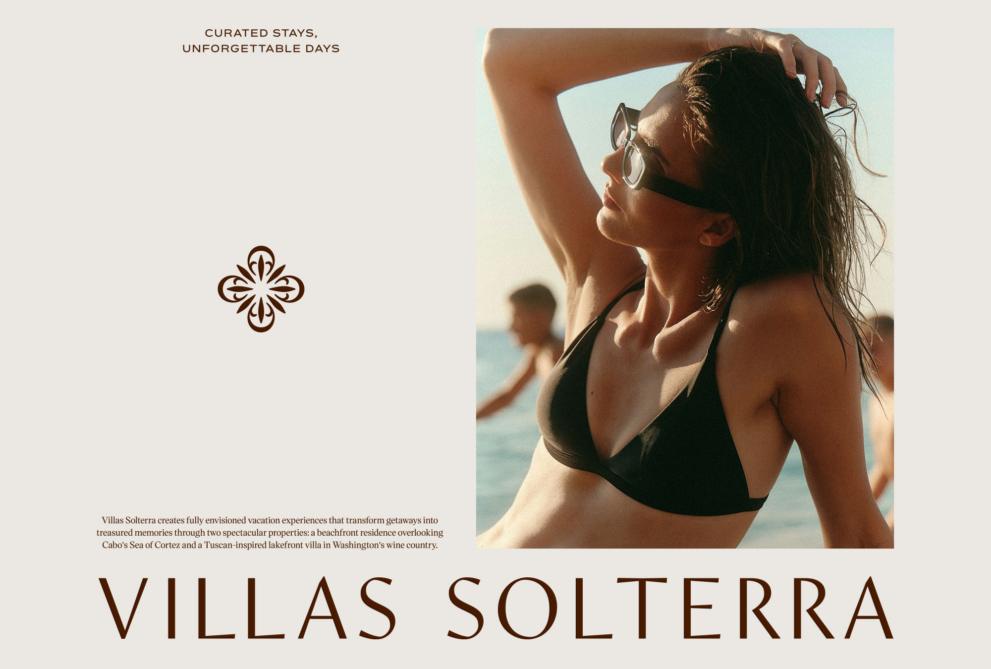
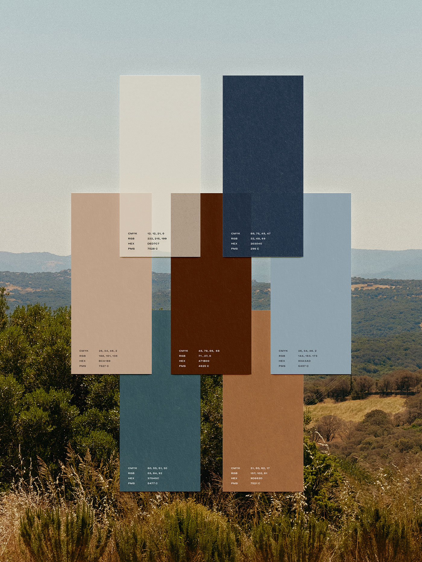
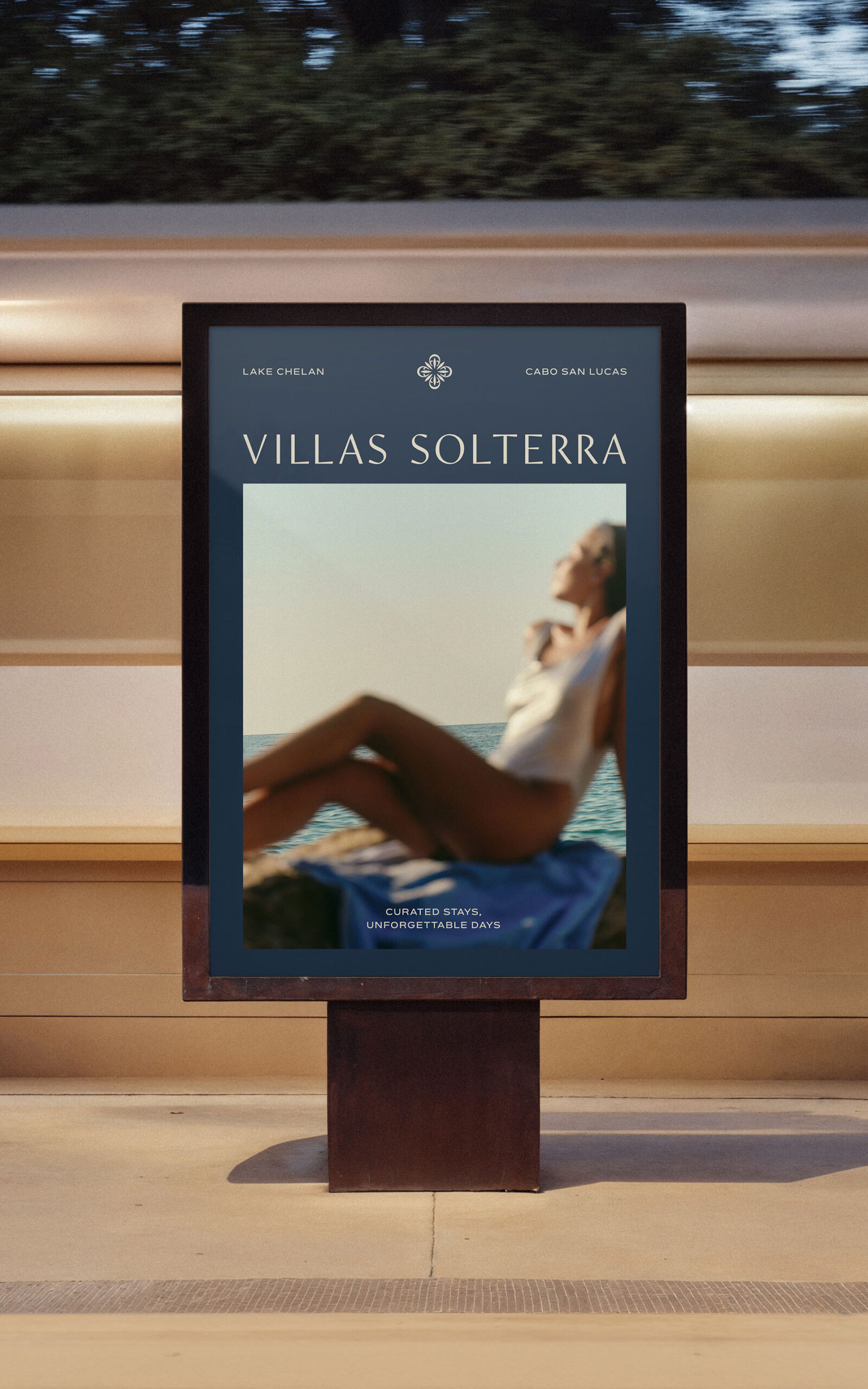
The identity holds two distinct locales under one curated system. Anchoring the palette is a warm terracotta and driftwood earthiness that echoes Cabo’s sun-drenched sand and stone, balanced against a cooler midnight blue and sea glass drawn from Chelan’s wine country lake. A quatrefoil mark, repeating into a soft tiled pattern across collateral, ties both properties back to one brand, while the serif wordmark carries the same quiet elegance the guest experience is designed around.
Services
- Visual Identity
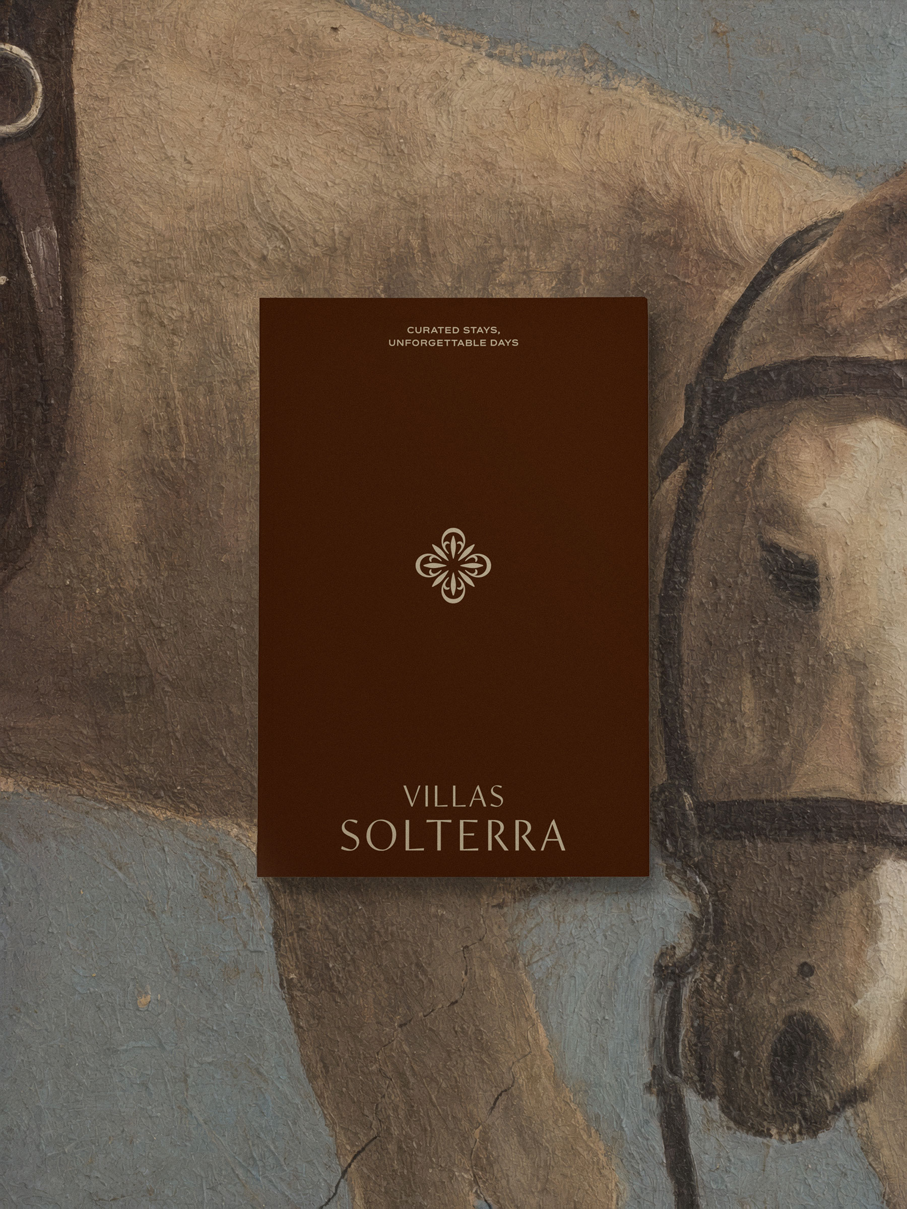
- Stationery & Print Collateral
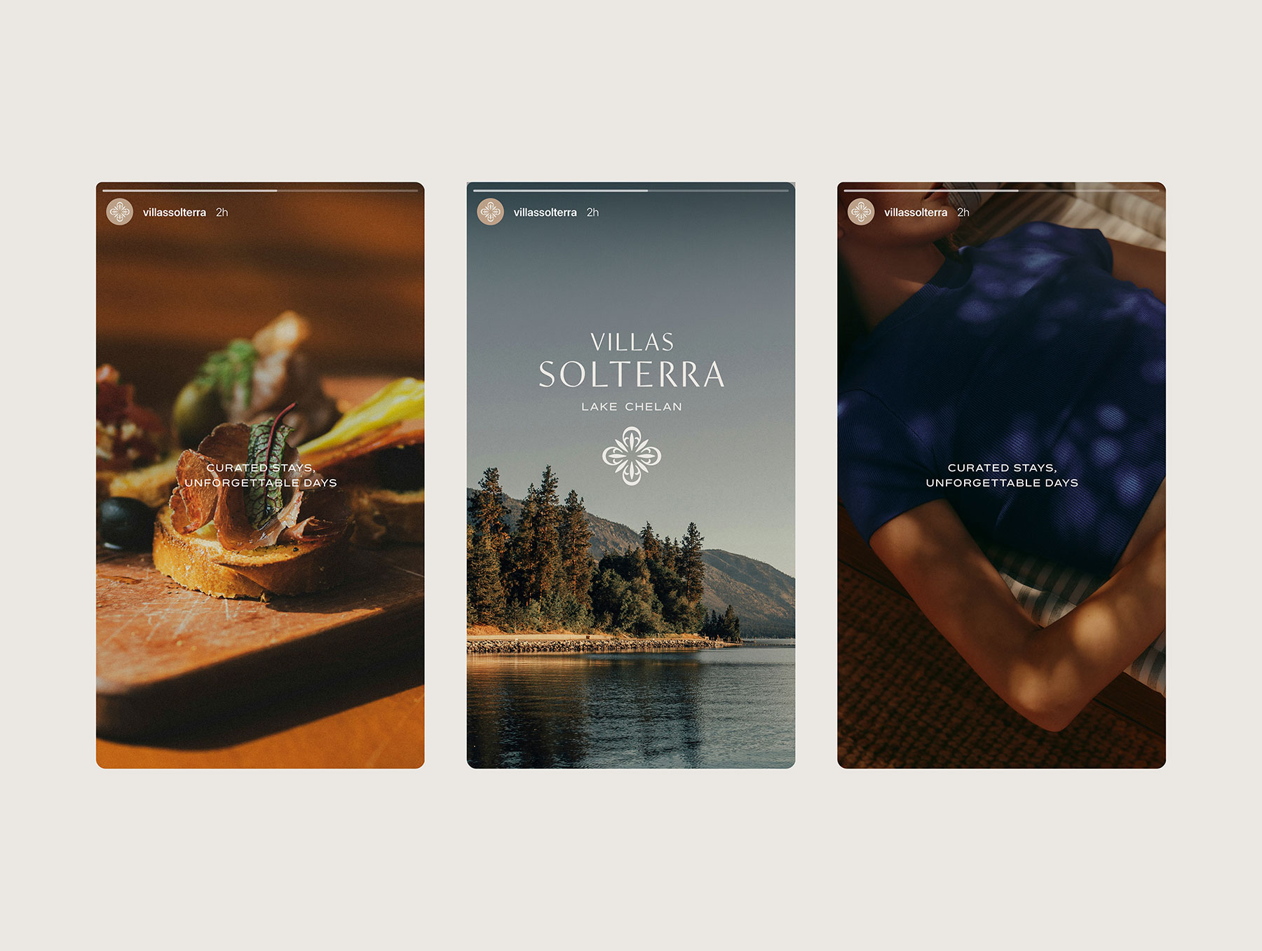
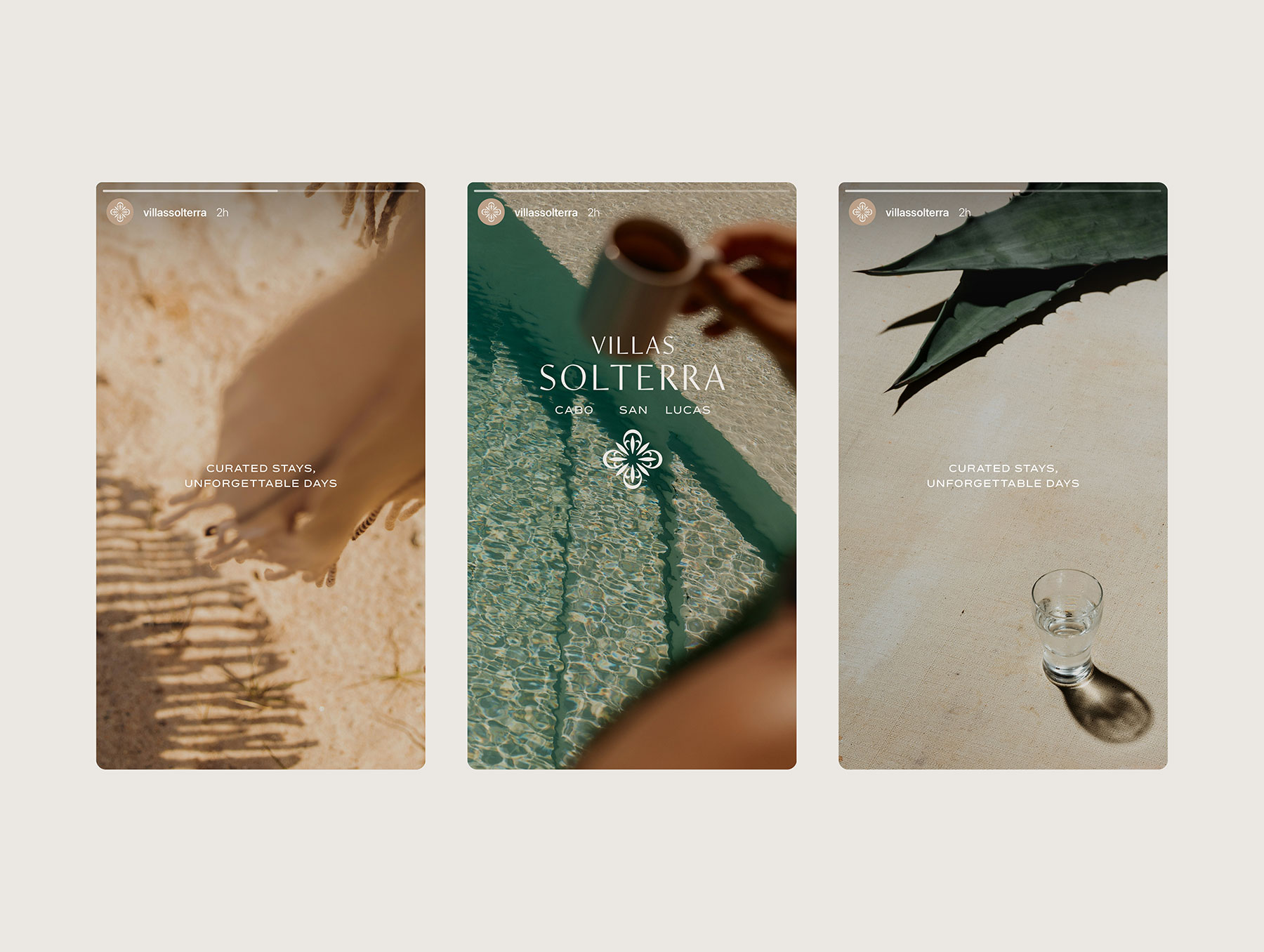
- Social Media Templates
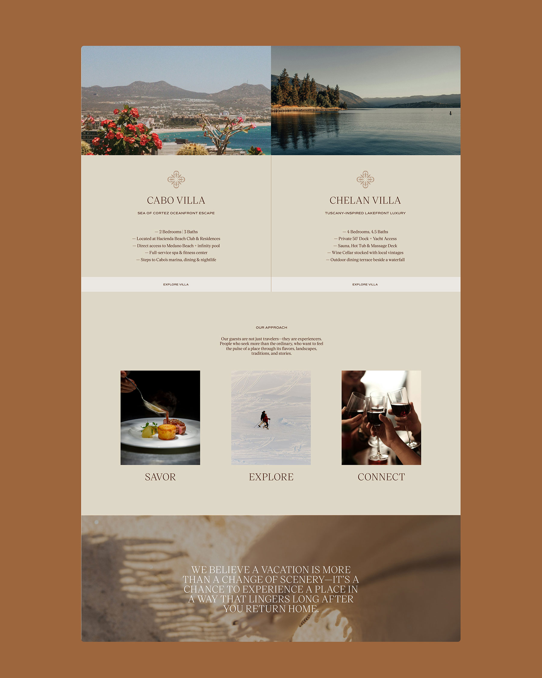
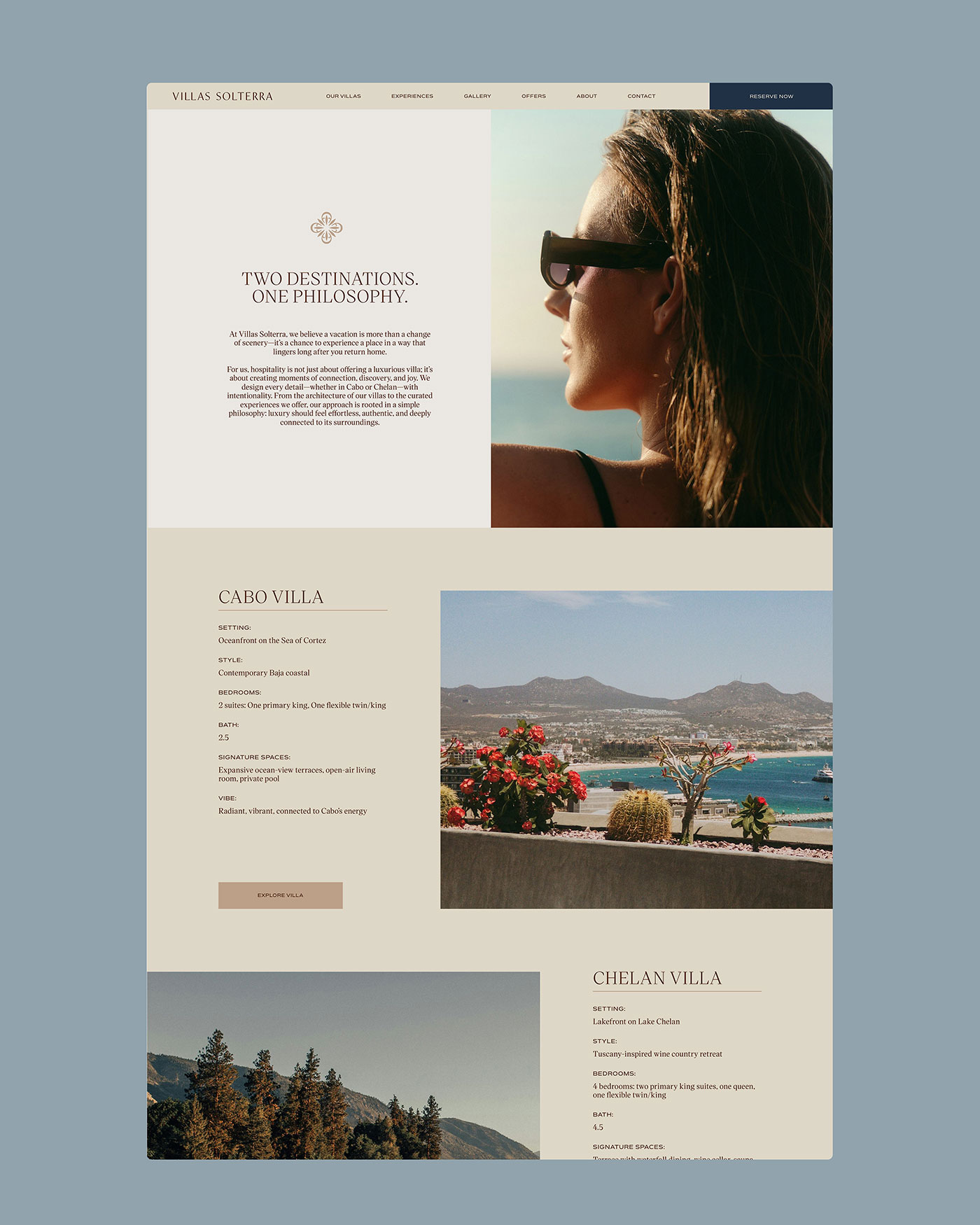
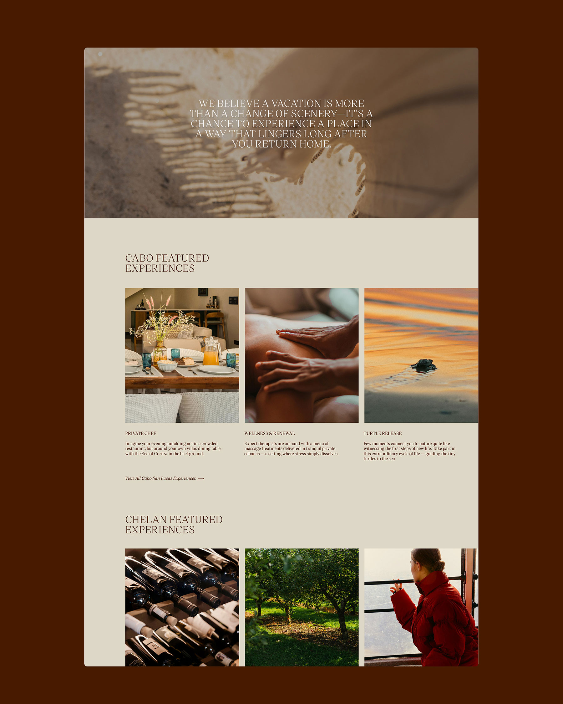
- Web Design
The icon
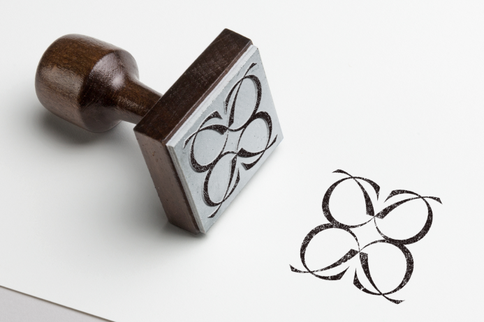
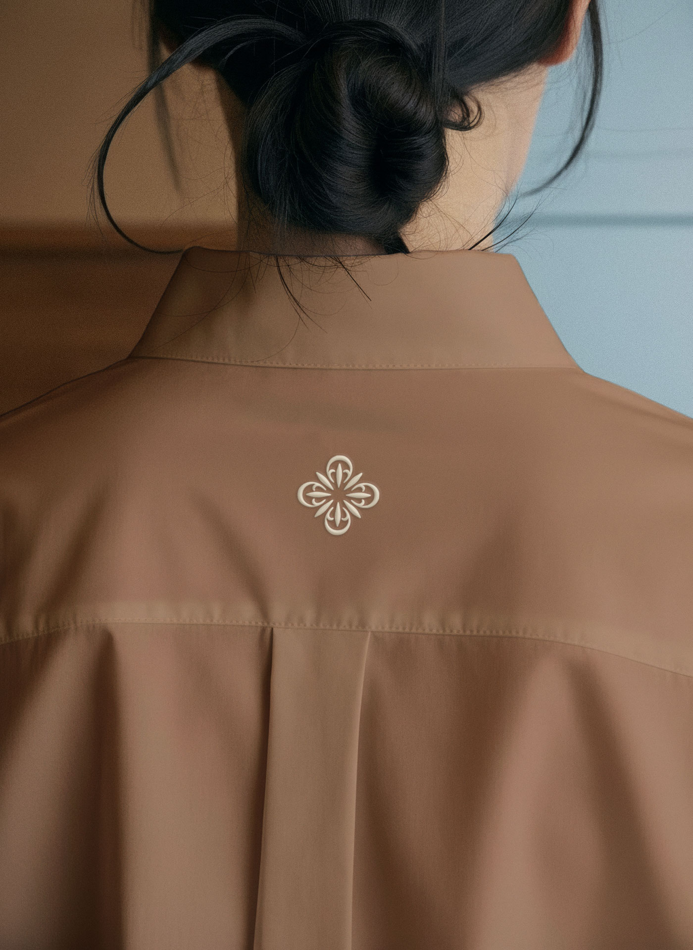
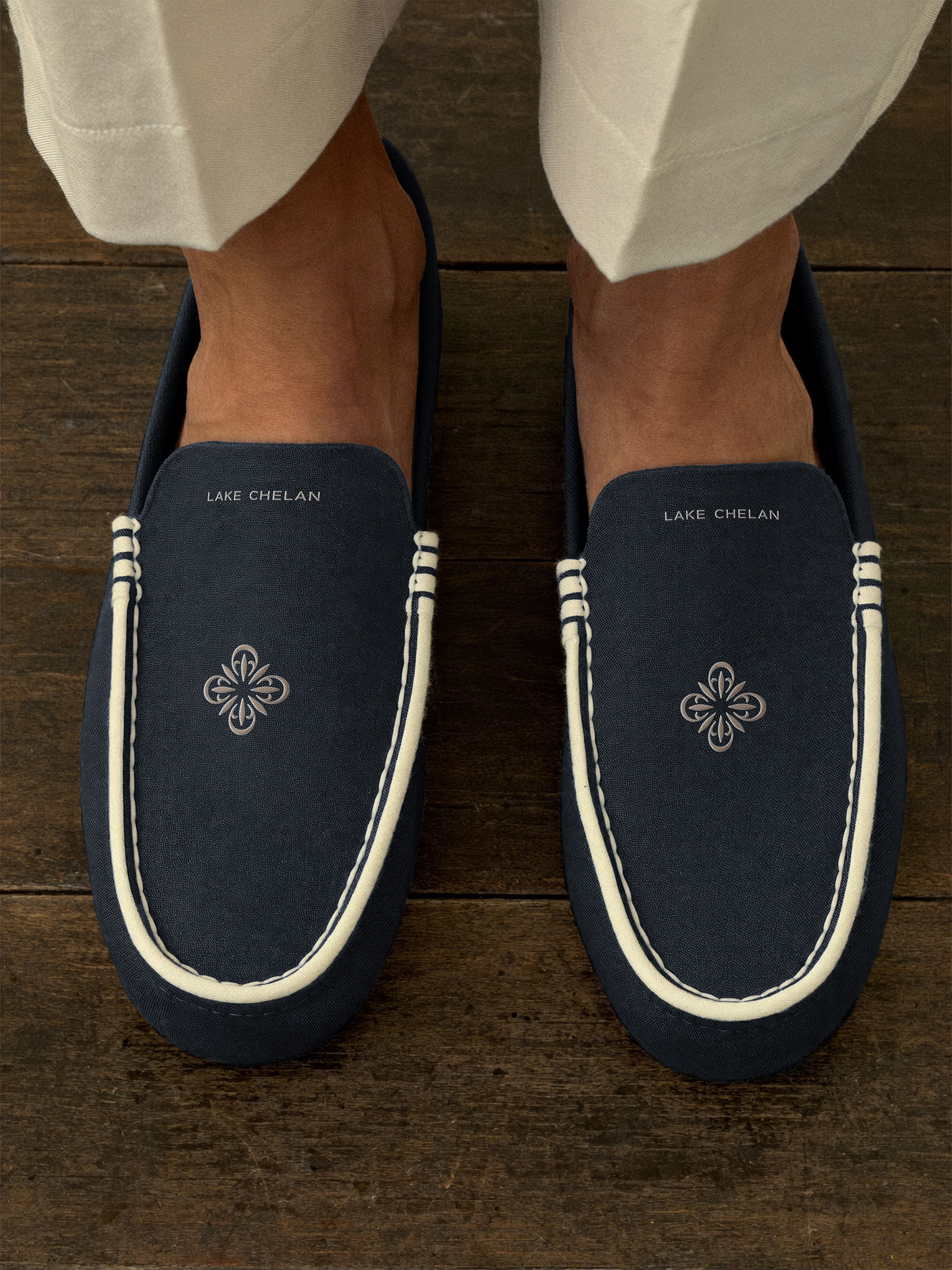
The Villas Solterra mark takes the form of a quatrefoil, four petals folding into one another around a shared center. Its symmetry is a deliberate nod to the brand’s dual-property structure, two distinct destinations, Cabo and Chelan, held together by one unified system. What reads at first as a simple ornamental flourish reveals itself on closer inspection as a mark built to anchor two very different settings under a single, cohesive identity.
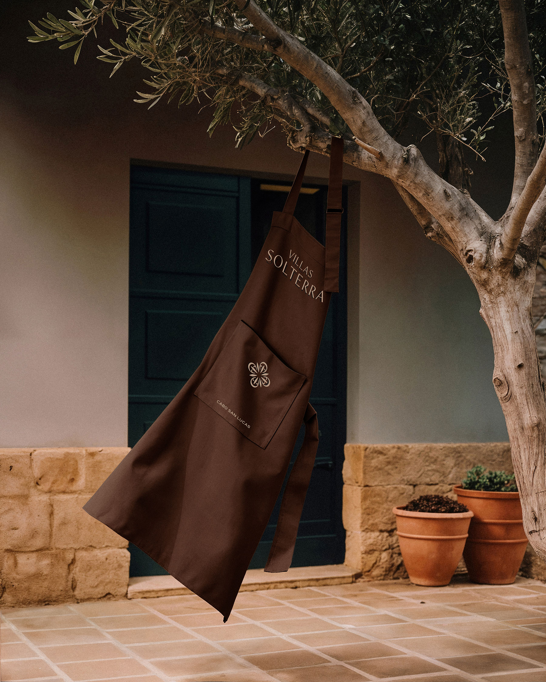
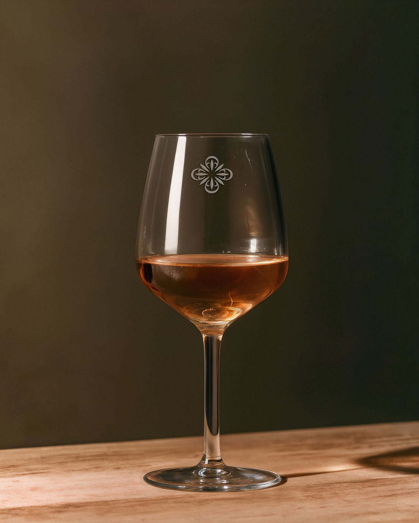
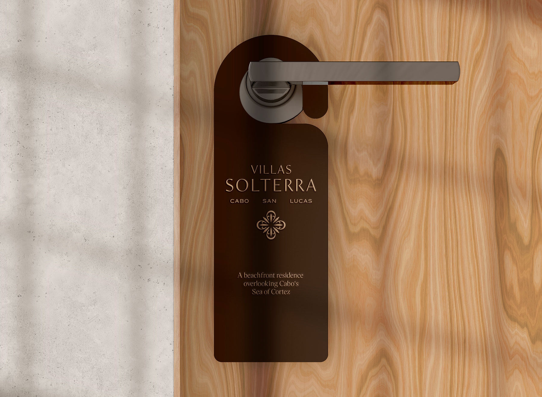
The quatrefoil is a nod to the tilework found across both properties’ Mediterranean and Tuscan-inspired locales, a detail rooted in place rather than trend. Versatility allows the mark to work across the brand. Small enough to sit discreetly on a shoulder and bold enough to anchor a door hanger, the mark travels across every physical touchpoint of the stay without ever losing the quiet, architectural feeling that embodies it.
BUILT TO TRAVEL
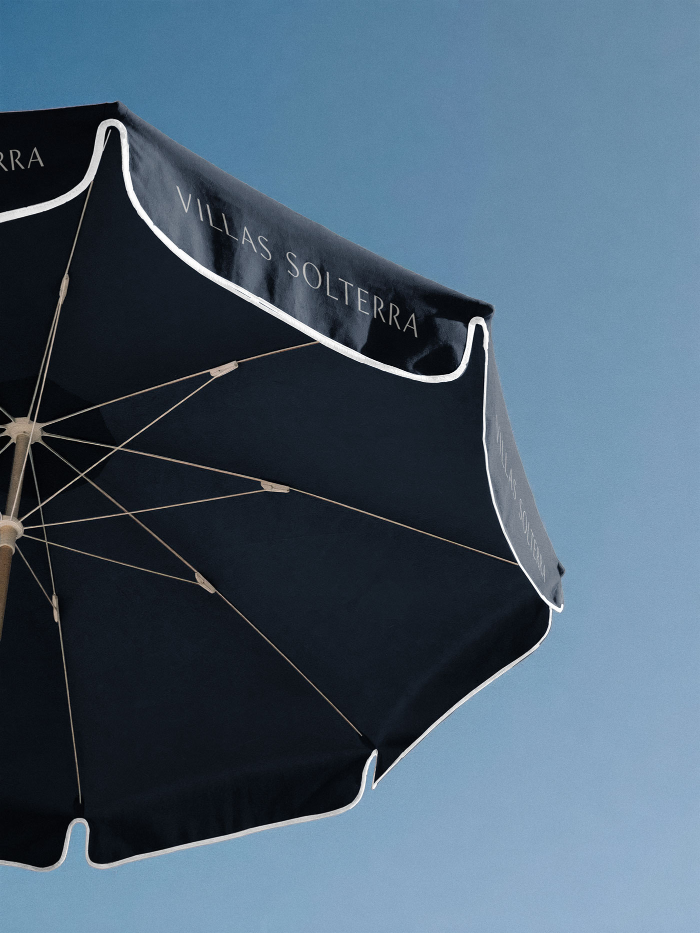
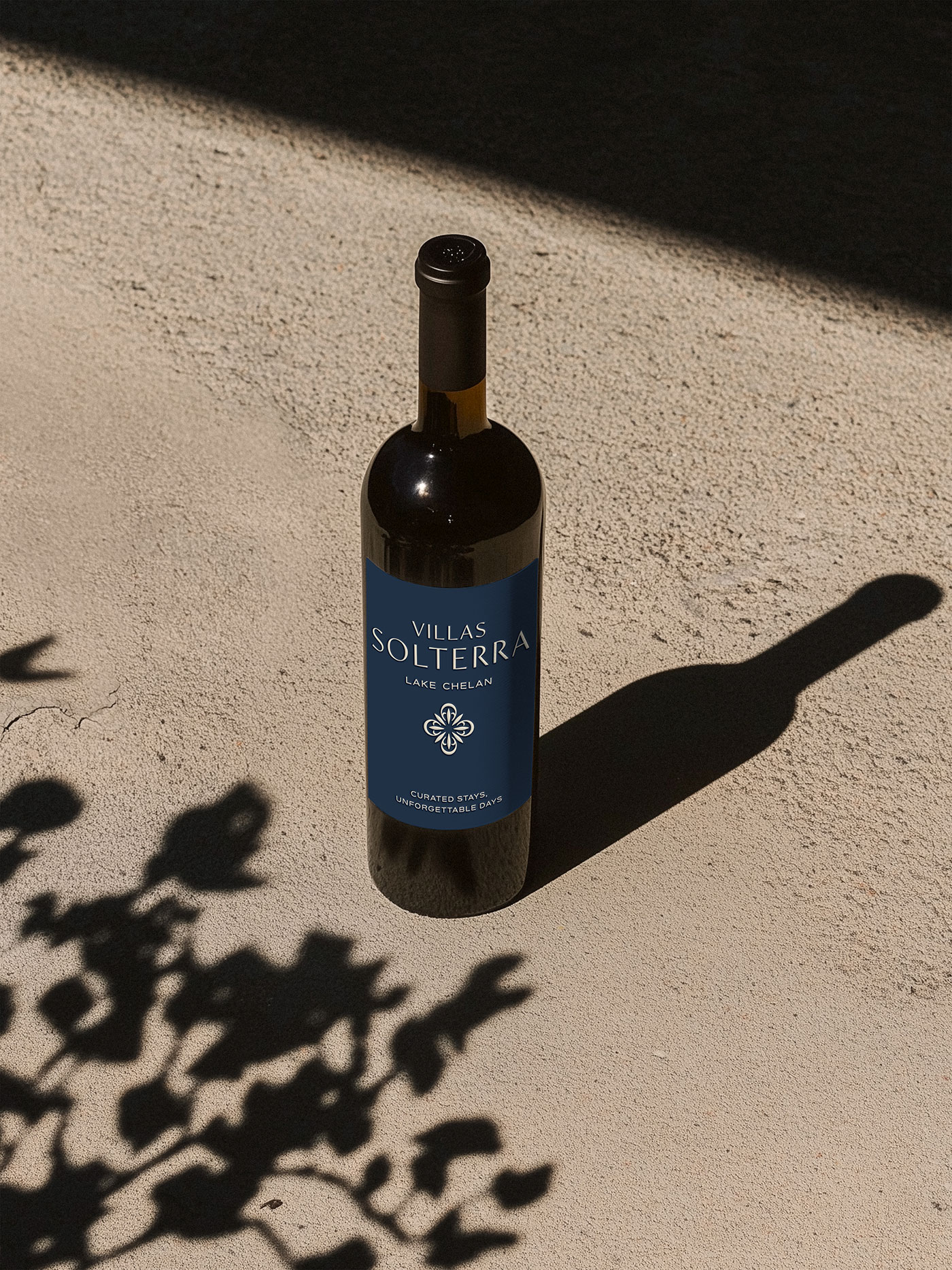
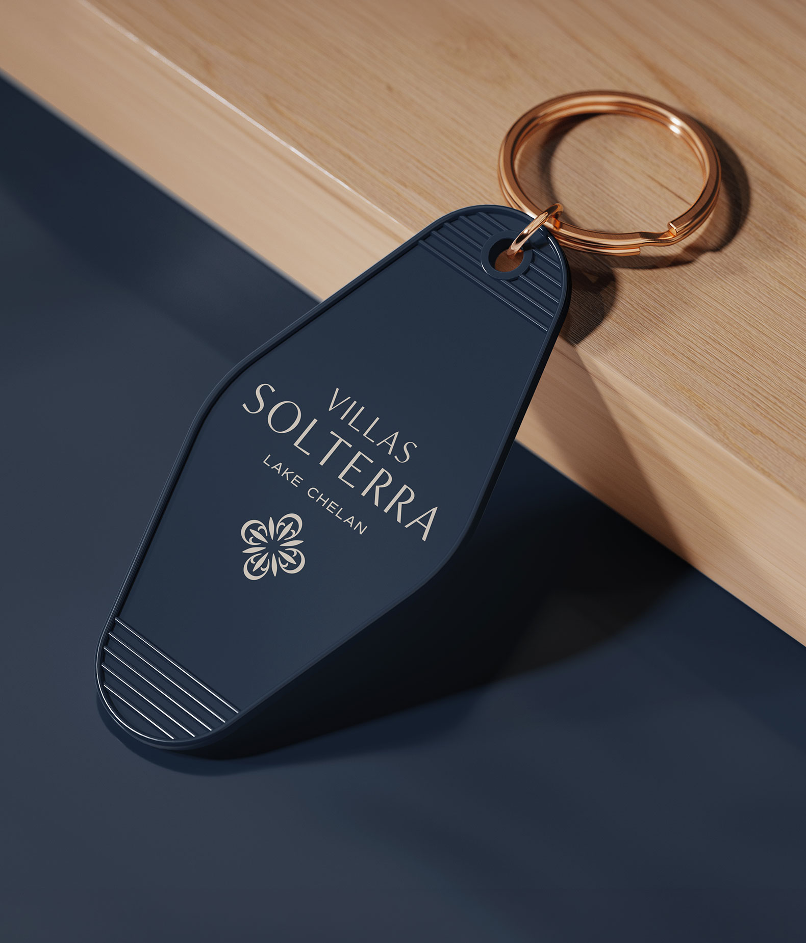
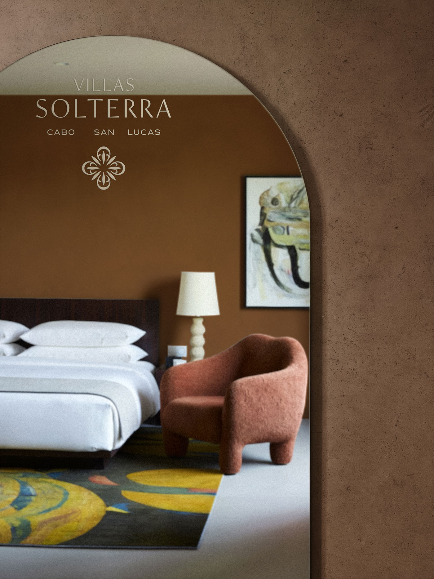
A brand meant to live across two properties, a full web experience, wine labels, resort merchandise and social content needed a system built for expansiveness from the start. The wordmark, palette and quatrefoil mark were designed to hold their own at every scale, whether engraved into a keycard, embroidered on a slipper, or stretched across a hero image on the homepage.
That flexibility shows up most in the collaborations. A Cabo wine label and a Chelan wine label share the same DNA while allowing color and messaging to speak to their unique settings. The system moves fluidly from web to wine to merch in a way that’s always recognizable and never repetitive.
Credits
- client Villas Solterra
- brand assets & mockups We Are Branch