
Format Ft. Worth
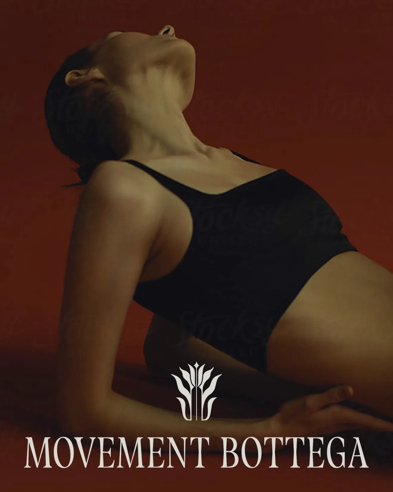
FORMAT is an integrated fitness and wellness destination built for clients who want group classes and med spa services under one roof rather than juggling a rotation of separate studios. Reformer Pilates, yoga and strength-based training sit alongside personalized nutrition consulting and med spa treatments like neuromodulator therapies, fillers and IV hydration.
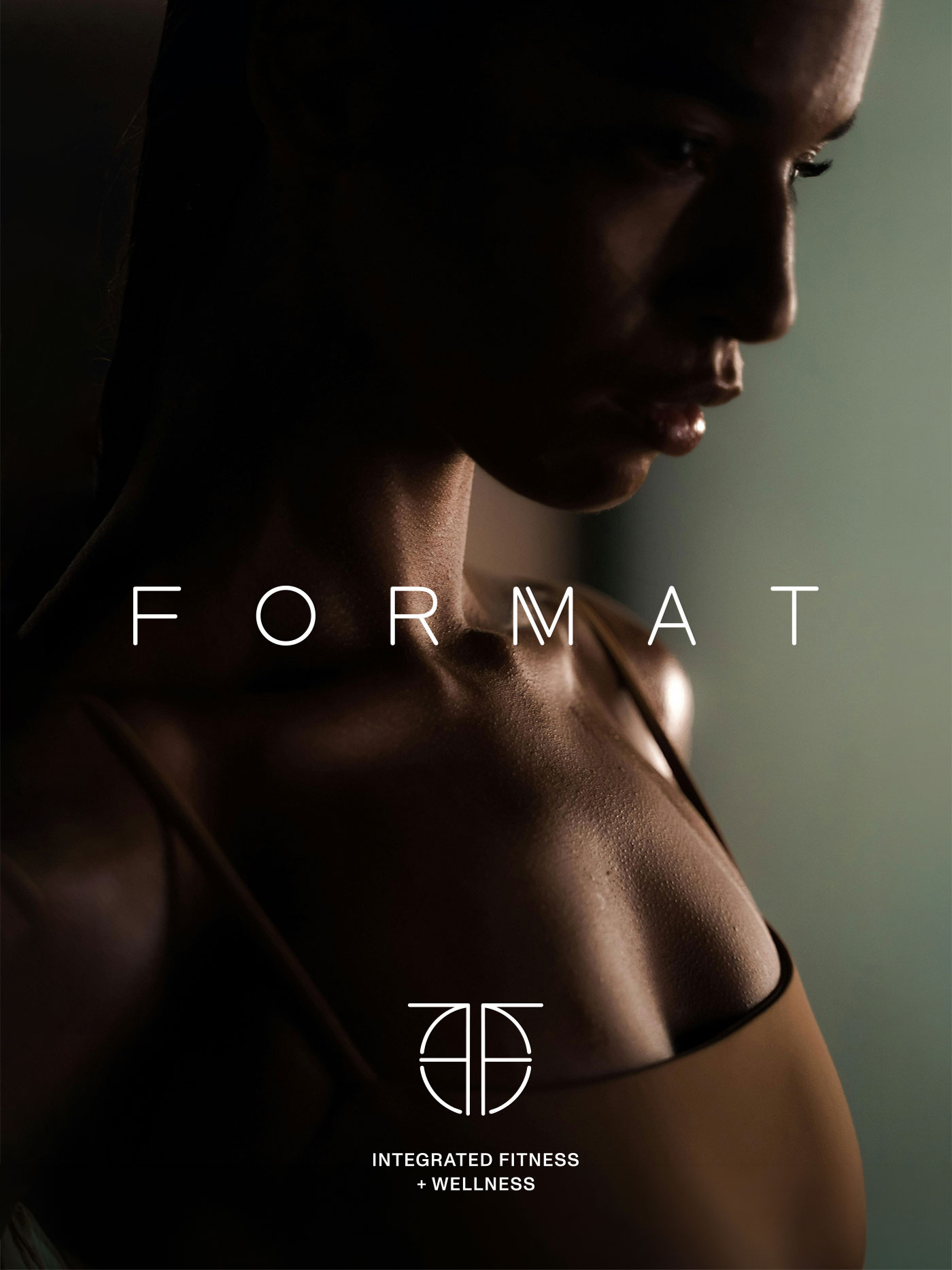
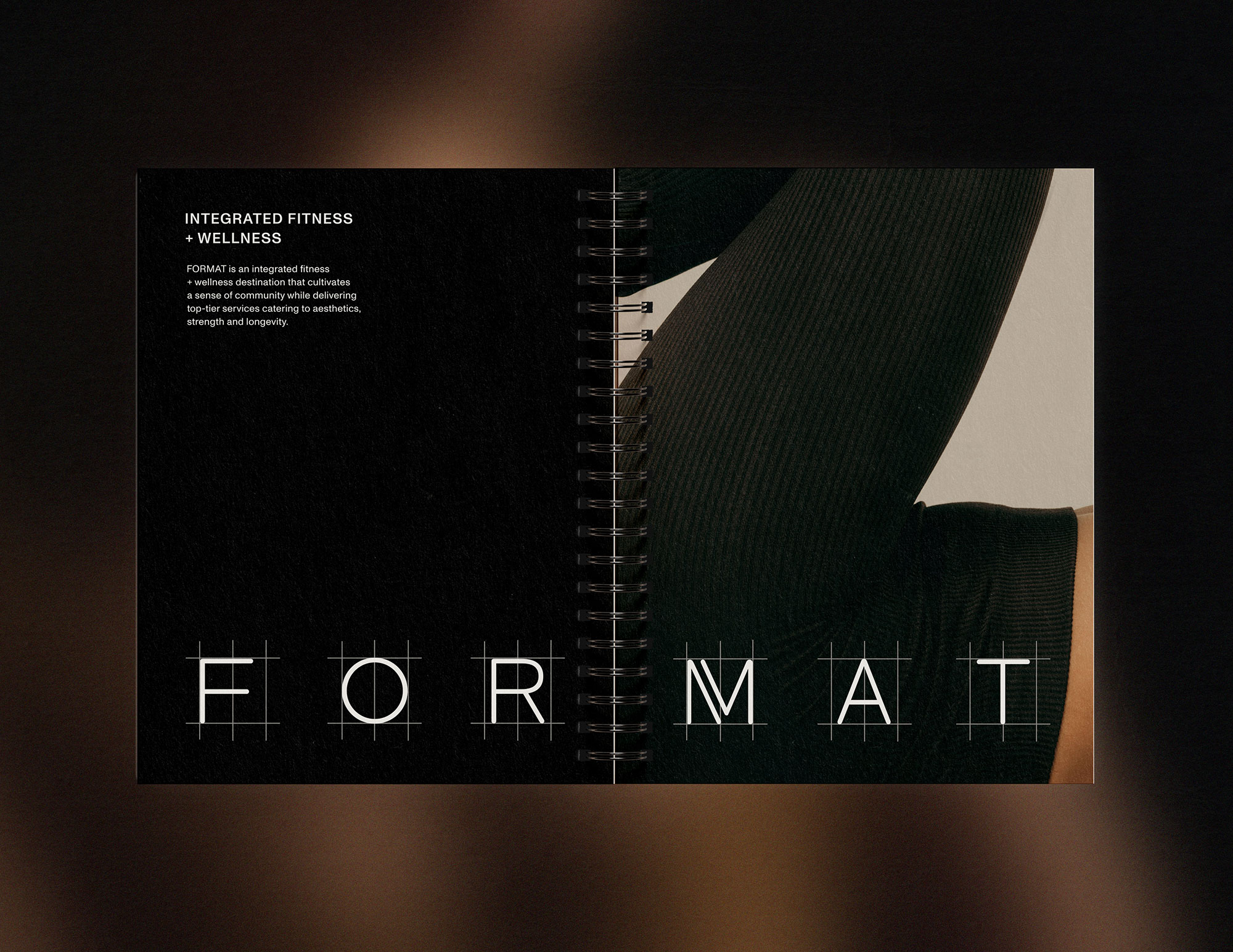
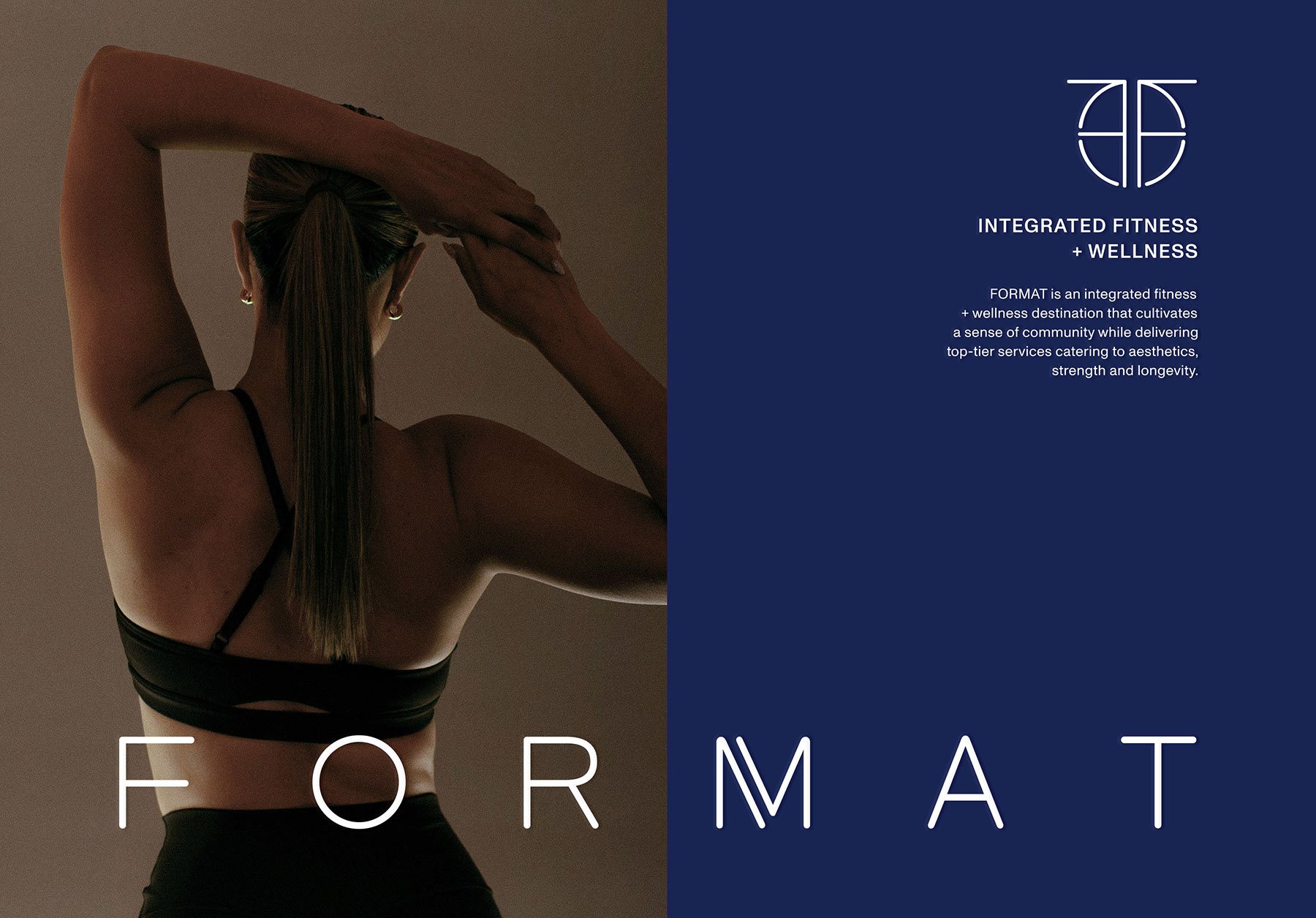
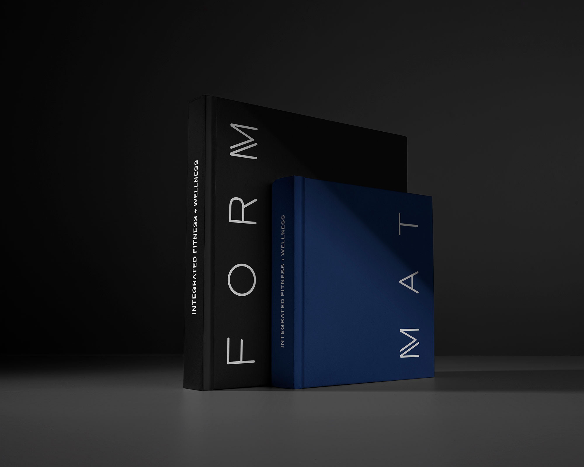
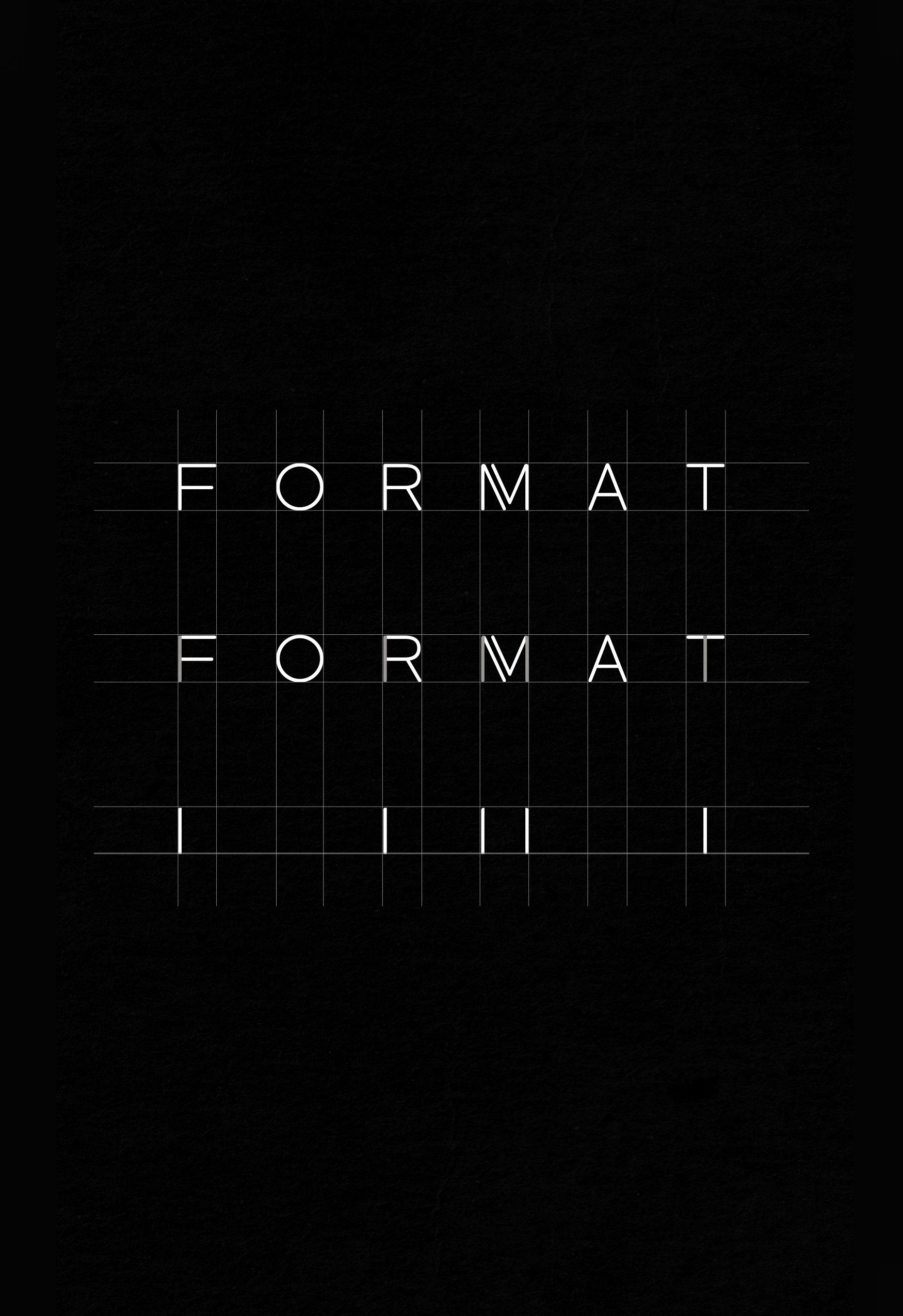
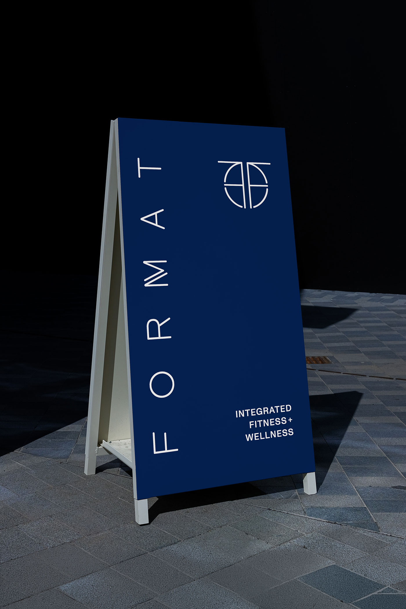
The identity needed to hold the dual identity of fitness and aesthetics, movement and med spa. The wordmark splits FORMAT into FORM (wellness) and MAT (fitness), while the icon distills that same split into a single graphic mark clean enough to stand alone on a hangtag or storefront window. Sleek and quietly luxurious, the system was built to feel less like a gym and more like a high-end destination for anyone chasing aesthetics, strength and longevity in equal measure.
Services
- Visual Identity
- Stationery & Print Collateral
- Social Media Templates

The icon
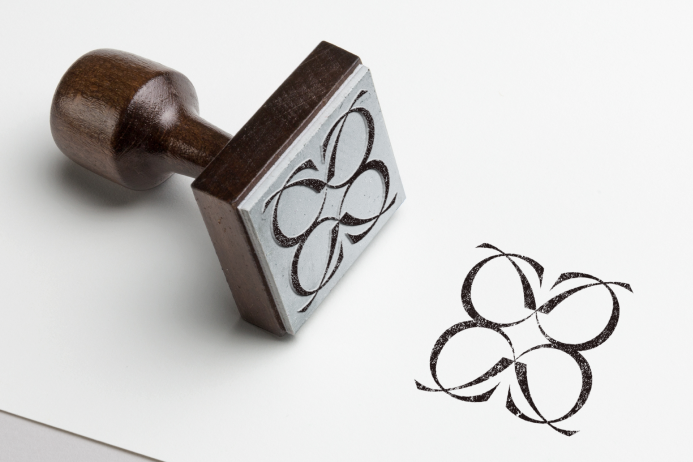
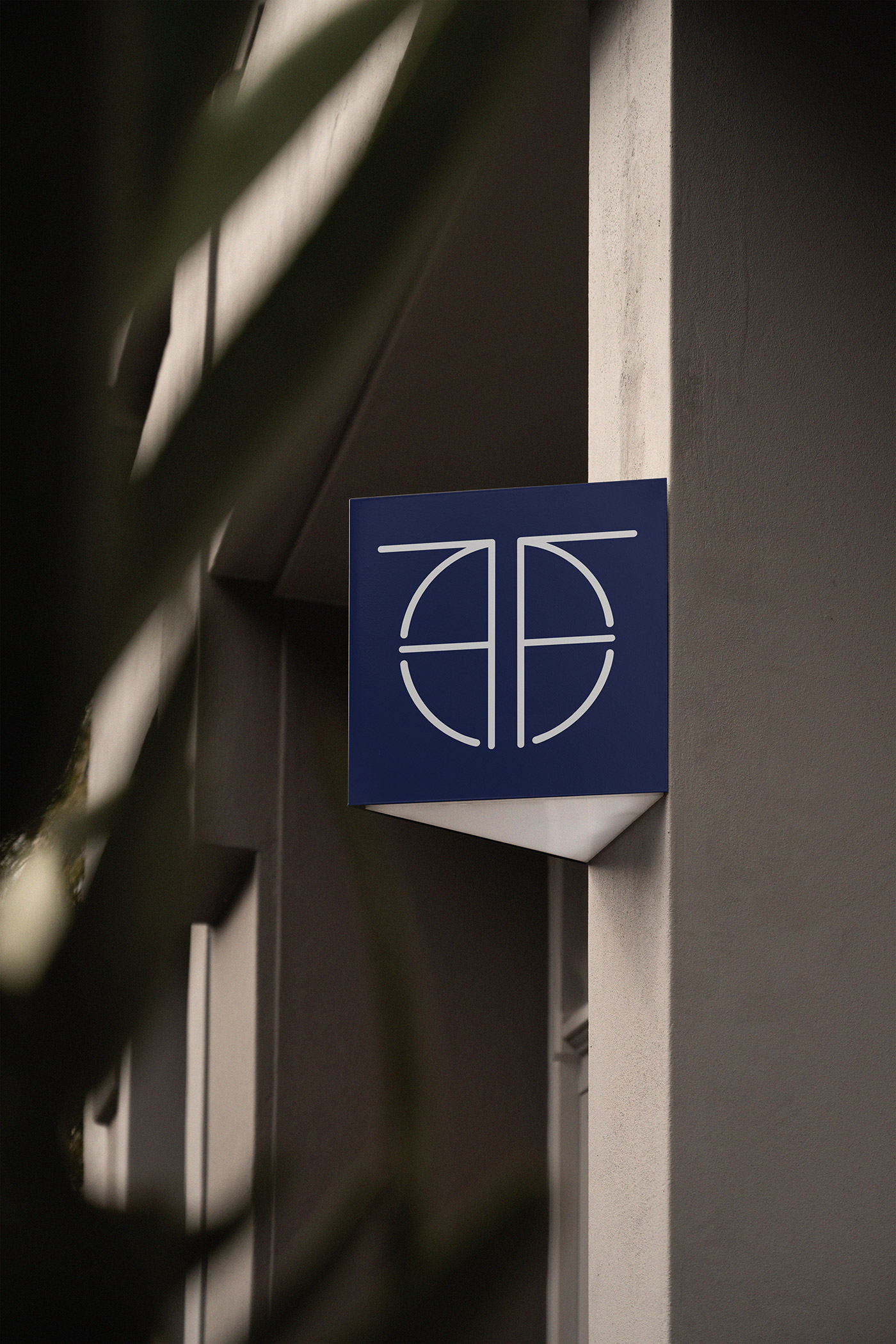
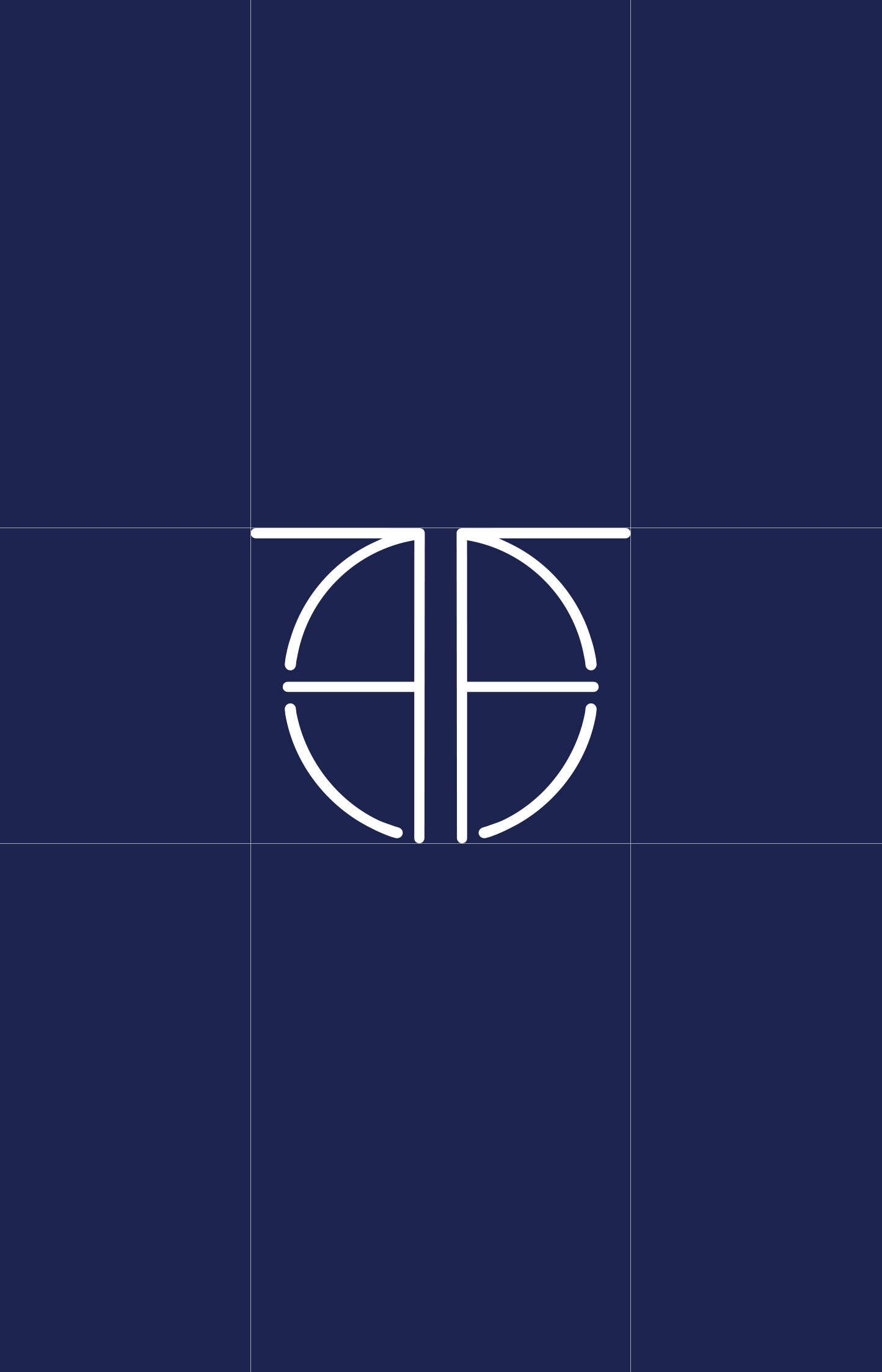
The FORMAT icon takes the shape of two mirrored F’s, drawn from the brand’s own name and set back to back inside a single circle. One F opens toward FORM, the wellness and med spa side of the brand; the other toward MAT, the fitness and movement side. What reads as a single balanced symbol reveals itself on closer inspection as the brand’s initial, holding two distinct practices inside one shape.
Layered beneath that is the idea that neither half works without the other. Aesthetics and strength, treatment and training, are two entry points into the same pursuit of longevity. We designed a mark clean enough to stand alone on a hangtag or storefront window, yet substantial enough to anchor a full brand system. Sleek, architectural and quietly confident, it feels like a mark built for a lifestyle brand.
the format experience
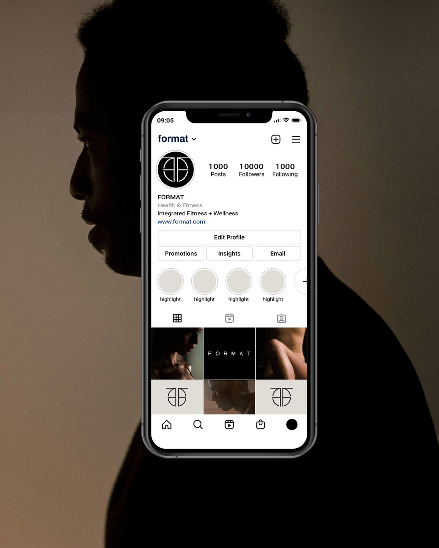
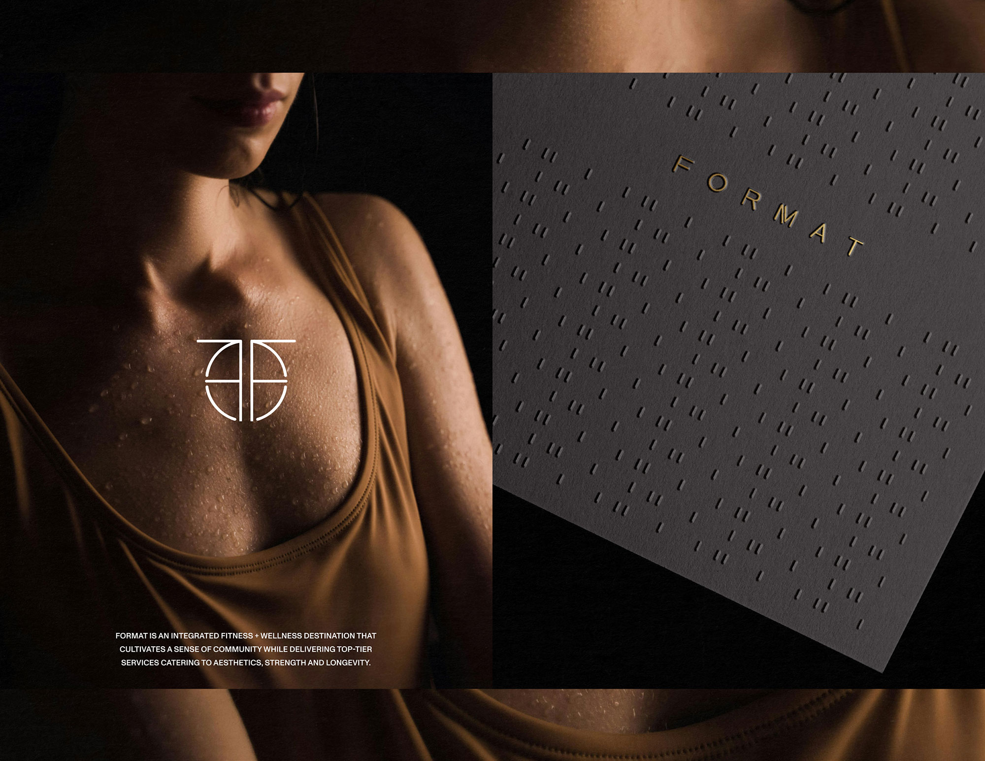
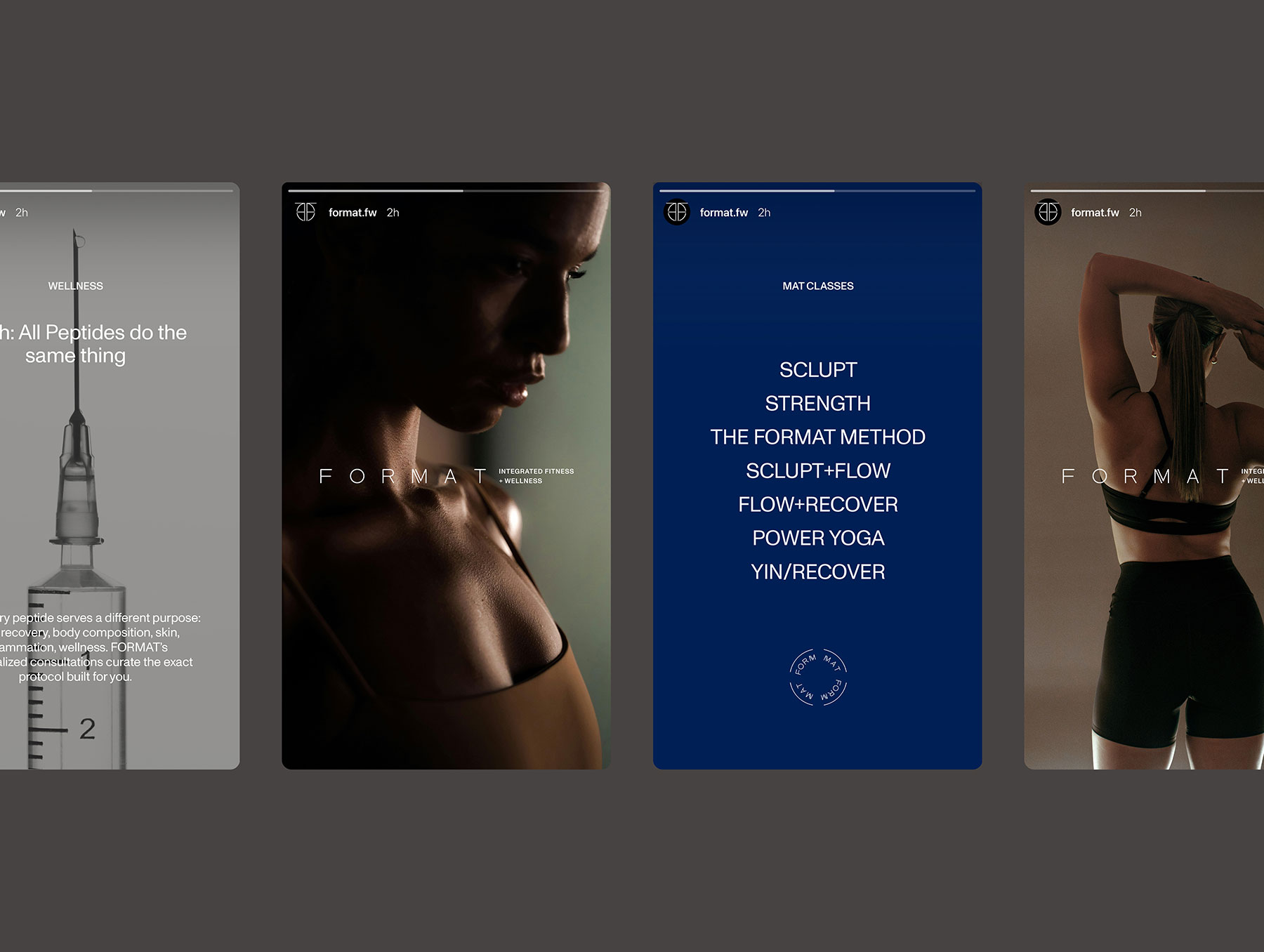
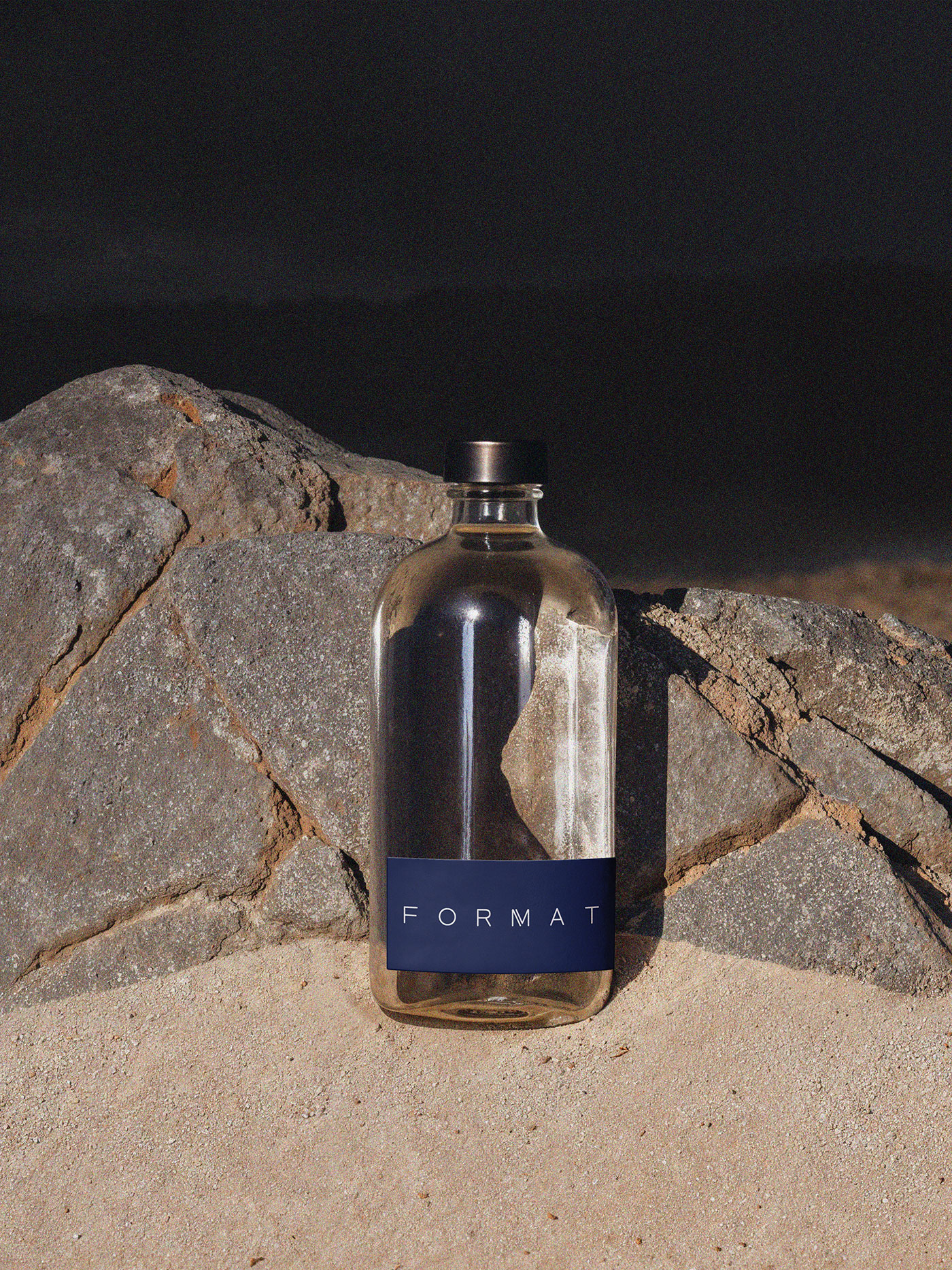
From Instagram to storefront, the FORMAT identity holds its shape. The wordmark and icon anchor the social grid, guiding everything from class overviews to educational carousels, while a signature pattern adds texture across packaging, wayfinding and print materials.
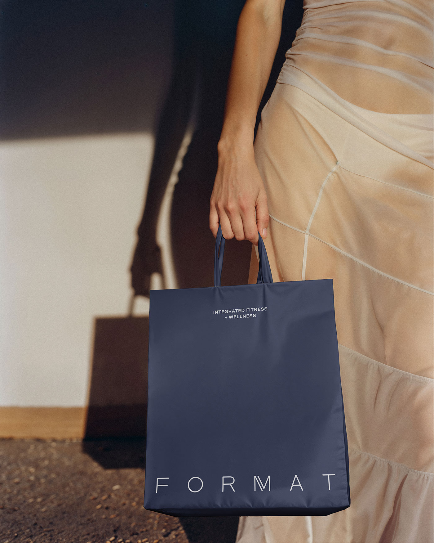
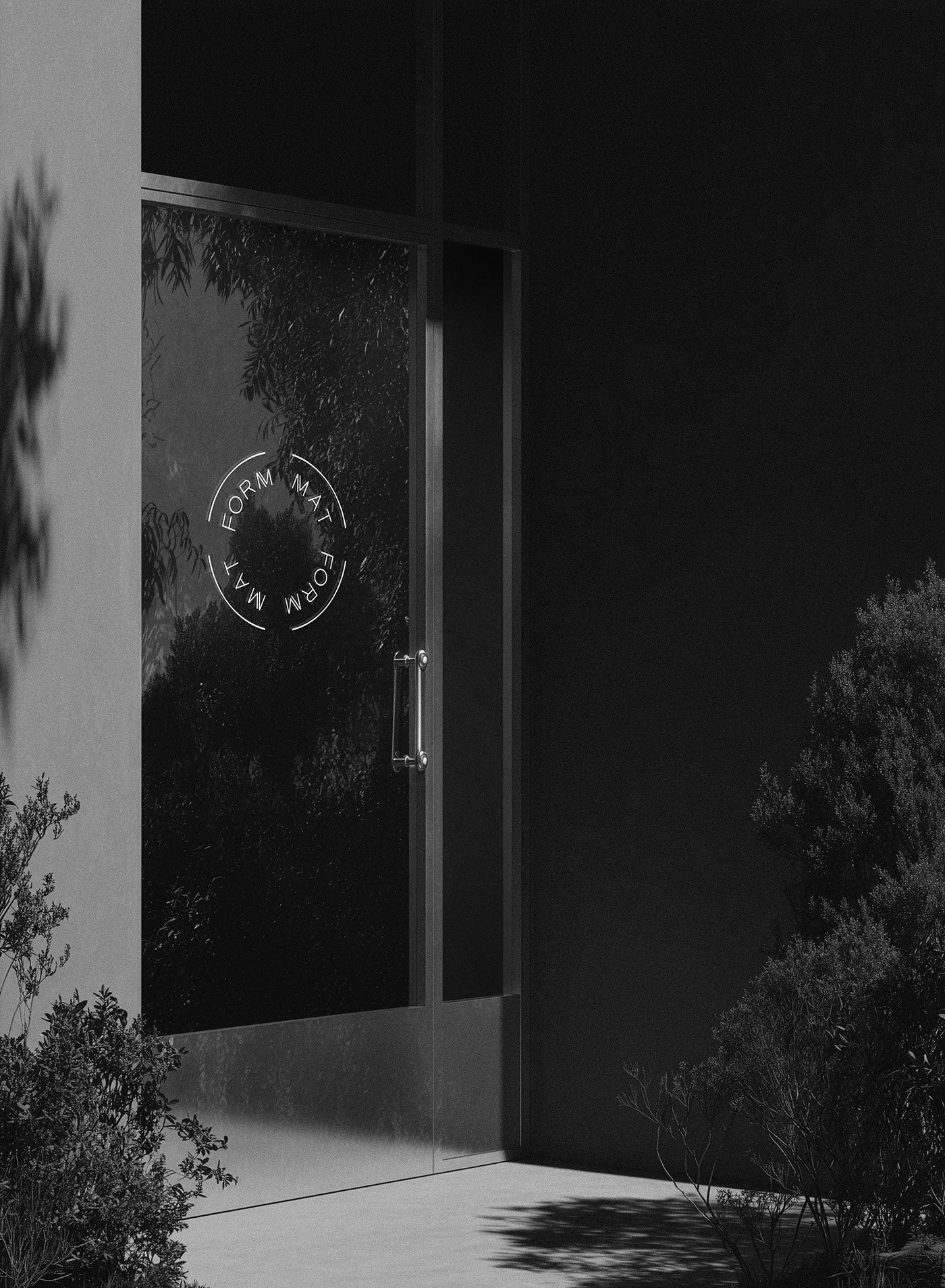
Signage, retail bags and apparel scale the mark up or down as needed, with a full lockup where there’s room to breathe and an icon alone where space is tight, so the brand stays legible and recognizable across all applications.

Credits
- brand assets & mockups We Are Branch