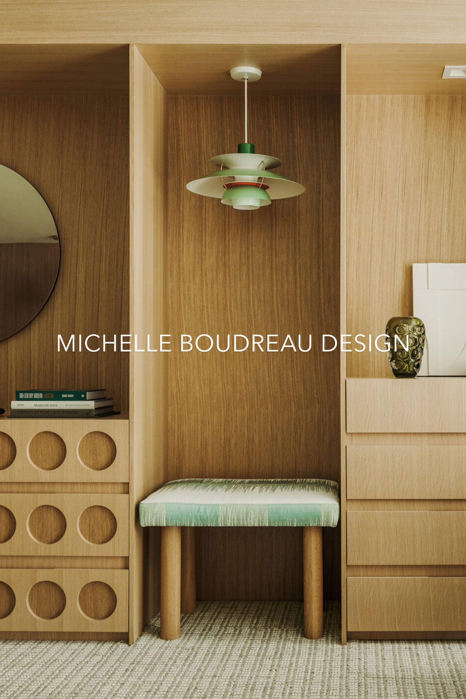
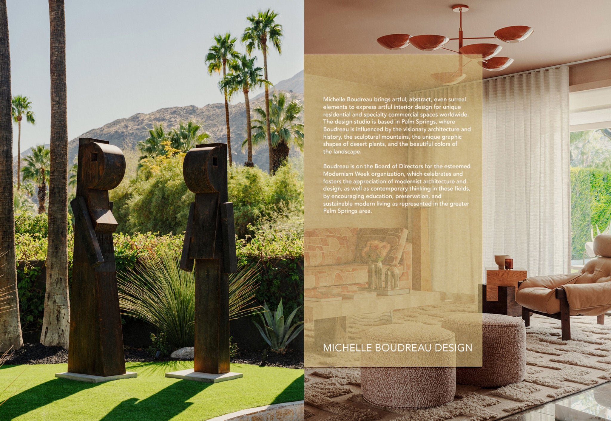
Michelle Boudreau Design
Helena Simon is a fashion accessories house producing fine floral brooches. Each piece is hand-fabricated at a fourth-generation floral atelier in New York City. The entire line is designed to function as a wearable heirloom: an accessory with the presence of fine jewelry and the hand-finished details of couture. The brand identity needed to hold its own next to the artistry of the product itself, elevated enough to be featured in Vogue, yet warm enough to feel personal and collectible.
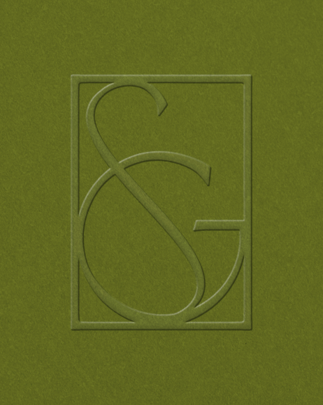
The system centers on a bespoke serif wordmark paired with an interlocking H monogram woven together into a small crest, a nod to the intimacy and craftsmanship behind every piece. Across the lookbook, social templates and e-commerce experience, the identity stays understated by design, letting the flowers remain the central focus.
THE MONOGRAM
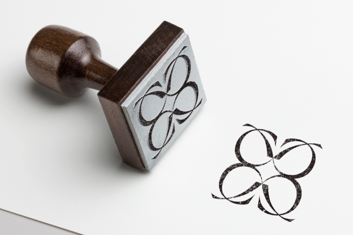
The mark takes its cue from the brand’s own initial, an H woven into a single crest, with looping strokes suggesting a vine. Rendered large, it reads as ornamental first, monogram second. Scaled down to a stamp on a gift box, it becomes a quiet mark of authenticity.
The GEM & STEM
The mark builds from a single faceted gem, a small four-petaled form echoing a flower, paired with two crossed, leaf-like stems beneath it. Together, they read as a cut flower. The gem alone works as the brand’s smallest asset, a single stamped point, while the gem and stem combined carry more presence for foil work.
At full scale, the two elements are set inside a double ring with “H” and “S” placed where the stems cross, completing the mark as a proper seal. This version anchors the brand’s most considered touchpoints: a seal and embossed care cards. The result is a single icon that scales cleanly from a minimal imprint to a finished emblem.
THE PACKAGING
Each brooch arrives in a sky-blue box, the color drawn from the brand’s core palette and finished in a fine texture that lends weight and tactility. A hairline gold border frames the lid, punctuated at each corner by a small floral flourish, while the interlocking H monogram is foil-stamped at the center. The result is a keepsake box, something meant to be kept long after the ribbon comes off.
Credits
- client Michelle Boudreau Design
- Interior photos Courtesy of Michelle Boudreau
- brand assets & mockups We Are Branch