Helena Simon
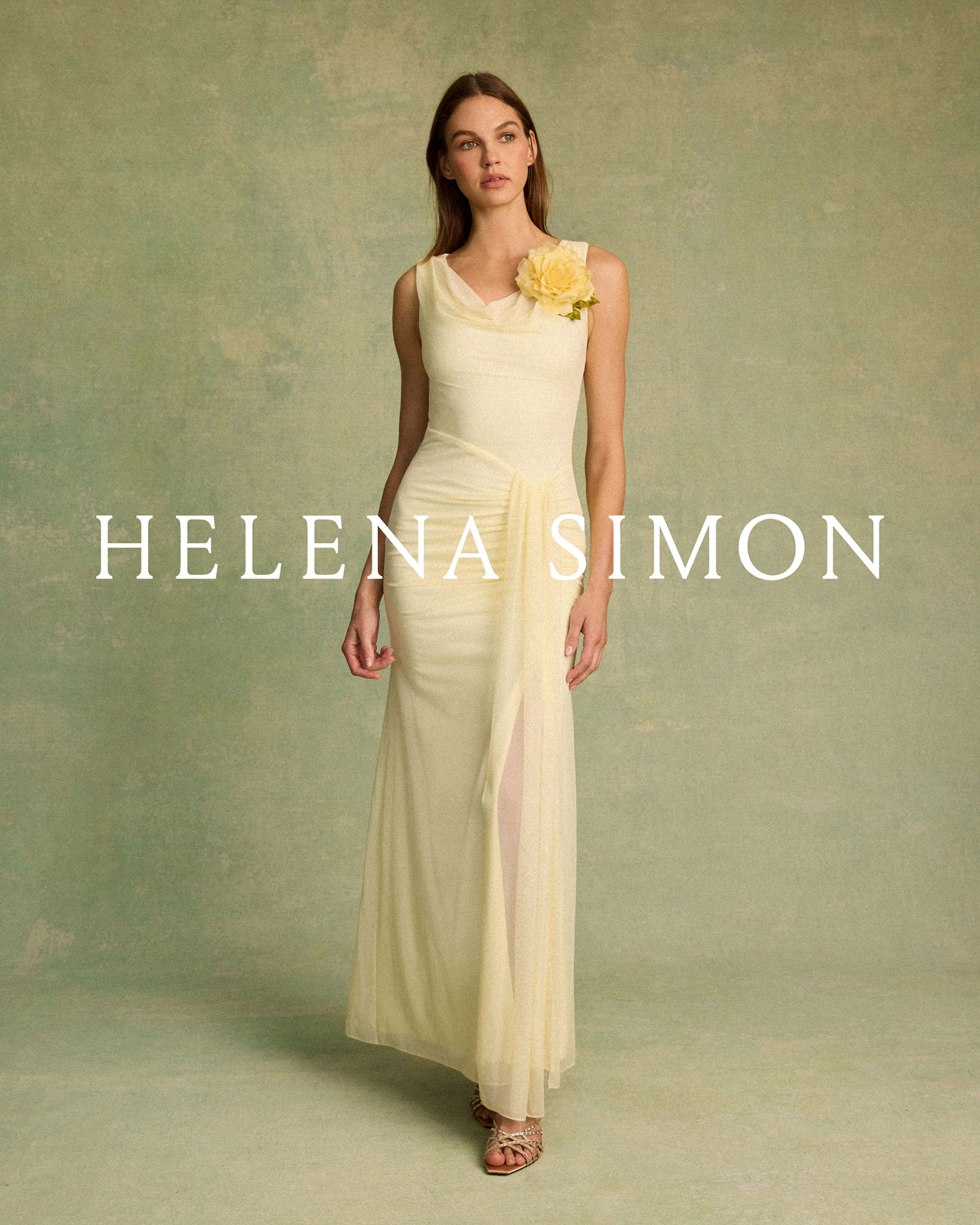
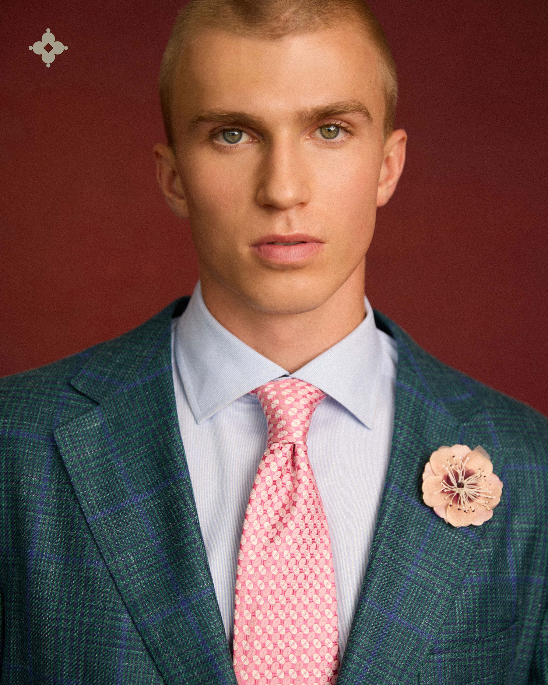
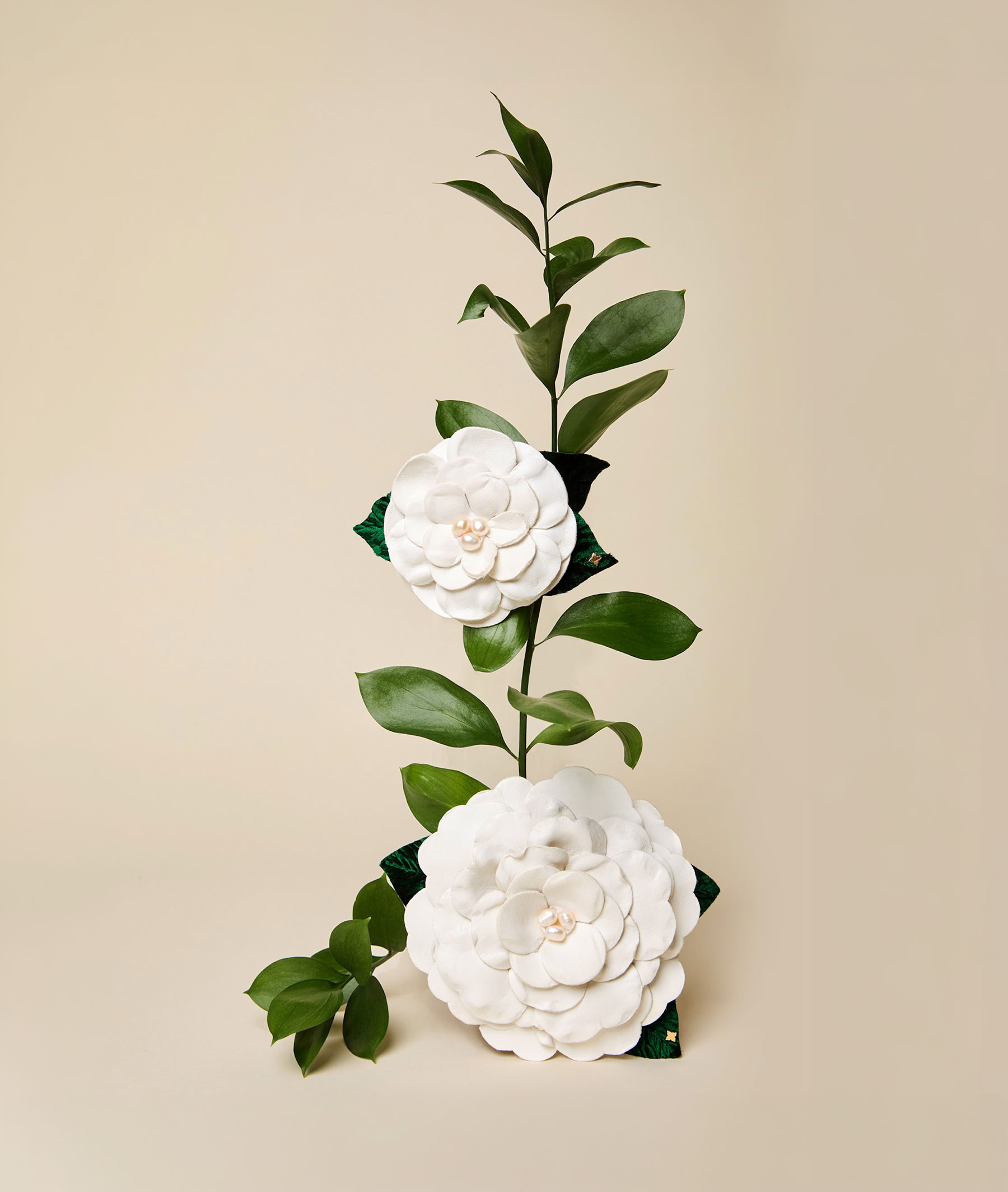
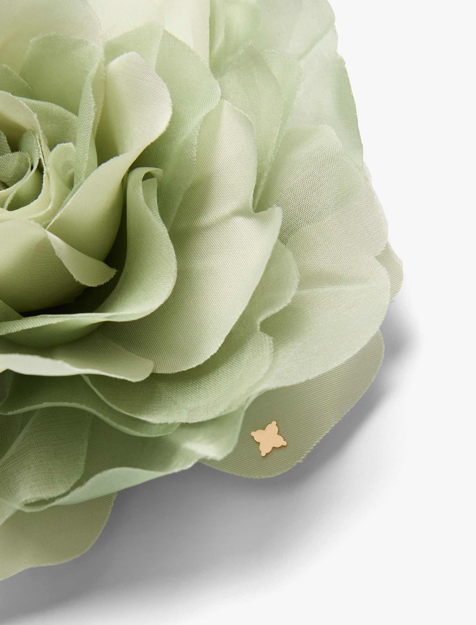
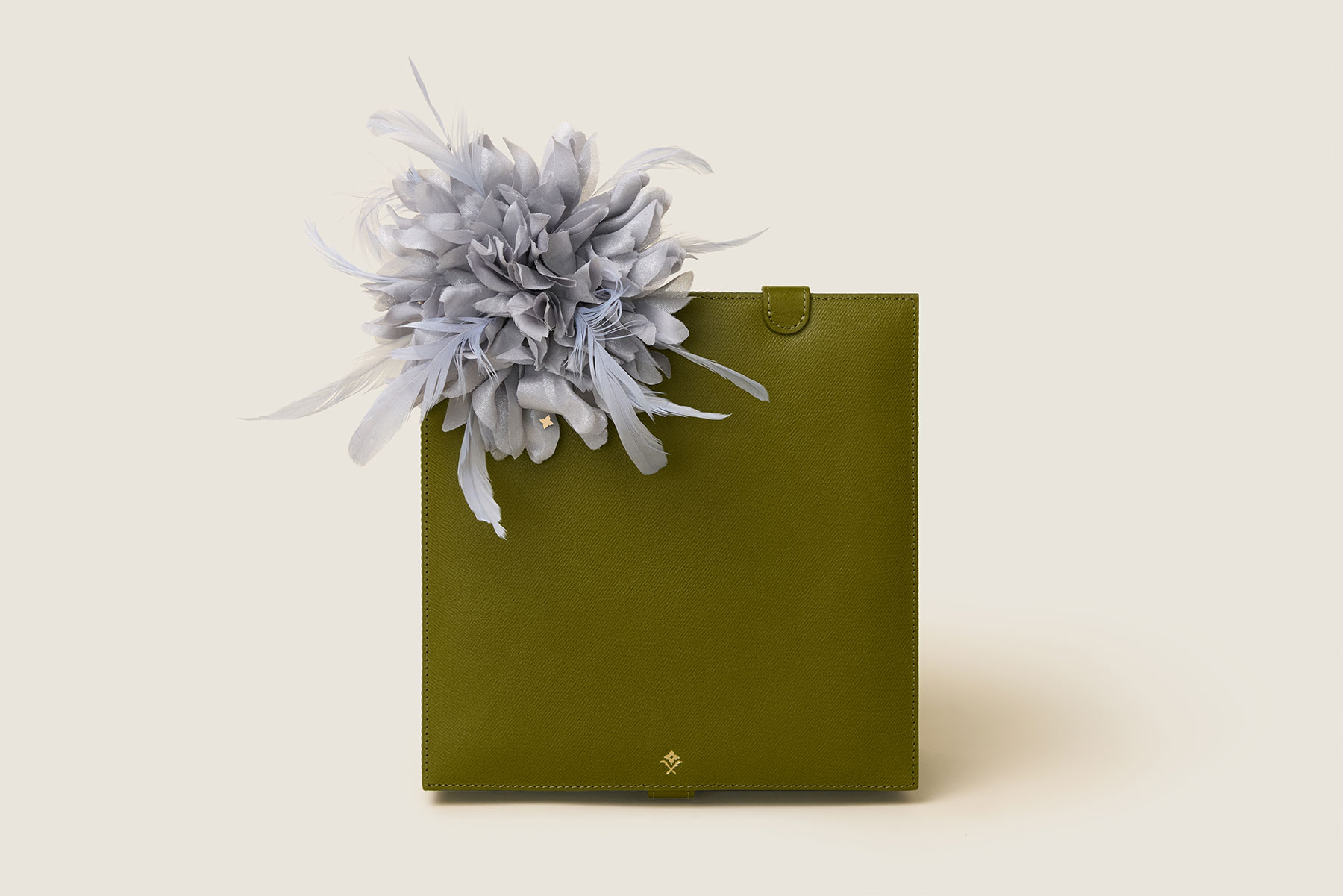
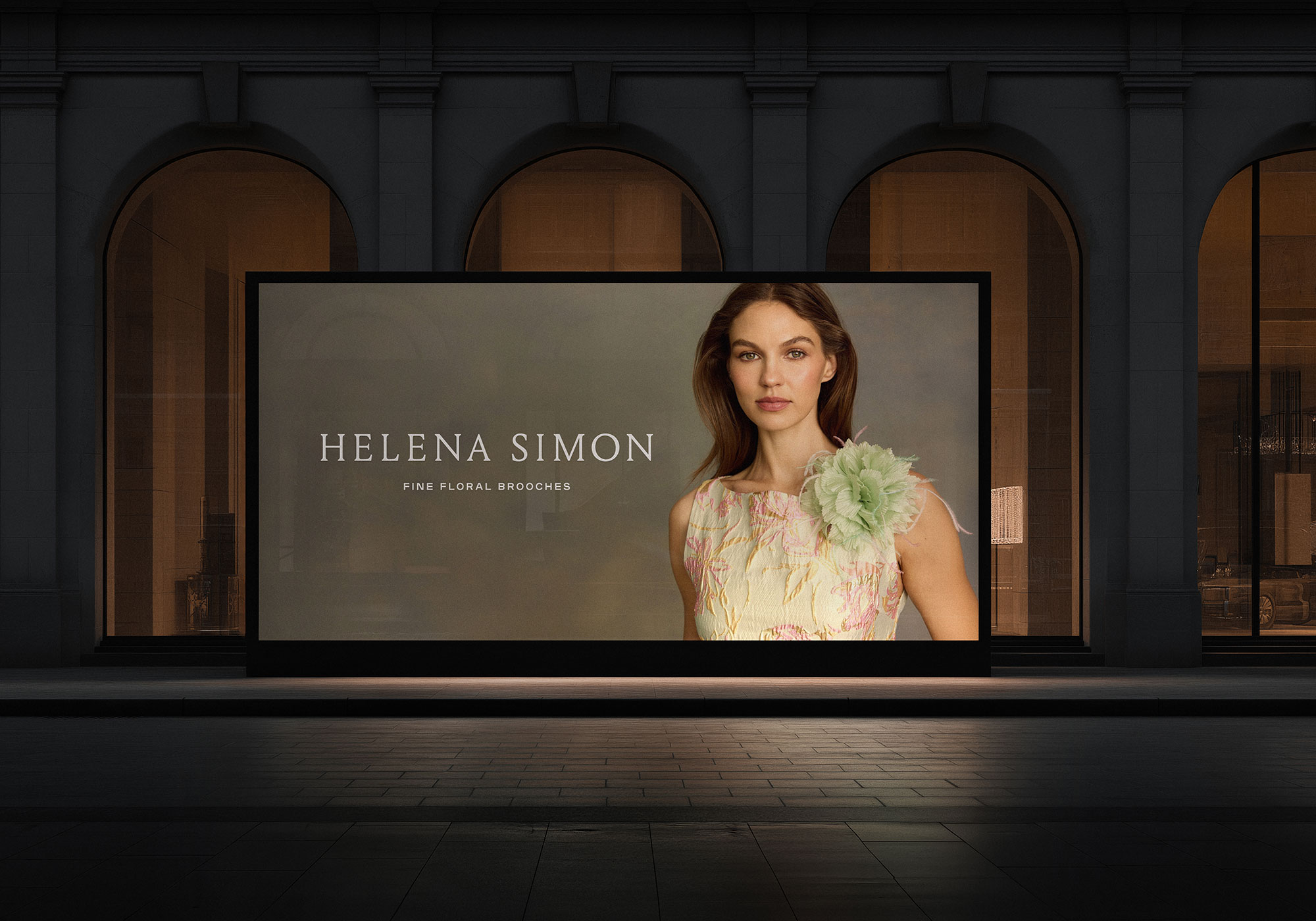
Helena Simon is a fashion accessories house producing fine floral brooches. Each piece is hand-fabricated at a fourth-generation floral atelier in New York City. The entire line, from delicate silk poppies to sculptural flowing peonies, is designed to function as a wearable heirloom: an accessory with the presence of fine jewelry and the hand-finished details of couture. The brand identity needed to hold its own next to the artistry of the product itself, elevated enough to be featured in Vogue, yet warm enough to feel personal and collectible.
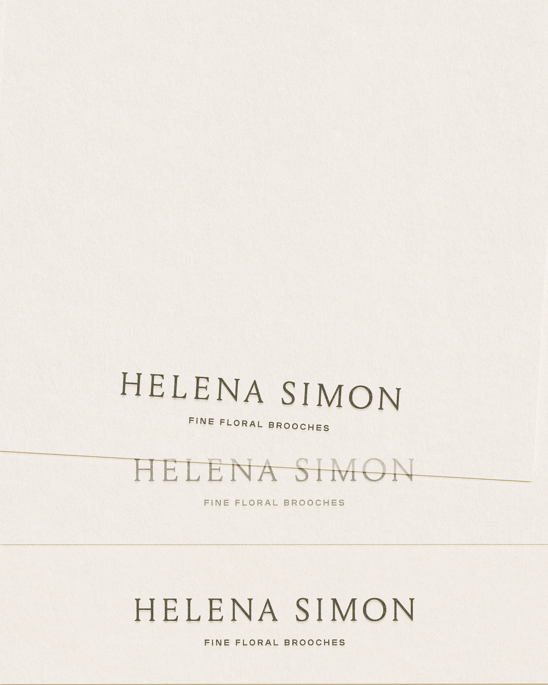
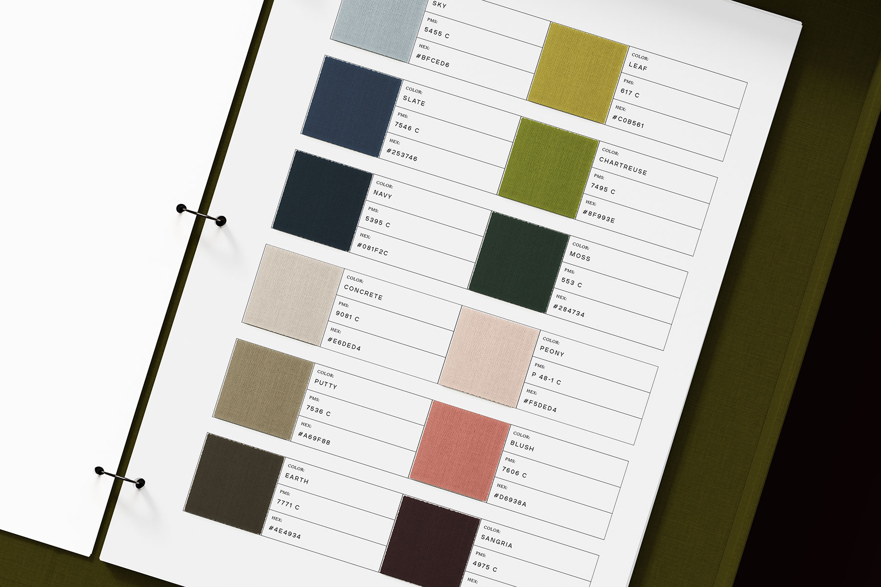
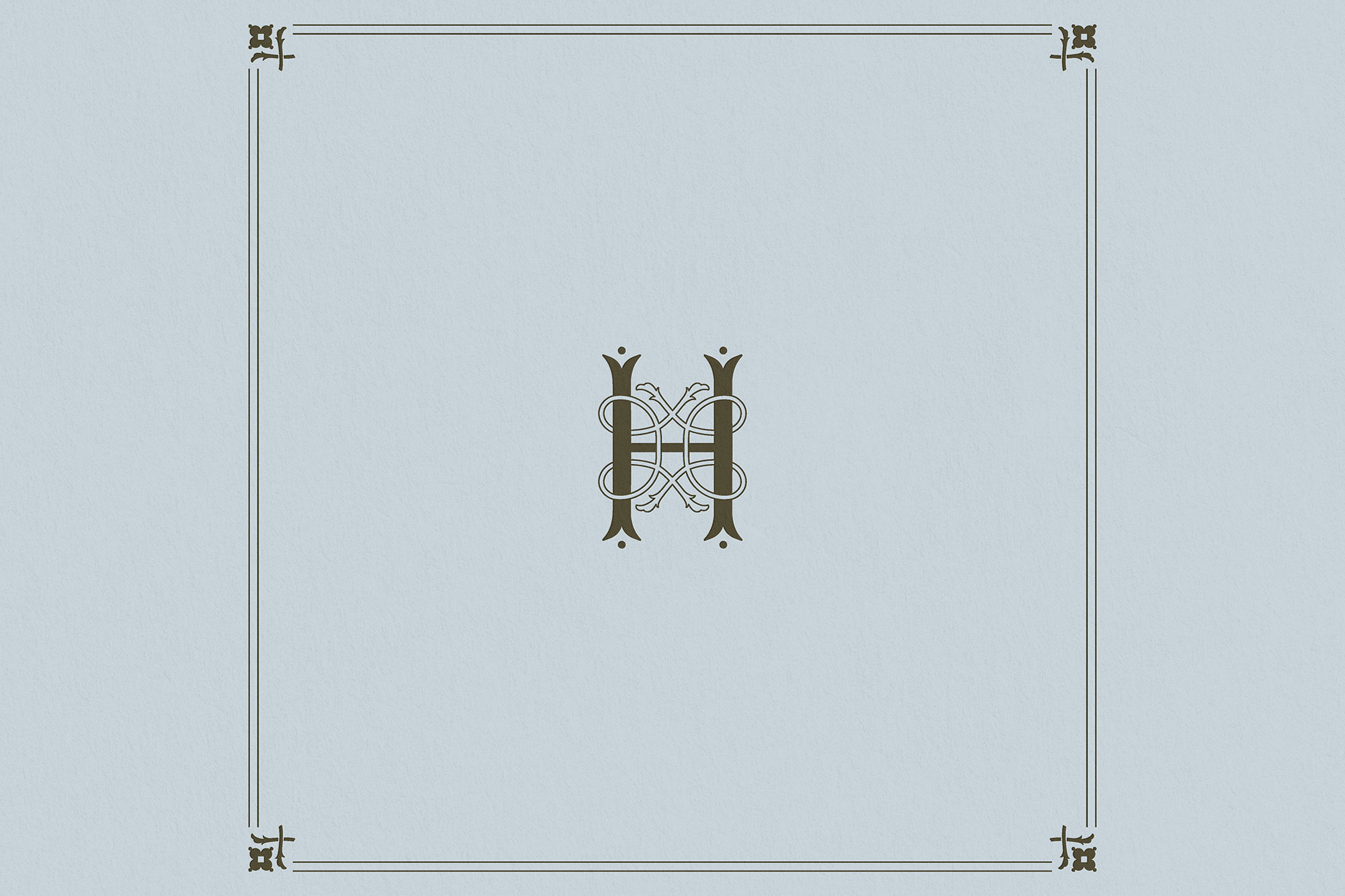
The system centers on a bespoke serif wordmark paired with an interlocking H monogram woven together into a small crest, a nod to the intimacy and craftsmanship behind every piece. A refined palette echoes the botanical range of the brooches themselves, while embossed gold foil details and sky blue packaging carry the brand’s elegance from the product page to the box on someone’s doorstep. Across the lookbook, social templates and e-commerce experience, the identity stays understated by design, letting the flowers remain the central focus.
Services
- Visual Identity
- Stationery & Print Collateral
- Social Media Templates
- Editorial Design
- Web Design
THE MONOGRAM
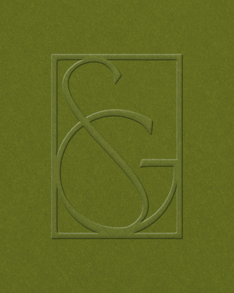
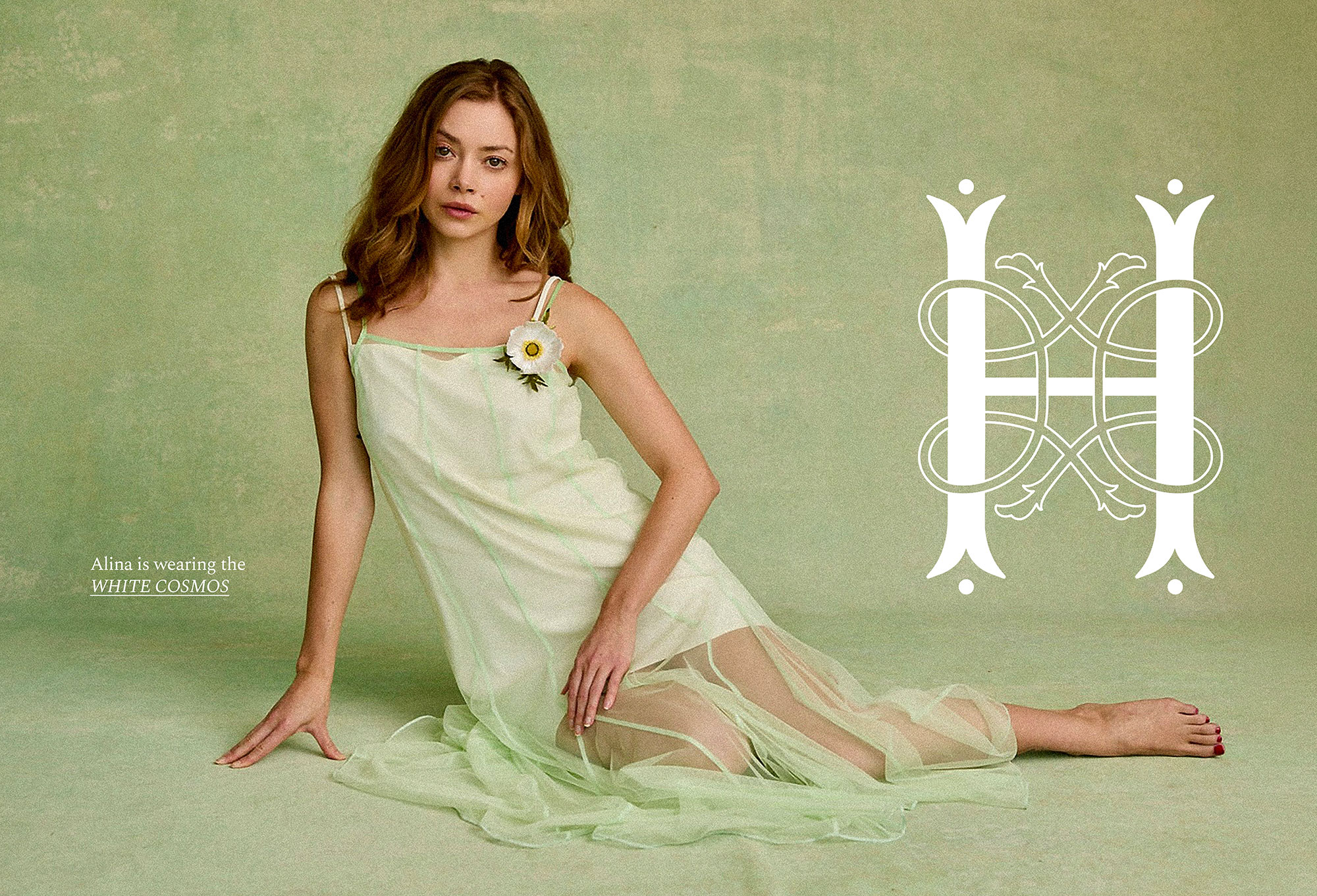
The mark takes its cue from the brand’s own initial, an H woven into a single crest, with looping strokes suggesting a vine. Rendered large, it reads as ornamental first, monogram second, the interlocking lines echoing the layered structure of the pieces themselves. Scaled down to a stamp on a gift box, it becomes a quiet mark of authenticity.
The GEM & STEM
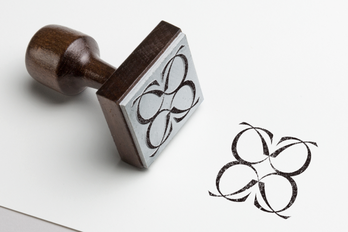
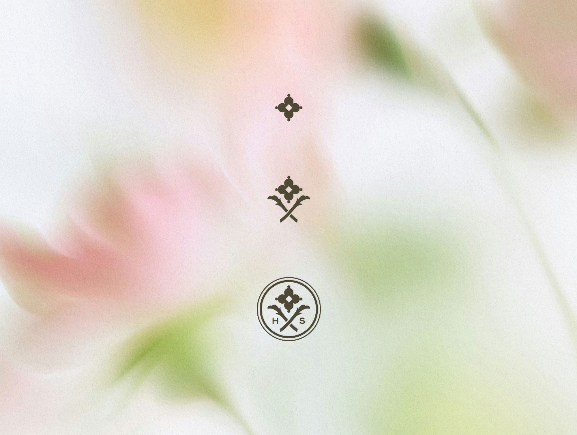
The mark builds from a single faceted gem, a small four-petaled form echoing a flower, paired with two crossed, leaf-like stems beneath it. Together they read as a cut flower, botanical without becoming literal. The gem alone works as the brand’s smallest asset, a single stamped point, while the gem and stem combined carry more presence for foil work.
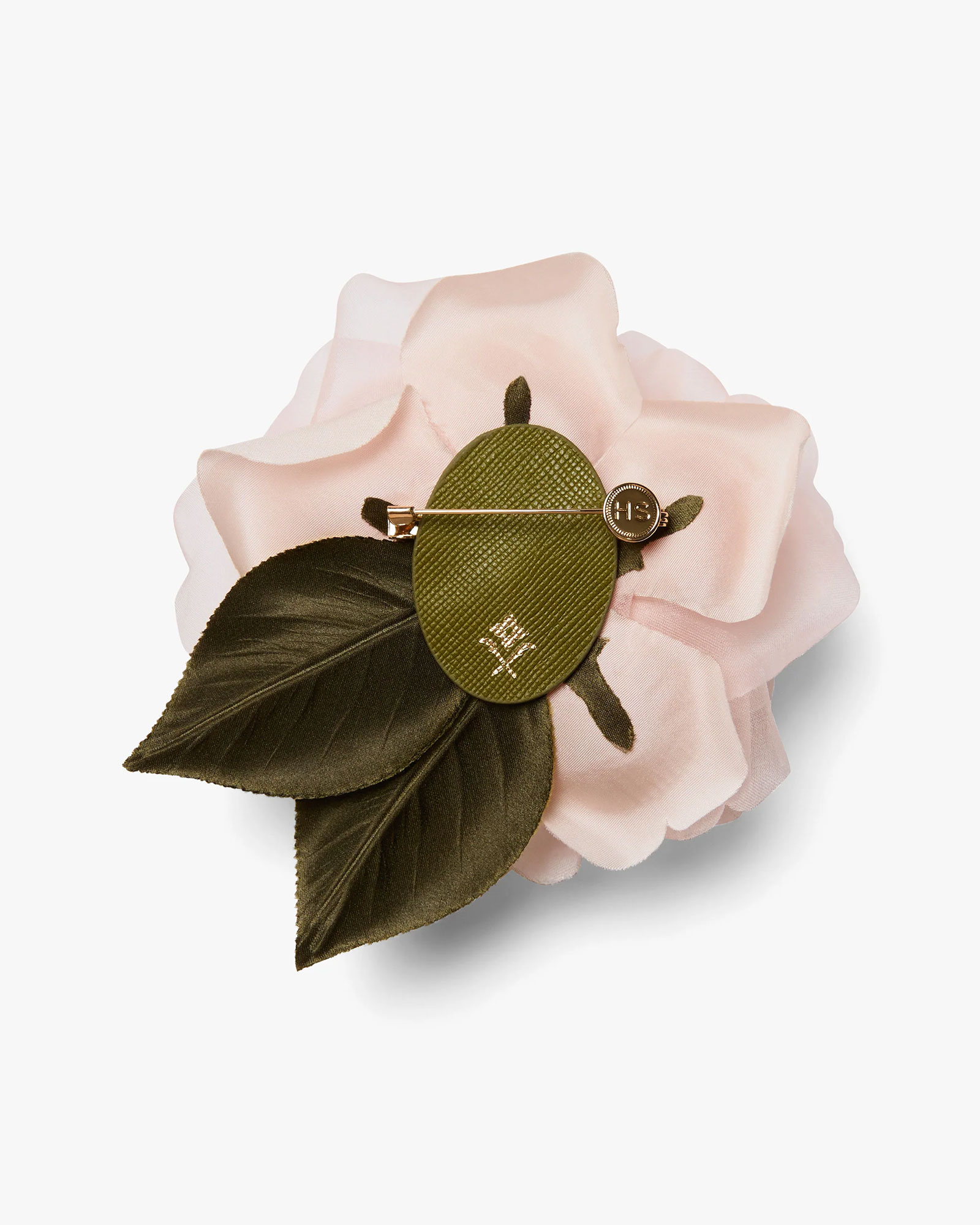
At full scale, the two elements are set inside a double ring with “H” and “S” placed where the stems cross, completing the mark as a proper seal. This version anchors the brand’s most considered touchpoints: a wax-style seal and embossed care cards. The result is a single icon that scales cleanly from a minimal imprint to a finished emblem.
THE PACKAGING
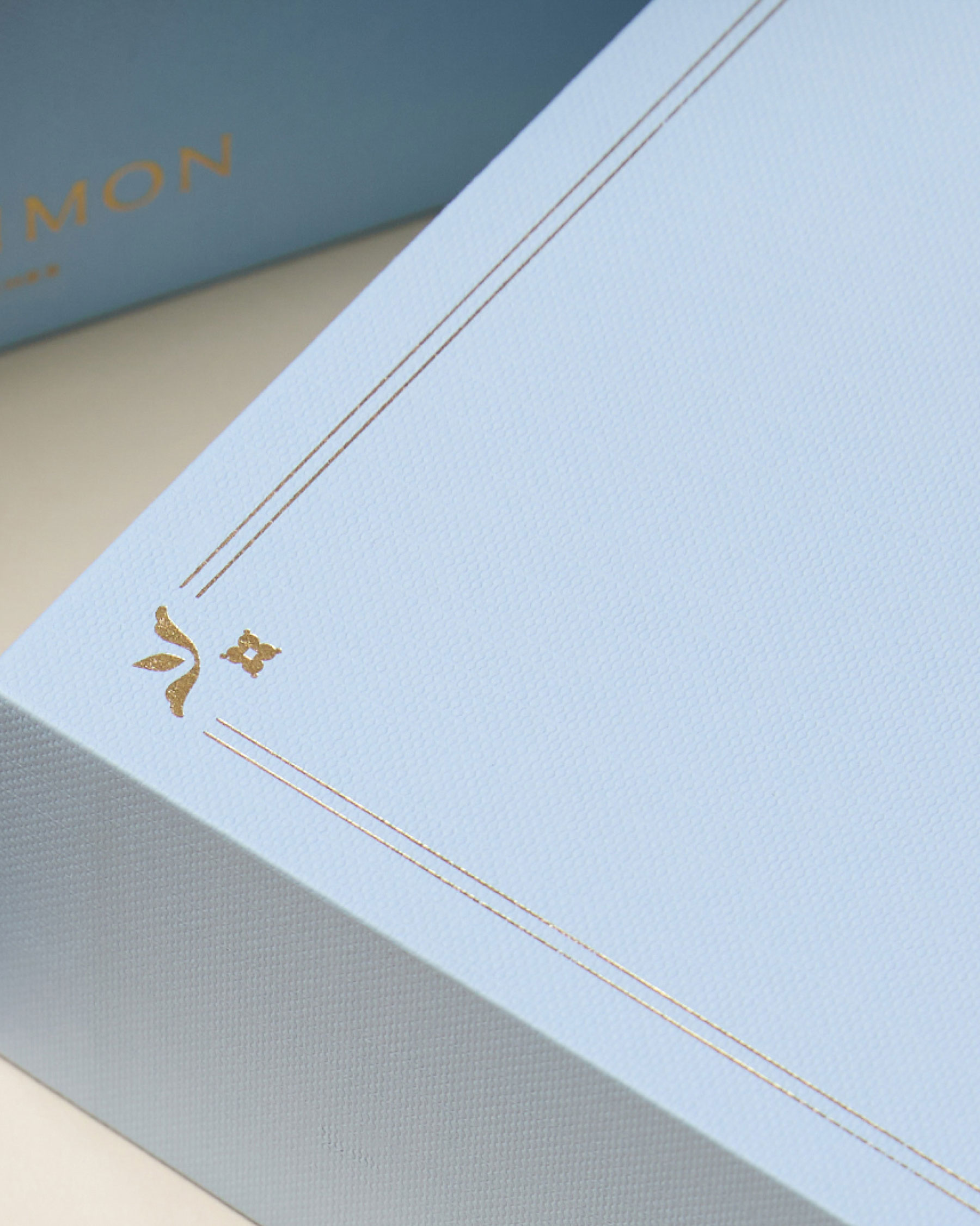
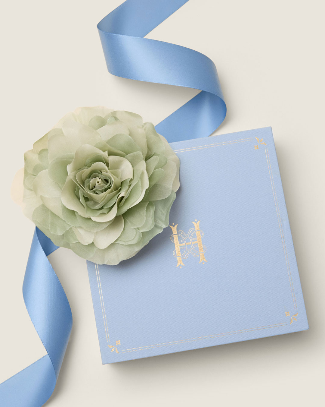
Each brooch arrives in a sky-blue box, the color drawn from the brand’s core palette and finished in a fine texture that lends weight and tactility. A hairline gold border frames the lid, punctuated at each corner by a small floral flourish, while the interlocking H monogram is foil-stamped at the center. The result translates to a keepsake box, something meant to be kept long after the ribbon comes off.
social media
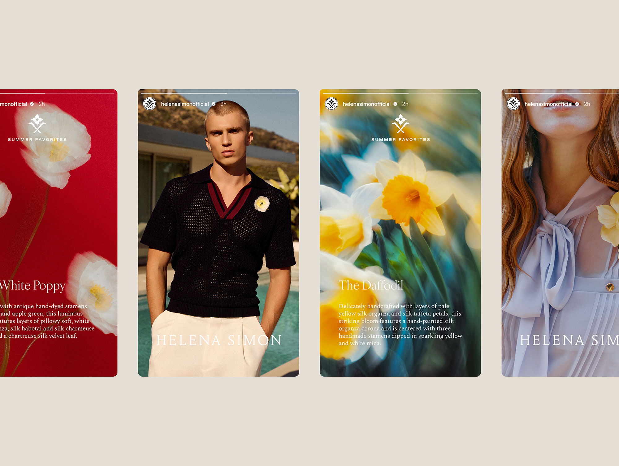
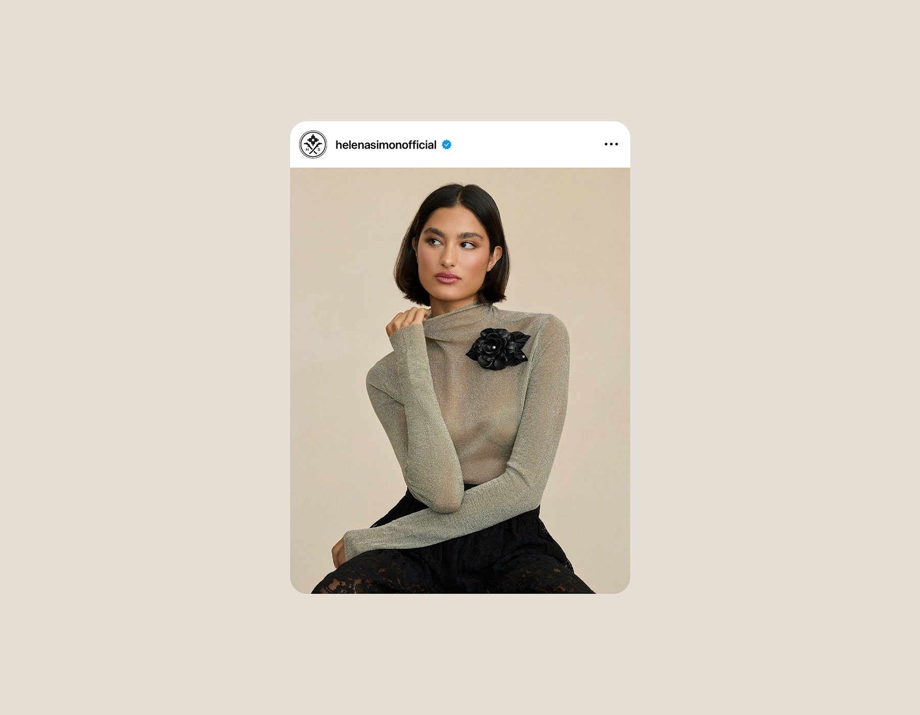
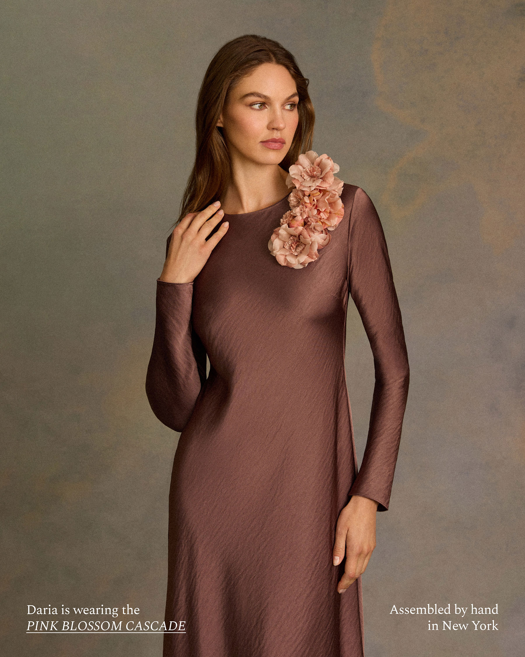
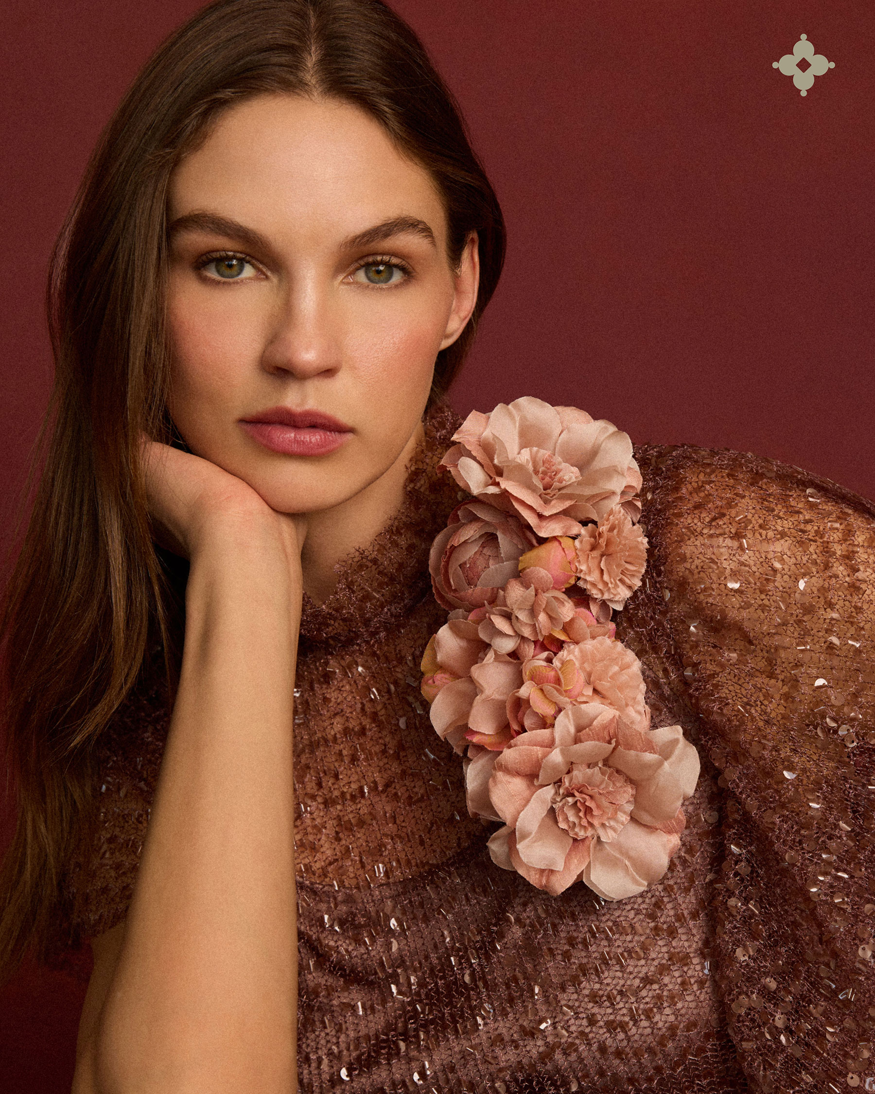
The social presence extends the same editorial sensibility across every post. Instagram Stories double as a mini lookbook, each bloom introduced by name with a details about its meaning, construction and fabrics, so followers learn to shop by story the way they would browse a boutique shelf. The feed moves fluidly between product and person, a brooch pinned to a knit turtleneck reading as naturally as a still life of the flower alone, reinforcing that these are pieces meant to be worn and lived in, not just admired.
THE WEBSITE
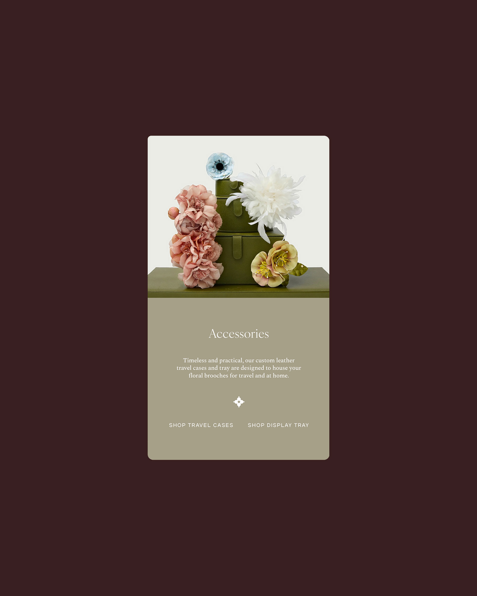
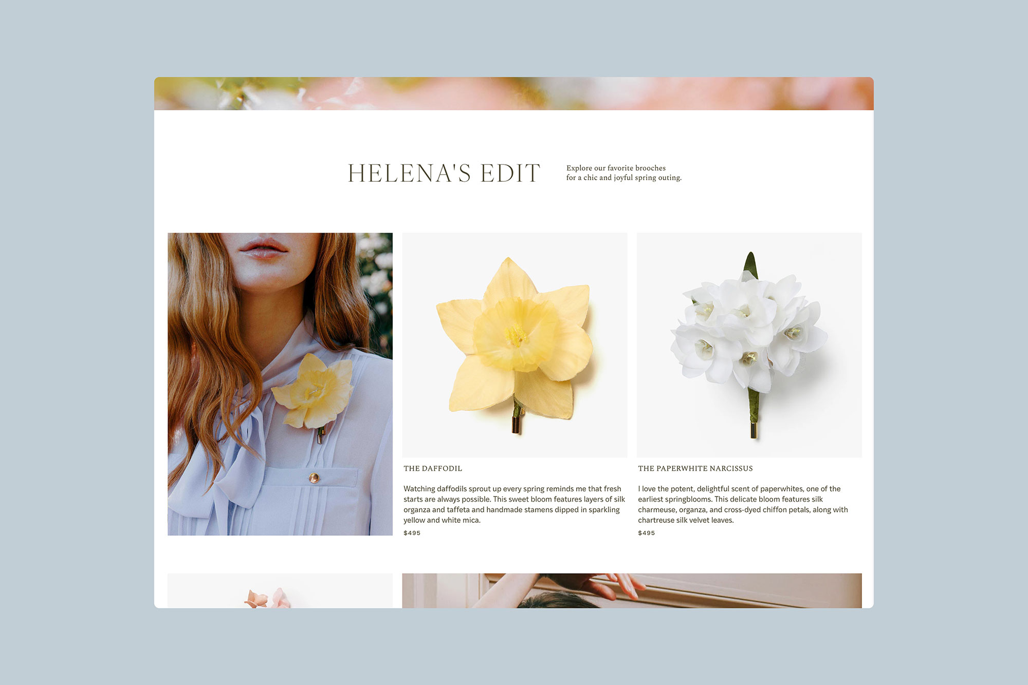
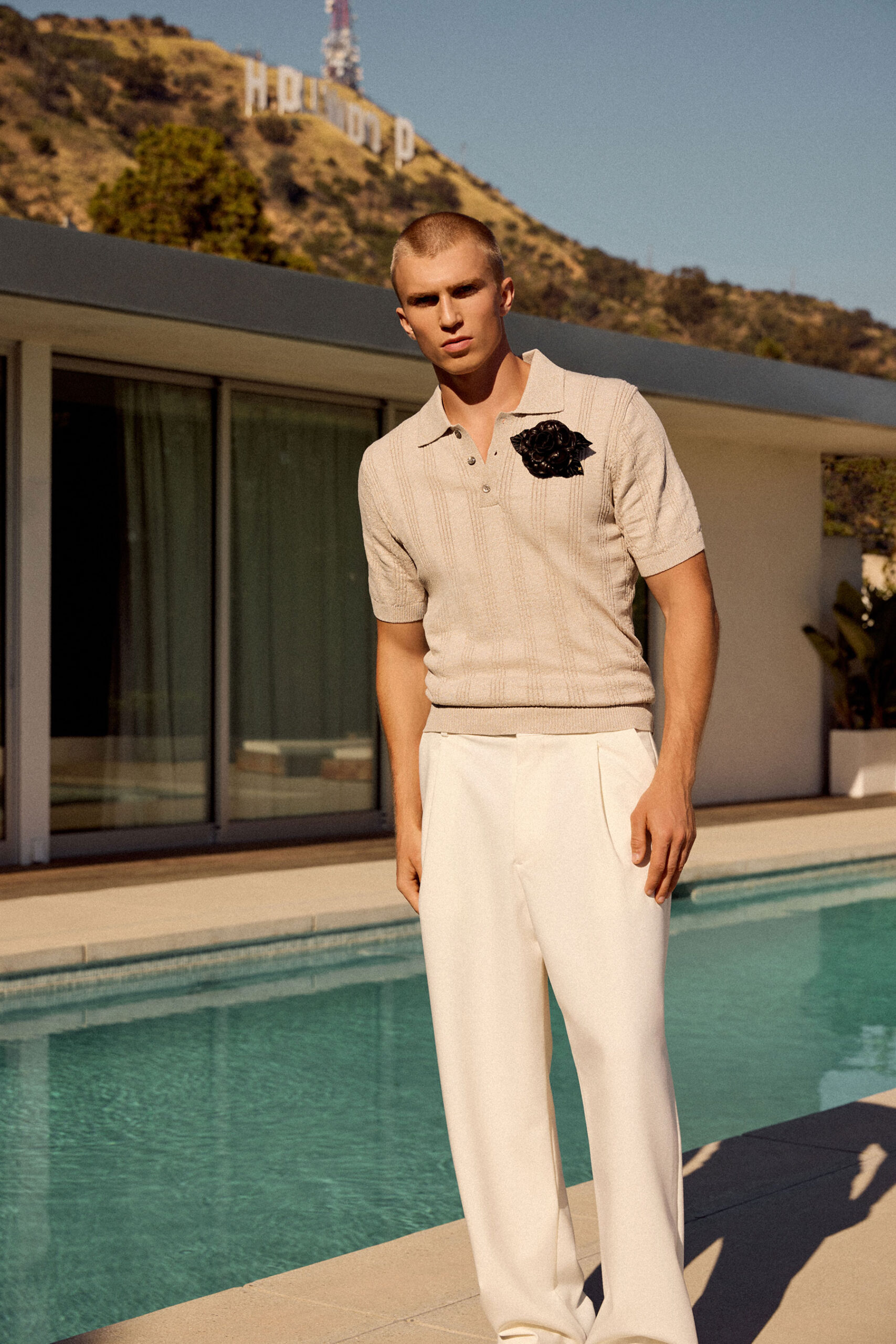
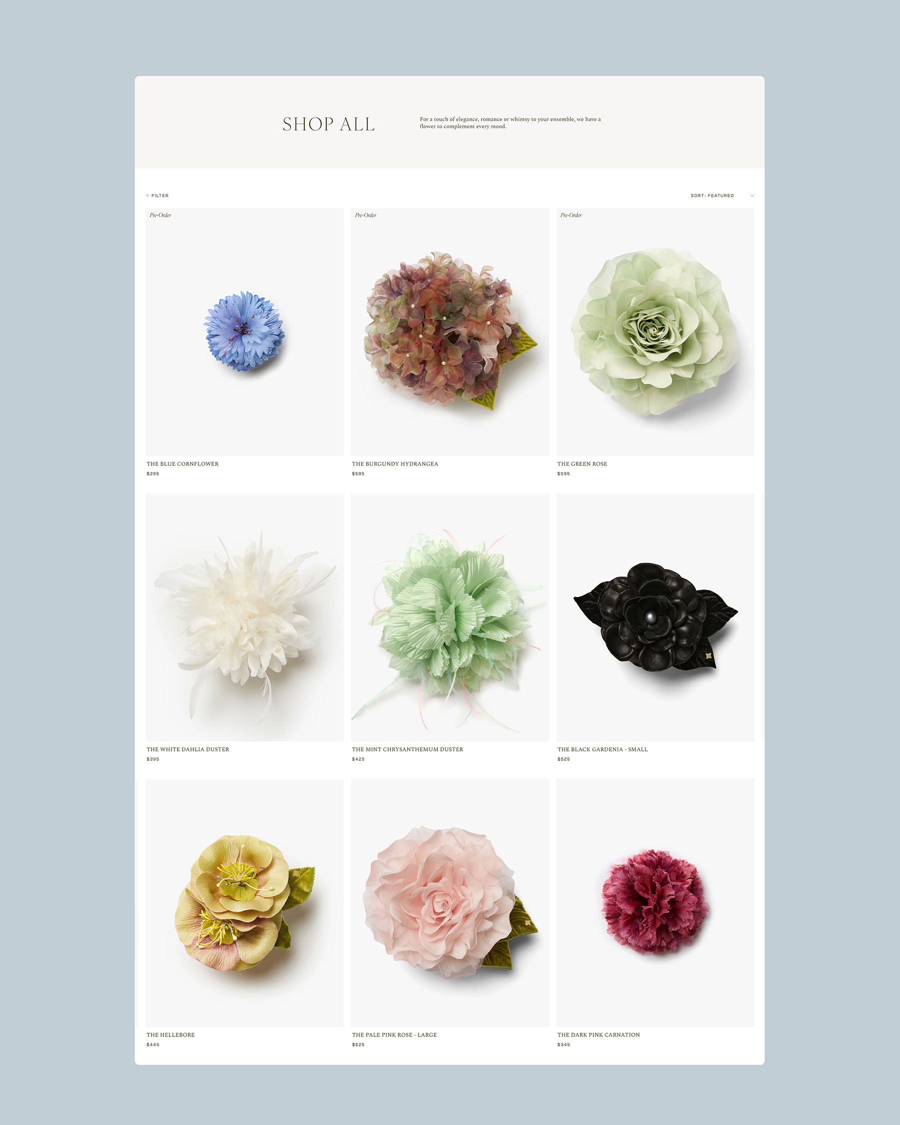
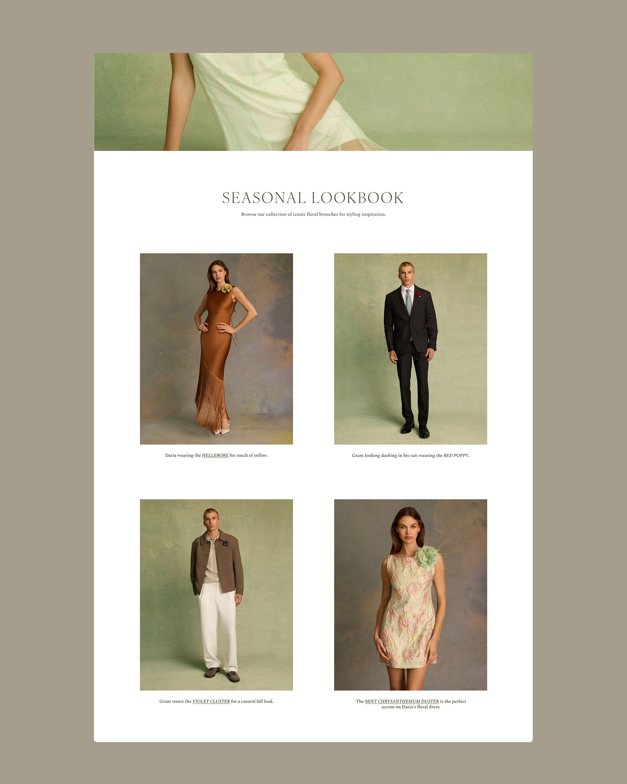
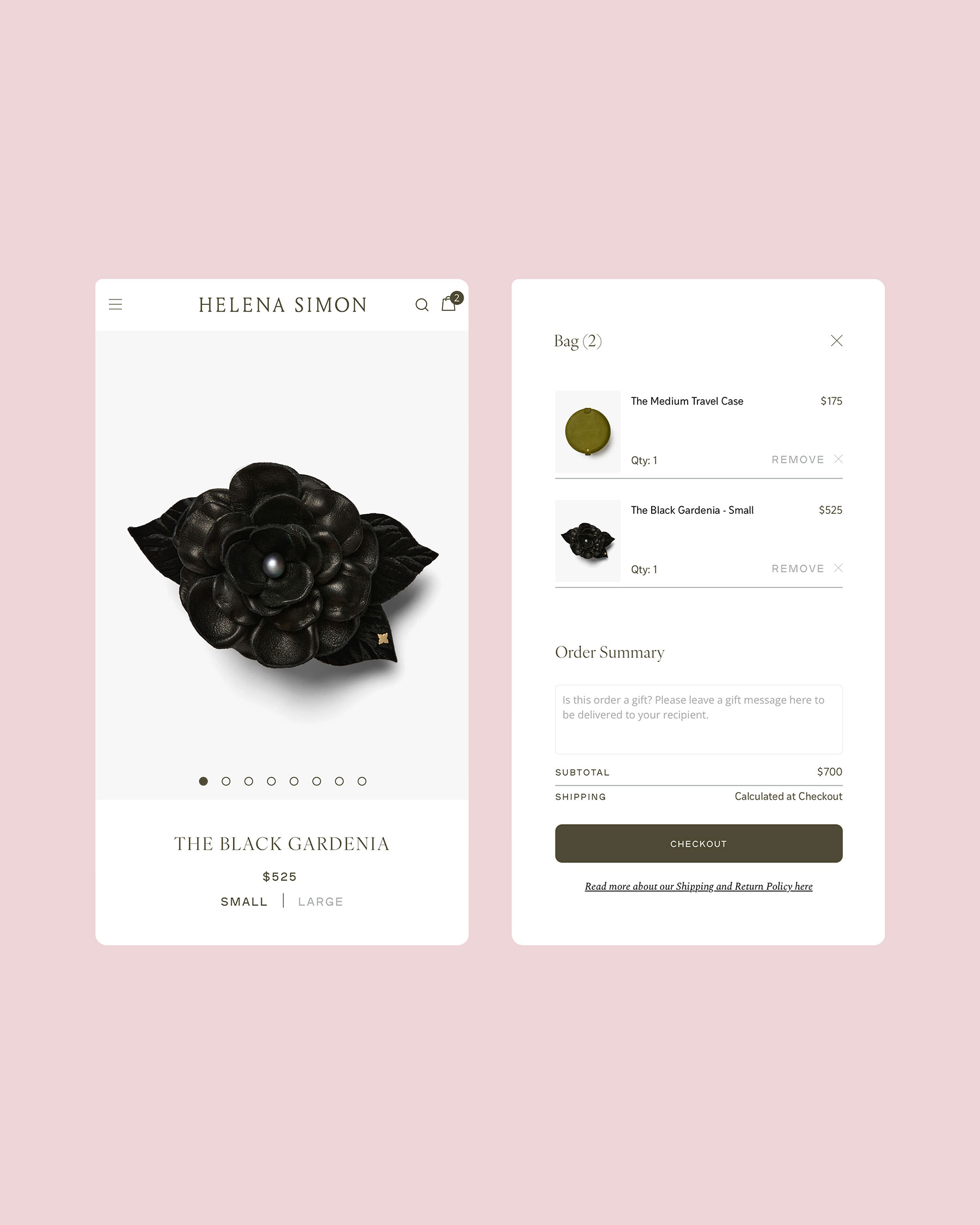
The custom Shopify site presents each brooch photographed against a clean background, with ample detail shots to study its construction. Category pages like the “Shop All” grid and Helena’s seasonal edits organize the collection by mood and occasion rather than by product type alone, giving the browsing experience an editorial feel. Campaign photography breaks up the browsing experience at key moments, with full-bleed portraits of the brooches being worn, reinforcing the emotional register of the brand.
Credits
- client Helena Simon
- Campaign & product photos Courtesy of Helena Simon
- web development Made To Thrive
- brand assets & mockups We Are Branch