

By the beginning of 2025, a rebrand for Branch was on the horizon.
The studio had been in business for eleven years by that point and what worked in 2013 had long ceased to hold up. Design standards had changed and nothing on-hand from the original identity fit quite right.
Some of the initial questions I worked through at the beginning of the rebranding journey included:
• What do I want to say that hasn’t been coming through?
• How does this align with the new era of business I’m stepping into?
• What should stay in the mix to create a through-line to what’s next?
• What’s been carried long past its expiration date?
These questions took weeks to sit with. Eleven years is a long time to run the same business, especially one that is so closely tied to your identity. The strategy phase is where all of that gets excavated.
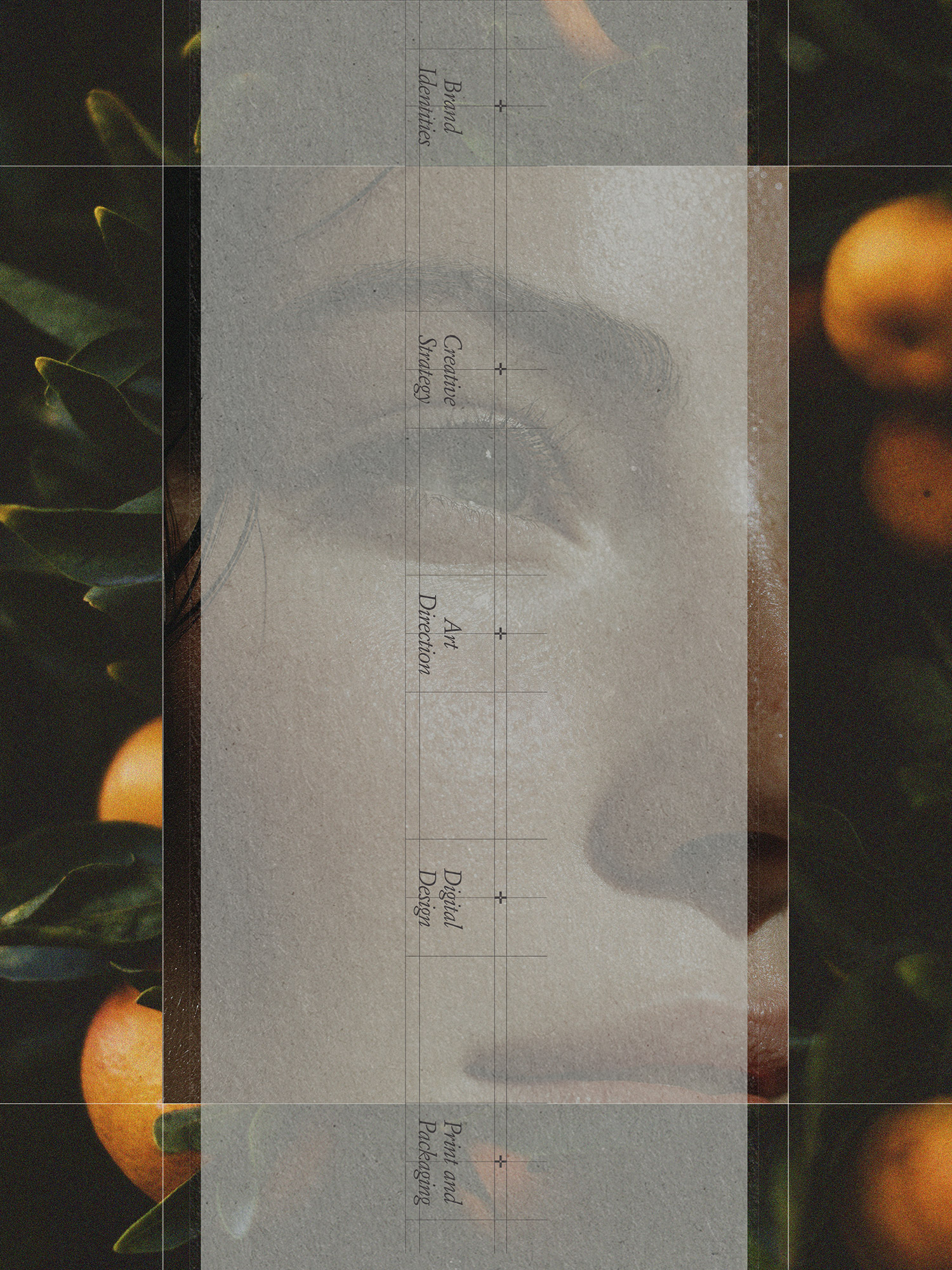
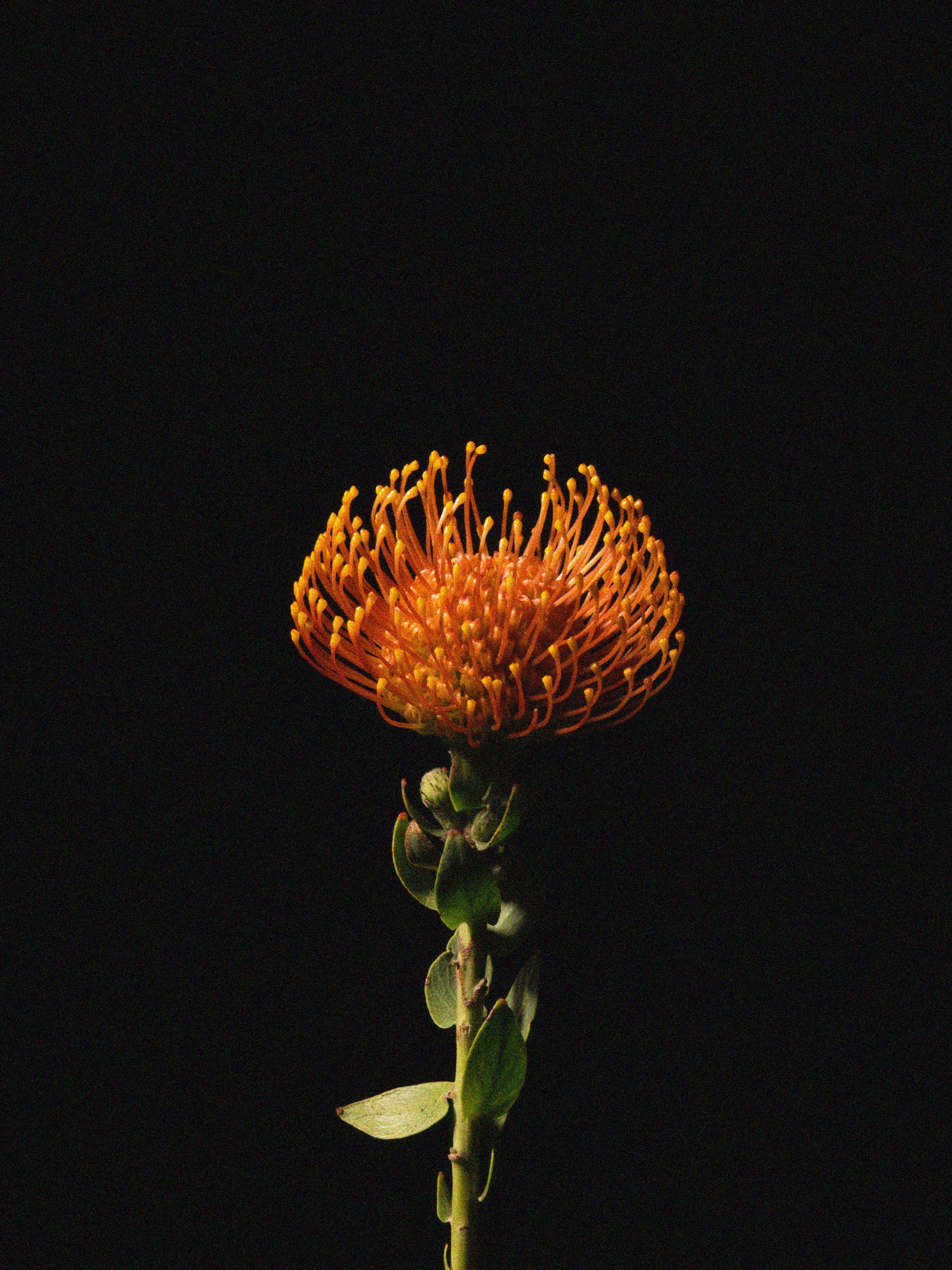
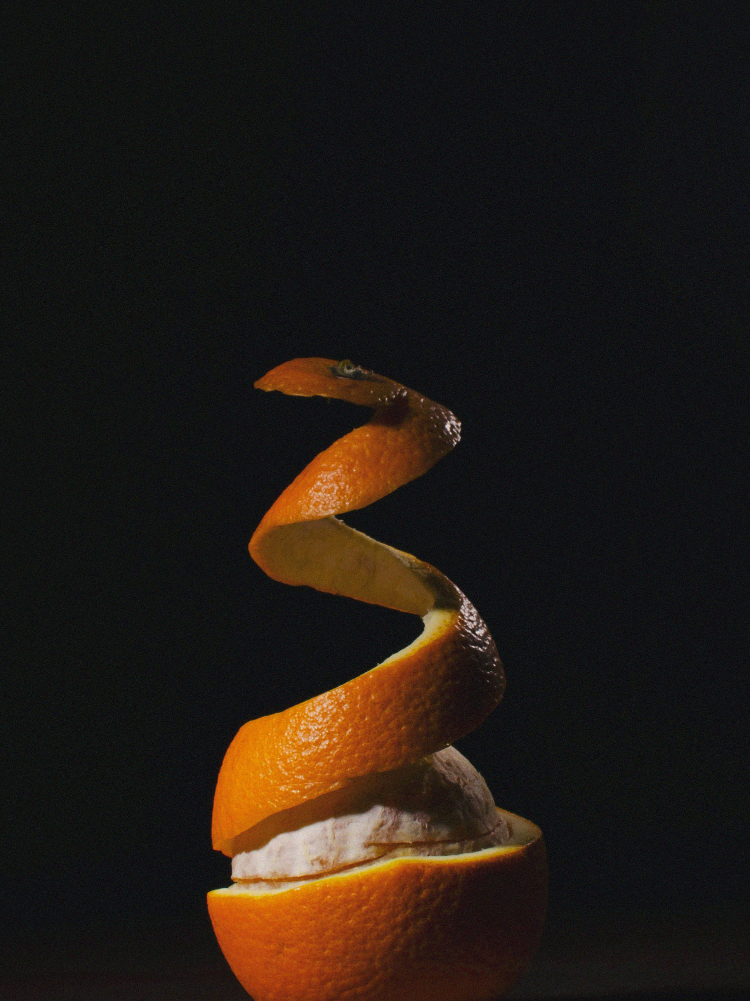
In the strategy phase, I sat in the discomfort of what I was ready to let go of but what surfaced was more subtle than I thought. With a rebrand, it’s often a bunch of smaller tweaks that add up to a more aligned outcome. This process wasn’t about a dramatic transformation; the goal was to dial in the overall look and feel to be more discerning, more precise and more established.
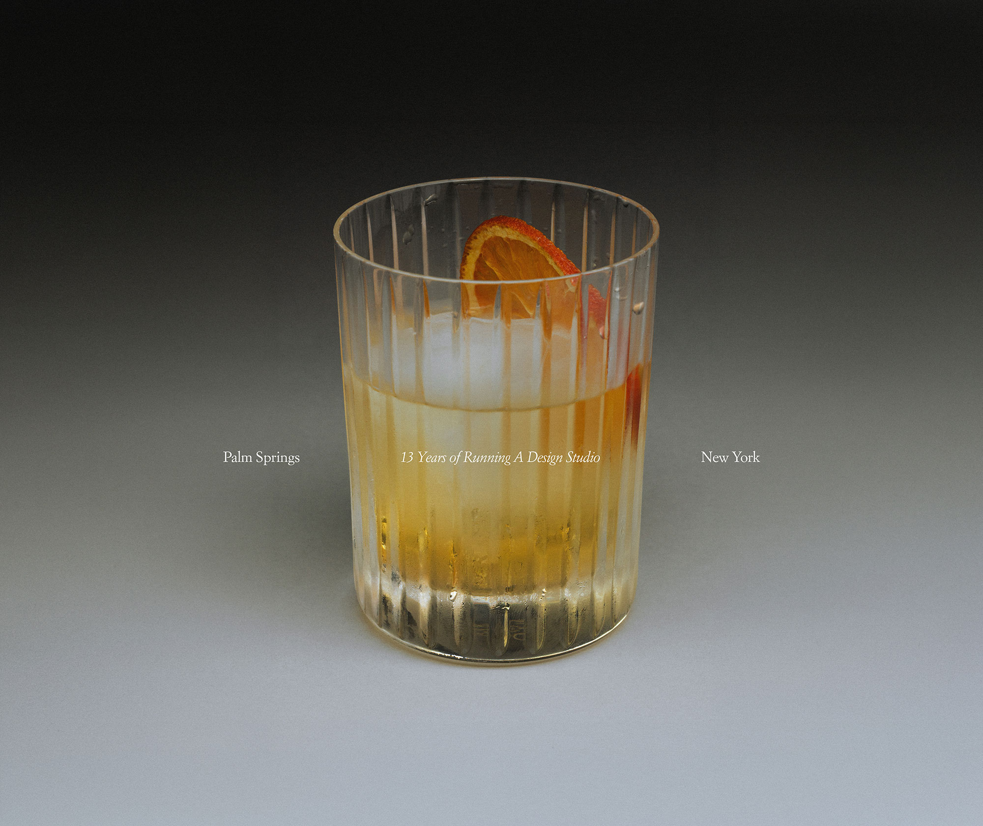
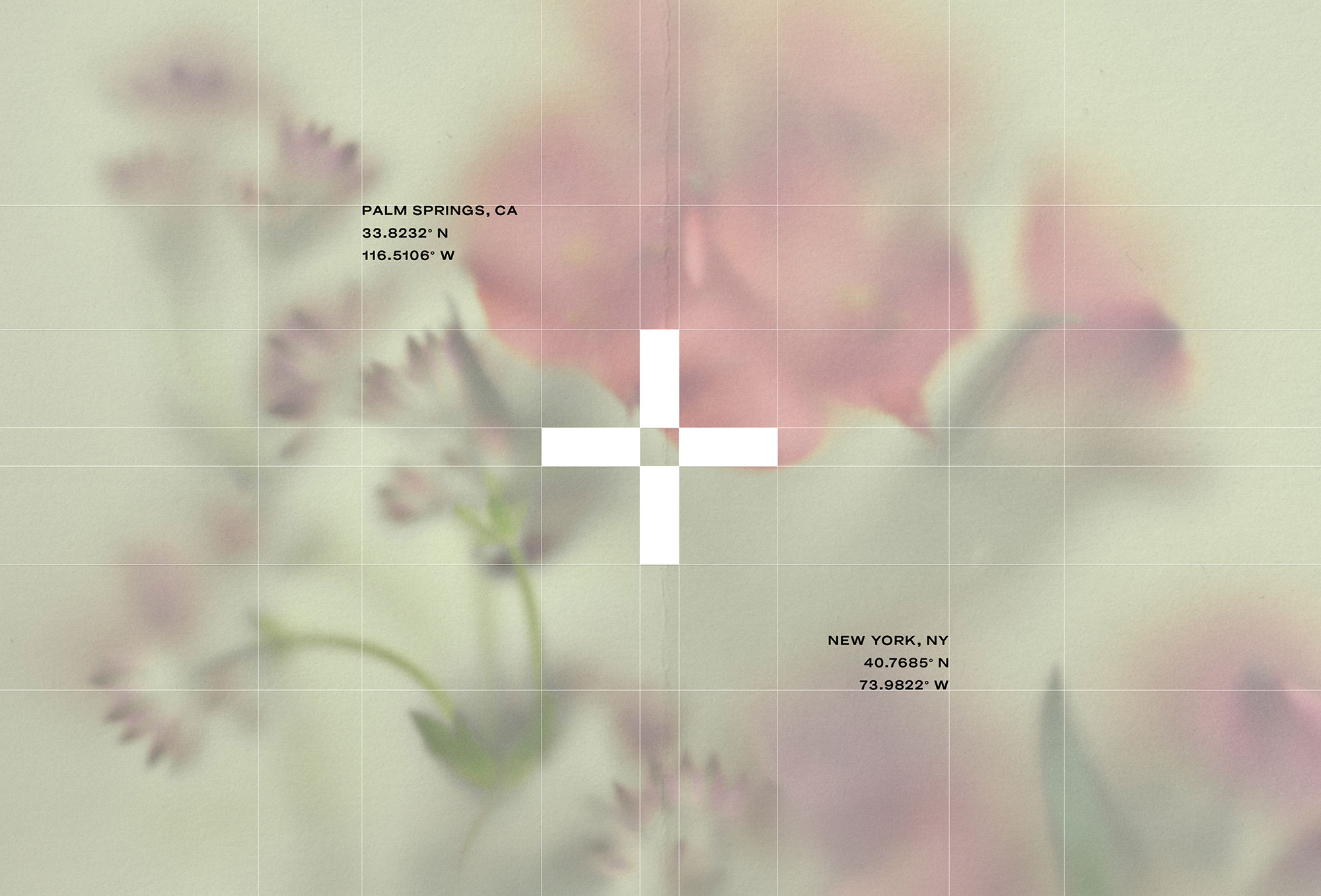
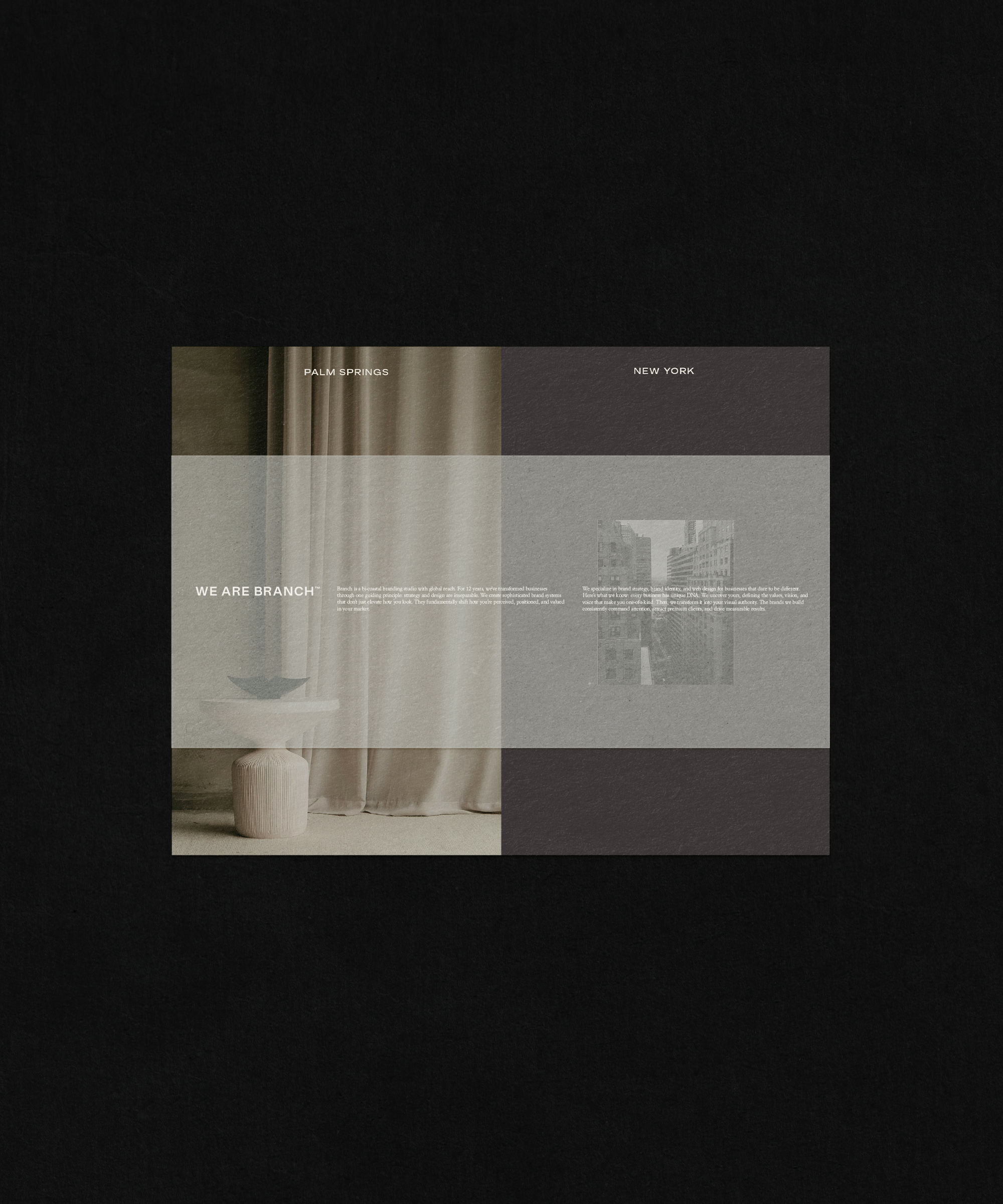
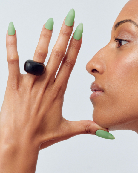
Once the verbal piece of our strategy was nailed down and we were clear on what we wanted to communicate, it was time for the visuals. I pulled together inspiration that had been drawing me in for the last few years from the modernist, clean type of Palm Springs to the editorial sharpness of New York. This exercise in contrast was important in capturing our very specific brand DNA.
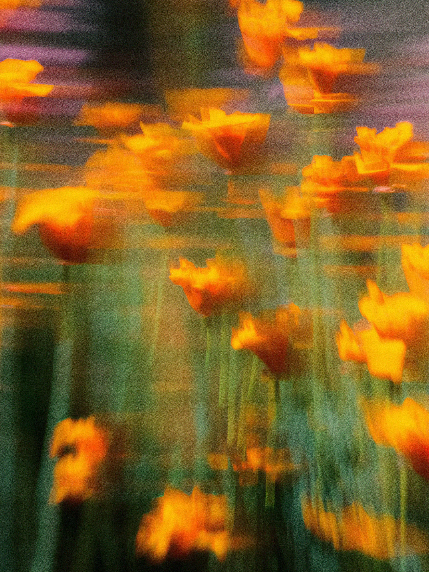
Next came color. Color is always where the strategy takes its first physical form and it holds a lot of weight in a brand. In a world flooded with noncommittal beige tones, color can do a lot of the heavy lifting to help a brand stand out.
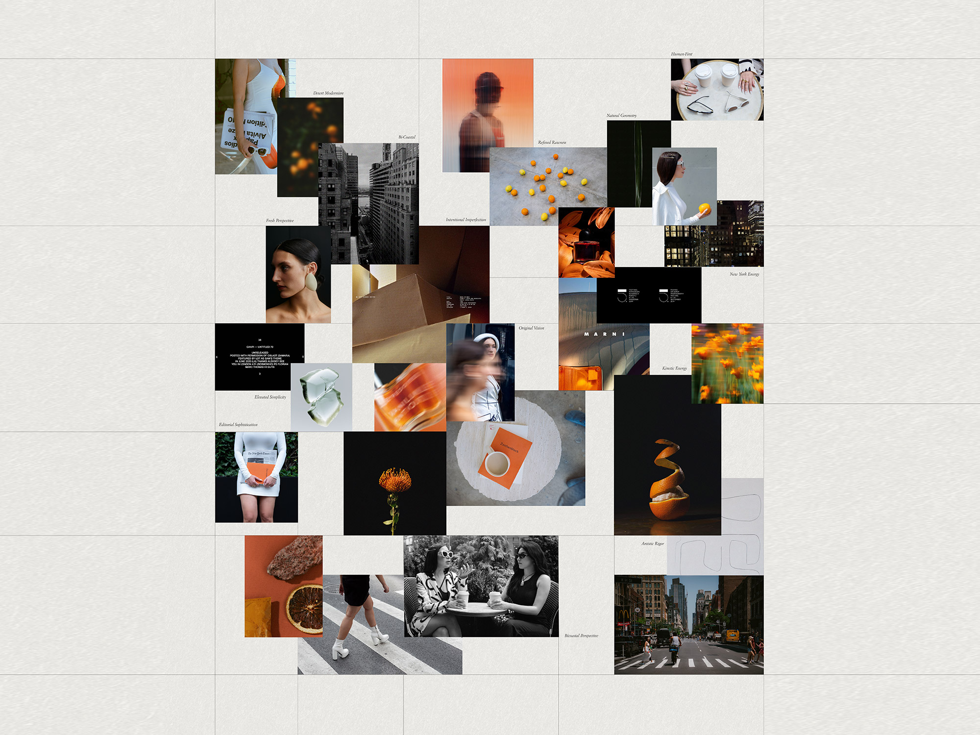
Diving in, I knew one thing for sure: the orange was staying! That Palm Springs-inspired citrusy hit of warmth and energy has been part of The Branch identity since the beginning, and some things are worth keeping as they are. But, everything around it needed a subtle evolution.
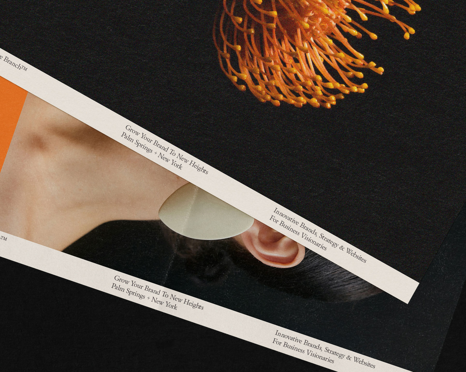
After testing dozens of swatches, the palette landed on contrasts: a near-black that reads as dark but holds warmth in its undertones. Warm white that creates a blank canvas for expression. Orange as the element of surprise, keeping things from feeling too sterile or safe.
When the foundational pieces started to come together, I understood something I’d been trying to articulate for over a decade: good strategy produces a truer version of what was always there. It was just lurking beneath the surface, ready to make its debut. —Shauna