Founded by Thea Kennedy, Design Quixotic is a celebration of design and beautiful miscellany. Whether crafting a blog post, social campaign for a client or doing creative direction for some of the biggest brands out there, Thea always has a pulse on the next big thing.
And, if you’re a design aficionado who loves Pinterest, chances are that you’ve repinned her images. As one of the top design pinners, she’s amassed an impressive 1.9 million followers.
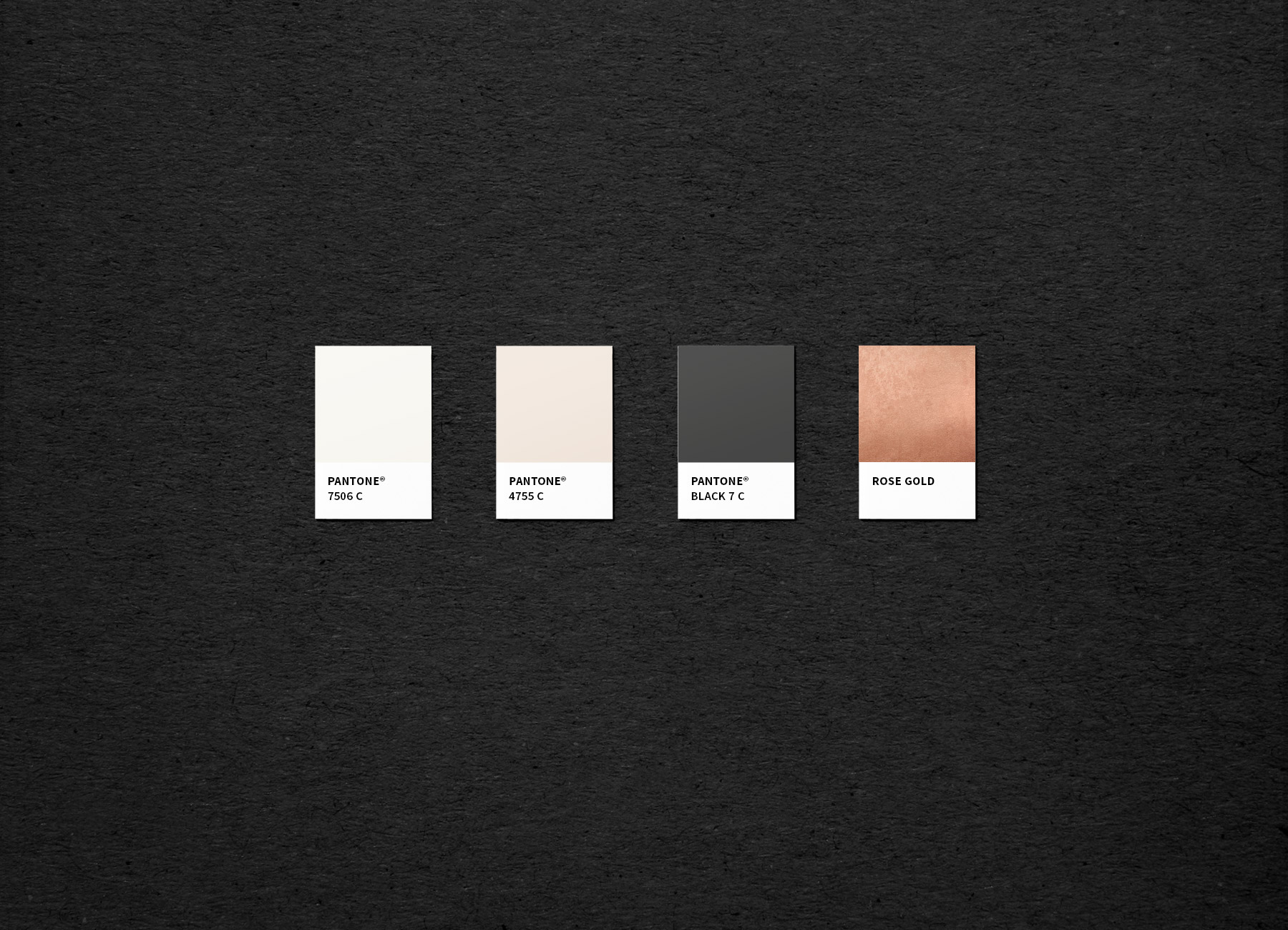
As a tastemaker, Thea is acutely aware of the newest trends which made our design process interesting as we worked to distill the core focuses. There’s a fine line between being visually interesting and over-the-top so we mixed tropical patterns, marbling and metallics in small doses. To keep the balance, we focused on a crisp, mostly monochromatic palette.
Because Thea has such a strong visual focus, she knew exactly what she liked: polished wth a dash of maximalism. In our initial questionnaire, we asked her what her goal of the redesign was and her response led the way:
“For people to view my brand differently. I want Design Quixotic to be perceived as polished with a dash of maximalism — I’m confident in what I offer and not afraid to stand out in a world saturated with influencers and designers.”
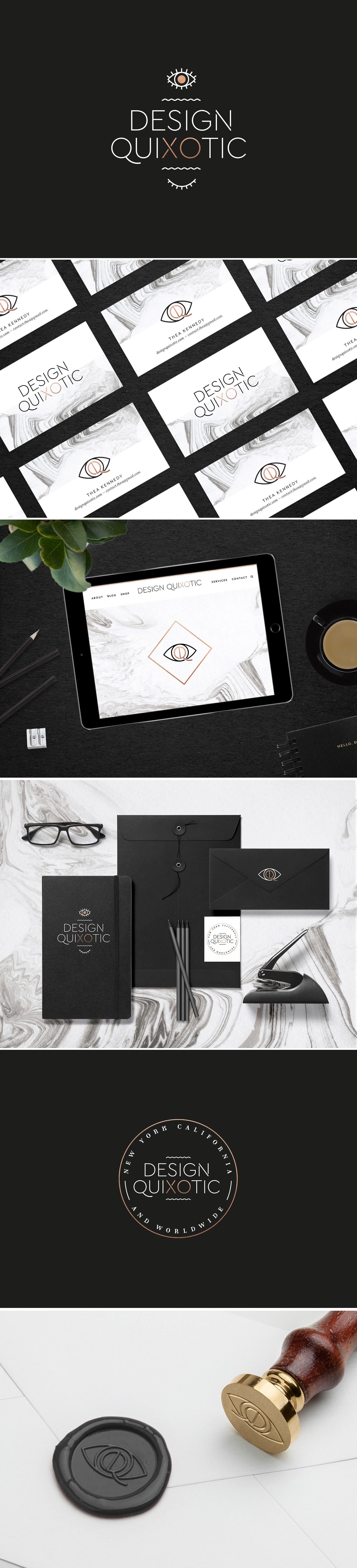
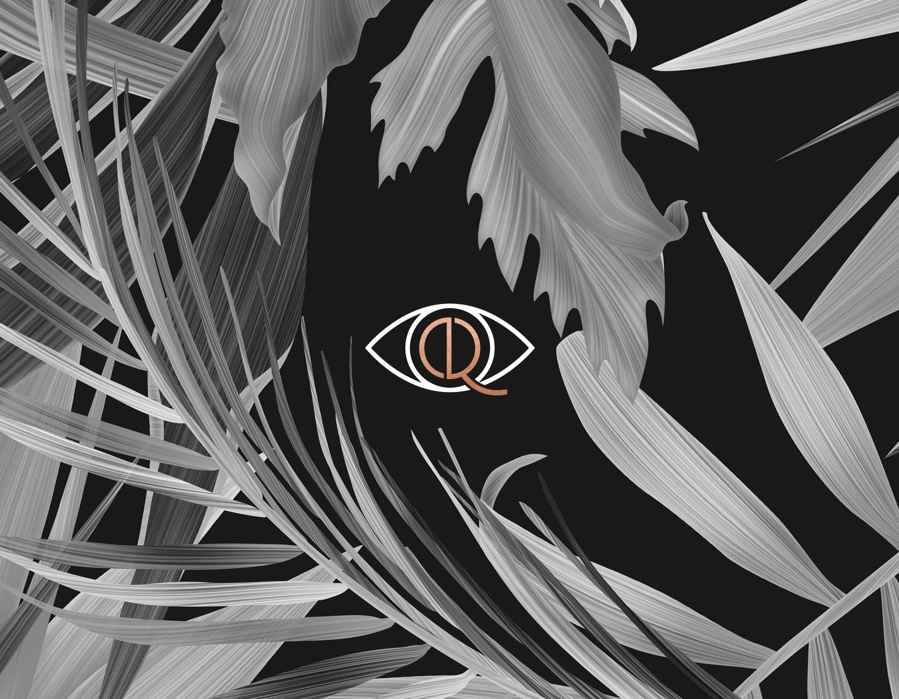
As we moved into the branding phase, an eye for the icon felt like the right choice. Thea has an eye for style, trends and ideas that translate into everything she does, often giving her readers an inside view of what she’s discovered on her blog.
The eye wasn’t enough on its own, though. We worked to combine her brand initials, a “D” and “Q” into the center of the eye for a more customized touch.
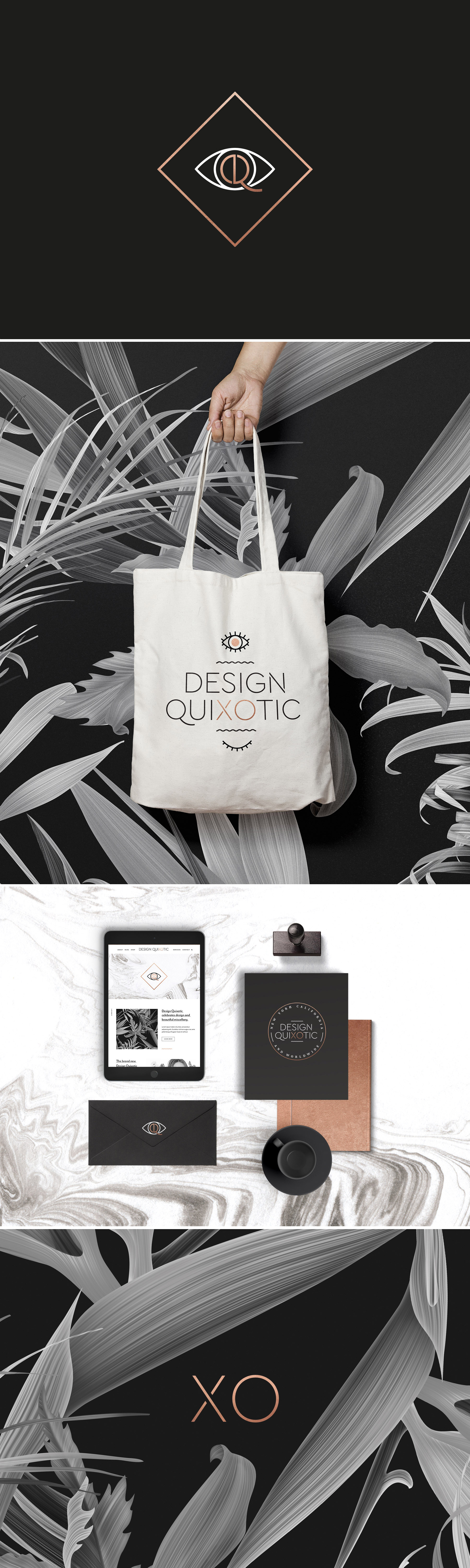
From there, we settled on a simple, sans serif wordmark with memphis-style design details. As we were finalizing the brand, Thea mentioned one more element that added a personalized touch: “XO” is naturally present in Design Quixotic and we called it out in rose gold. It’s a simple, elegant sign-off.
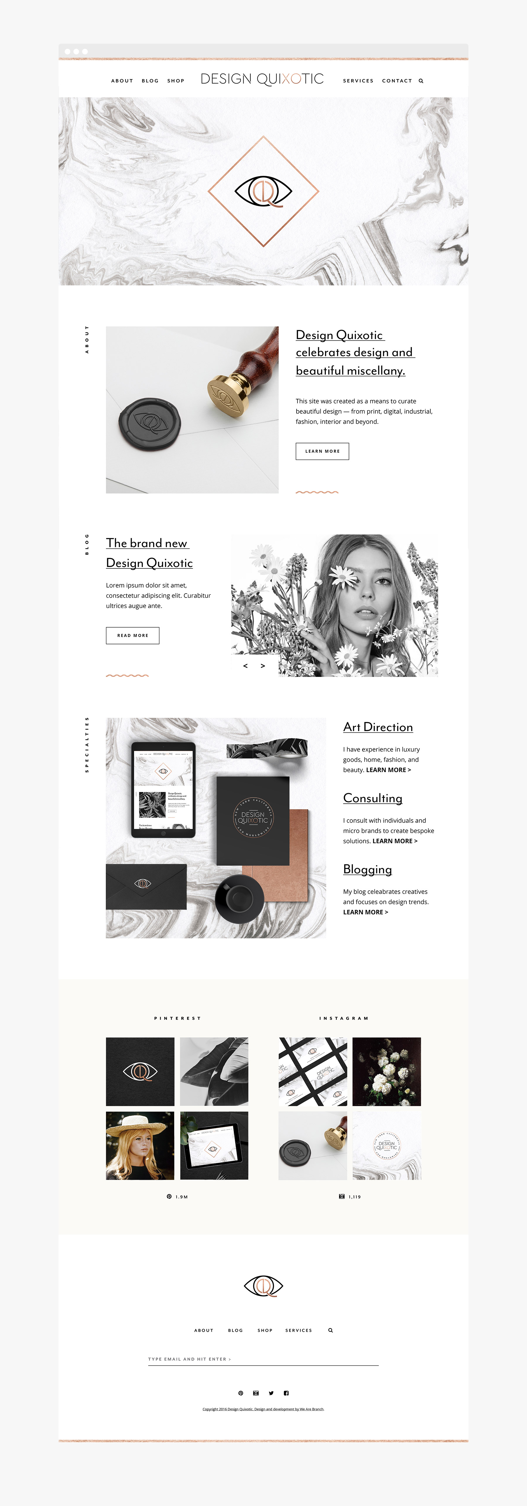
Once the branding was completed, we tackled the website. With so many visual elements queuing for center stage, we focused on simplicity. It is packed with plenty of white space, modern sans serif type and subtle color blocking.
Thea’s previous site was a stand-alone blog (you can see it here) and our goal was to re-focus her brand as being all-encompassing with a more service-focused format.
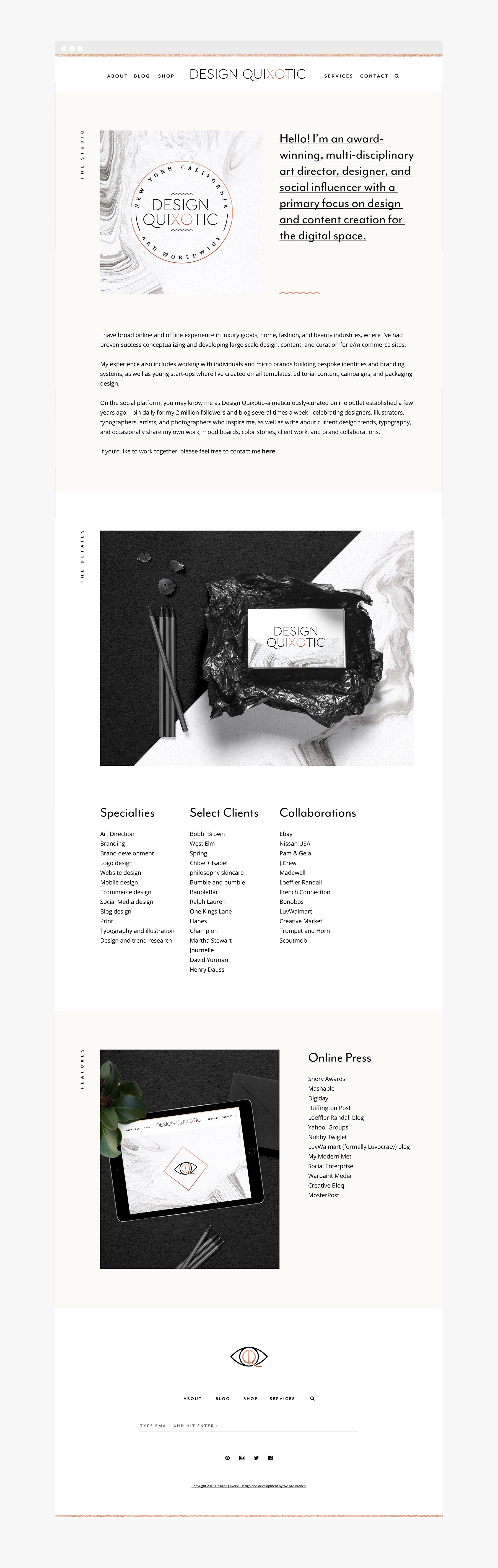
The true jewel of the site is Thea’s personal story which is a great reminder that the path to becoming a creative is rarely as effortless as it seems.
Thanks to Thea, someone I’ve long admired both personally and professionally for trusting us with the Design Quixotic brand and site refresh. If you’d like to read Thea’s inside look at the process, check it out here and here. -Shauna
Learn more about our design services by contacting us here.
Services offered:
Branding
Print Collateral
Website Design
