As a commercial architecture photographer, Lindsay Sisting has a knack for creating bold images for bold designs. Based in Western New York with a career spanning over 15 years, she’d successfully established herself as a leader in her local market but was ready for an updated look.
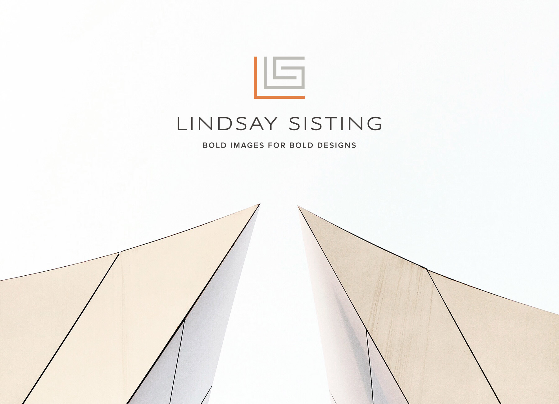
When designing her brand identity, we looked for inspiration in the clean lines of the architecture she photographs, developing a brand icon made with perfect right angles that come together to form her initials.

To offset the more complex line work of the icon, her wordmark is modern and airy. With a crisp color palette reminiscent of the modern interiors and exteriors she shoots, we added one surprise with a papaya hue that adds a pop when needed.

You can see more of Lindsay’s work on her site and follow her on social media here and here.
Congrats to Lindsay on her fresh new look! -Shauna
Services offered:
Branding
Supporting cast:
Samantha Sacomano, design


