Like a lot of fellow designers, I love a good neutral. Neutral colors are great for anchoring a color palette and can add a sense of warmth and versatility. At the same time, for the most part I don’t think they are the answer to a compelling outcome on their own.
The best color palettes often have plenty of contrast — the bolder, ‘pop’ colors add vibrance, depth and a sense of energy while the softer accents (often neutrals) serve as anchors.
Right now, heavily neutral palettes are having a moment on Pinterest and Instagram but this is a reminder that trends come and go. When it seems that everyone is veering towards one thing, don’t be afraid to bypass the ‘sea of beige’ and go for the bold. Embrace some color, whether it’s soft and muted or juicy and vibrant.
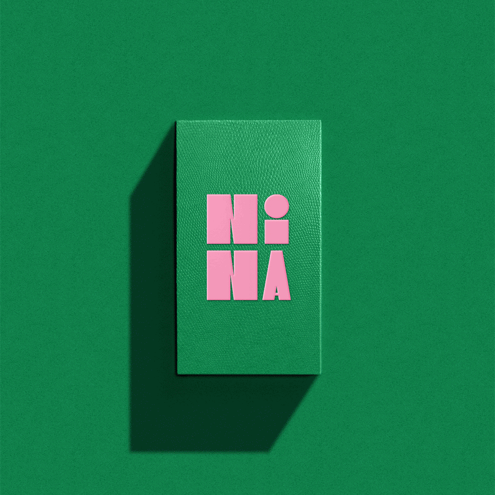
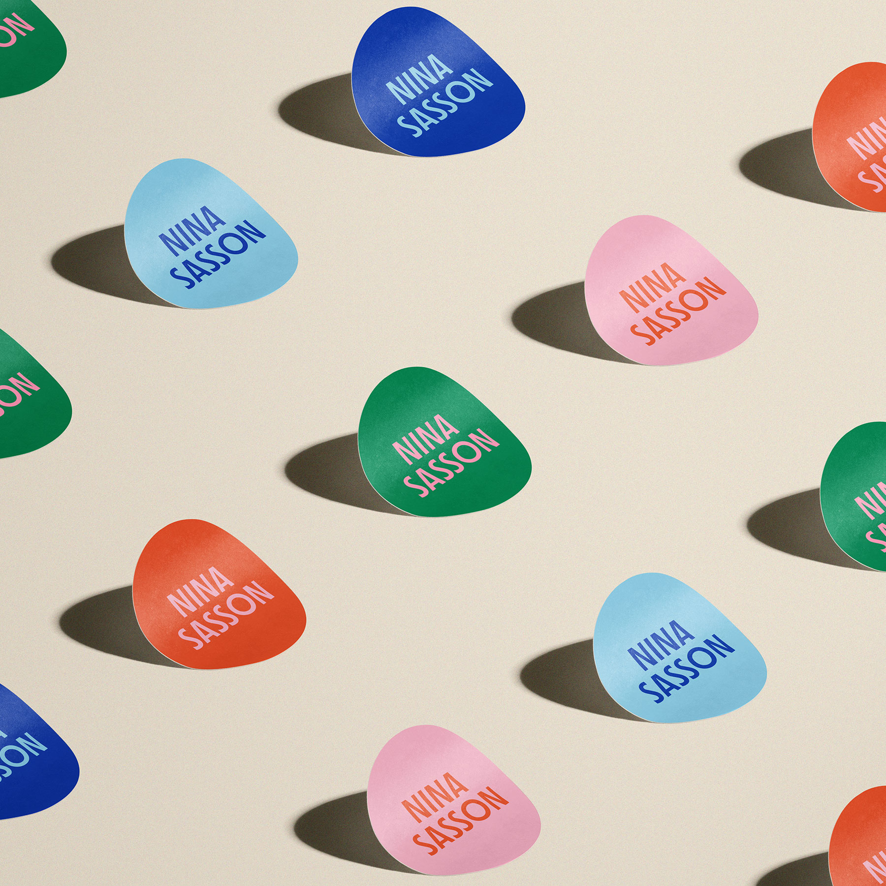
Some of the clients we’ve partnered with lately have been super open to color and it’s brought a sense of optimism and differentiation to their branding. Nina Sasson, a career coach, is a perfect example.

Color can inject instant energy and style into your brand, helping you immediately stand out from your competition. And if you’re in need of some inspiration for your brand palette, check out this Pinterest board for ideas — I’m constantly adding to it!


