Shauna here — this project launch today is a really special, personal one. Gala Darling has been one of my closest, best friends for over a decade and last summer, we finally had the chance to start working together.
Let’s back up a bit, though. Gala and I first met around 2002 on Live Journal, an early blogging platform. By the time we finally met in person in 2008 in New York, I felt like I already knew her, thanks in part to those early days of oversharing on the internet. Over all those years together, we celebrated birthdays in Central Park, were very brief roommates during one Summer in the East Village, visited Iceland, London, Paris, Vegas and Greece (and many more cities that are slipping my mind at the moment) and launched a blogging workshop with our friend Kat. There’s never been a dull moment!
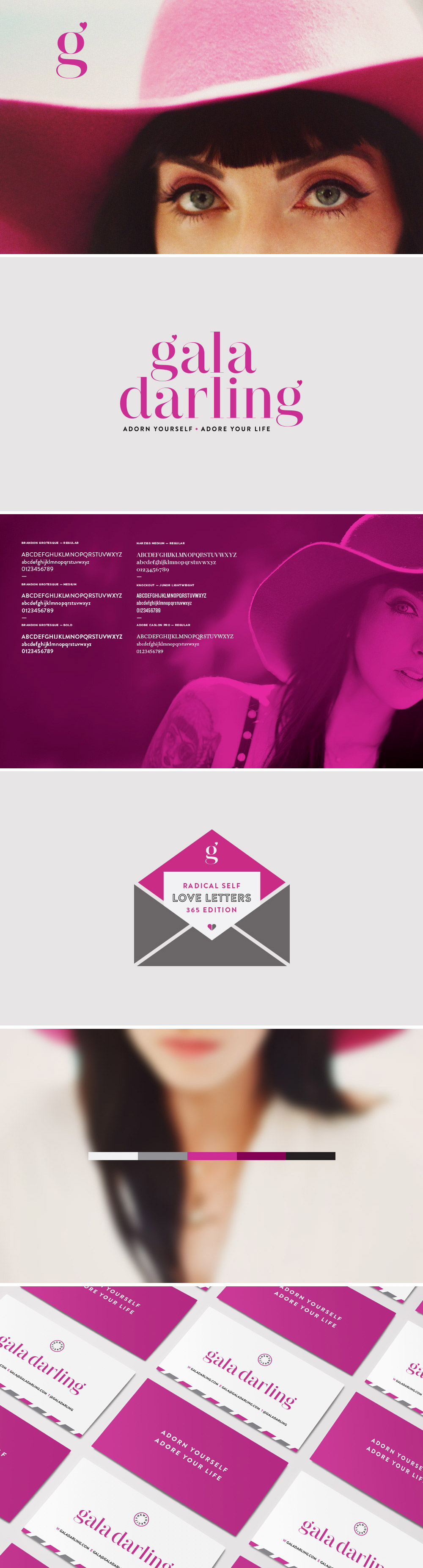
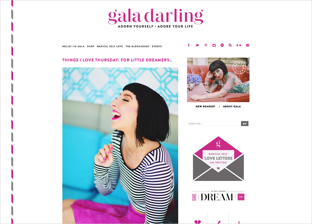
Gala is one of the best known fashion and lifestyle bloggers on the internet but she didn’t have a style guide. She’d started blogging full-time in 2006 before it became a big business and visual consistency just didn’t hold the same importance that it does now. She cobbled things together as she went and it had worked out just fine but as her 30th birthday neared, she felt ready to step things up.
Gala’s project was Branch’s biggest undertaking to date because it involved four separate phases:
1. Branding
2. Website
3. Print Collateral
4. Product Graphics
The first piece of the puzzle was to get Gala’s branding consistent. She’d been using Didot, a type family popular with fashion magazines for years but there was nothing particularly customized about it. We presented five completely different directions and to our surprise, Gala ended up picking the incarnation that was closest to her old branding — but with a little more flair.
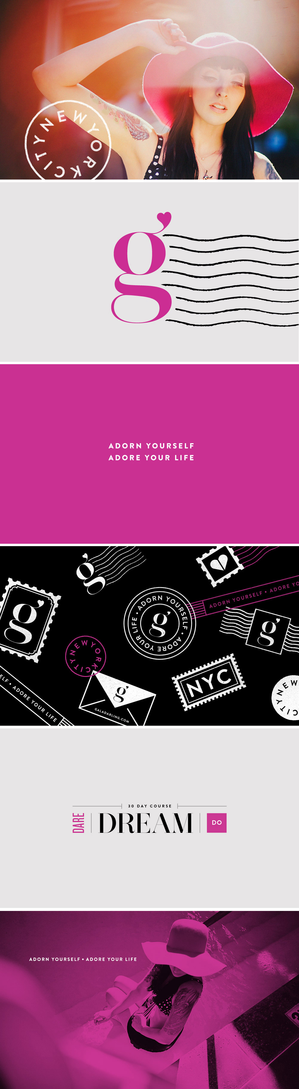
Gala is obsessed with stationery, handwritten notes and washi tape — the art of the letter is something she excels at. To this day, she still sends her friends postcards on a whim! Knowing her well, a postal theme tied in perfectly with her branding direction.
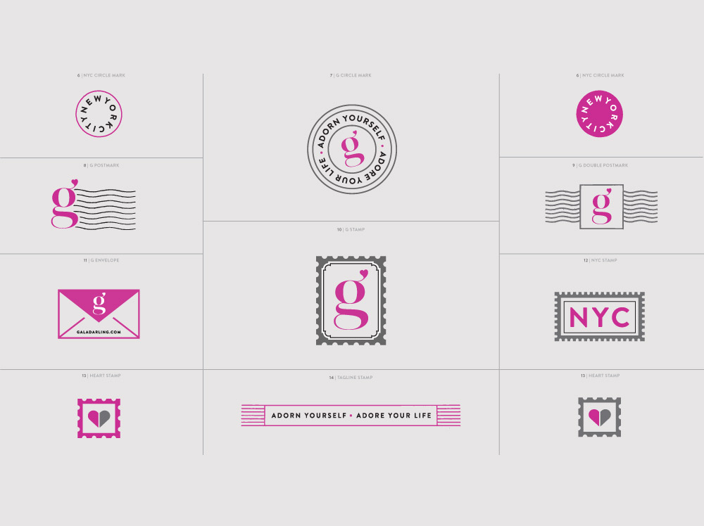
We created an assortment of marks that she could customize and use for product launches, newsletters, stamps and stickers — and in the months since, she’s already used almost all of them!
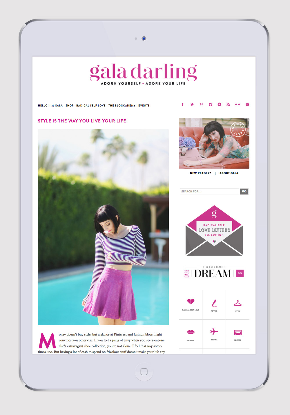
With Gala’s branding completed, we moved onto her website. The dirty little secret is that Gala had been using a platform called Text Pattern since 2006. WordPress hadn’t yet gained steam and at that time, there were a ton of others to choose from. We redesigned her site from scratch, adding a customized airmail border down just the left side for a little modern flair, icons for each category and a footer featuring her most popular posts.
Then Gala’s husband Mike, an amazingly skilled developer took over and brought her site to life, customizing the sidebars for each page and meticulously transferring over her thousands of posts. His development was so pixel perfect that when he sent us a progress link, we had to double check that it wasn’t just a screenshot he’d uploaded!
Once the website was in the development stages, we moved onto the third phase which was print collateral. Being a devotee to the handwritten note, Gala had us design business cards, postcards and thank you cards which were all done through the Moo Luxe line.
The final piece was designing graphics for each of Gala’s digital products. Gala has about a half dozen offerings in her online shop and each needed a graphic style that still tied into the overall brand guide.
And, here we are today — a solid year in the making, Gala’s updated branding, website and online store are finally all live. I am so proud of Gala for making this commitment. It wasn’t easy but the outcome was totally worth it.
P.S. You can read Gala’s recap here!
