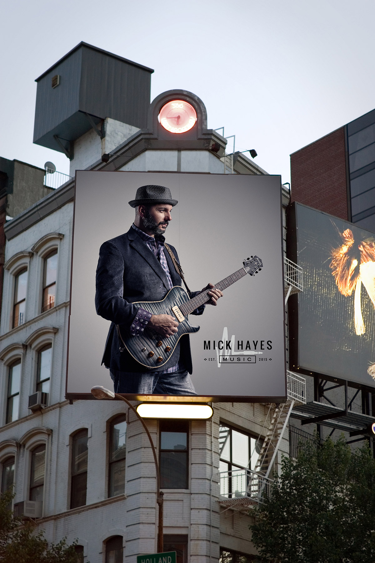
When musician Mick Hayes came to us a few months back, I was immediately intrigued. He possesses some serious soul and his music will light you up. The first time I listened to his songs, I became a fan — and others would agree, including Stevie Wonder, who once jammed with him.
While Mick had his musical sound on lock, he knew that it was time for an image refresh. First, he shot a new portrait with our longtime client Luke Copping that oozed personality and then, it was time to dig into the missing piece: branding.
Like any creative industry, music comes down to individuality. A unique sound and image is what’s going to allow you to stand out. We presented 5 concepts but one immediately stood out to Mick: the amp cable. Mick is rarity in the industry since he sings, writes and plays guitar so we wanted to create a nod to that while forming his initial in the brand icon.
The rough-hewn texture of the icon lends itself to an individual flair, much like his music while the clean, sans serif type adds structure. Finally, the “established” date is a nod to the relaunch of his brand.

We worked closely to create a suite of assets that worked as well together as it did apart because Mick has his hands in everything from touring to merch to self-promotion and a one-size-fits-all logo just wouldn’t work. The varying lockups will have him prepared as he promotes shows, prints t-shirts and hands out business cards.
One of the most exciting parts about developing Mick’s brand was the moody yet modern color palette. He’s a lover of purple which we felt paired nicely with a liquid silver. It’s a mix that’s a little unexpected but totally Mick.
If you’d like to learn more about Mick’s music, you can find him on his official website, Twitter, Instagram, Facebook and YouTube. -Shauna
Photo courtesy of Luke Copping Photography.


