Designers, if you’re creating branding for a client, chances are that when you deliver the final bundle of files, you’re also including a PDF guide of some kind that lays out the kit of assets and how to put them to use.
Every studio has its own naming conventions and depending on what’s included, yours may be called a Brand Platform, Usage Guide, Brand Book, Style Guide, Brand Ethos or an Identity Guide.
Here at Branch, we keep it simple and refer to ours as a Branding Guide. Our template was pretty basic when we launched but we’ve been slowly finding ways to step it up and make it more unique. The most important takeaway to remember is that no two branding guides should look alike. It’s important to switch them up style-wise so that the outcome perfectly reflects the essence of that client’s branding and messaging.
When wrapping up Kitty Cavalier’s project last week, we tried out a few new things and these 10 tips will hopefully give you some new ideas to integrate into your guides:
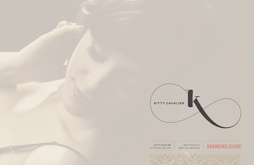
1. Dress up the cover page
While our presentations have a very basic format and are branded with Branch colors, once the final assets have been approved by our client, it’s time to build out a branding guide that perfectly represents them. Instead of just slapping their name and logo on the cover, think of how you can add in images, their brand colors and even a pattern to give it a more personalized feel. This is going to be their “brand bible” from now on, after all!
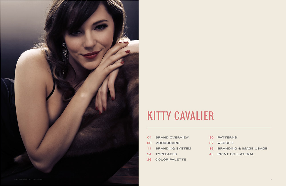
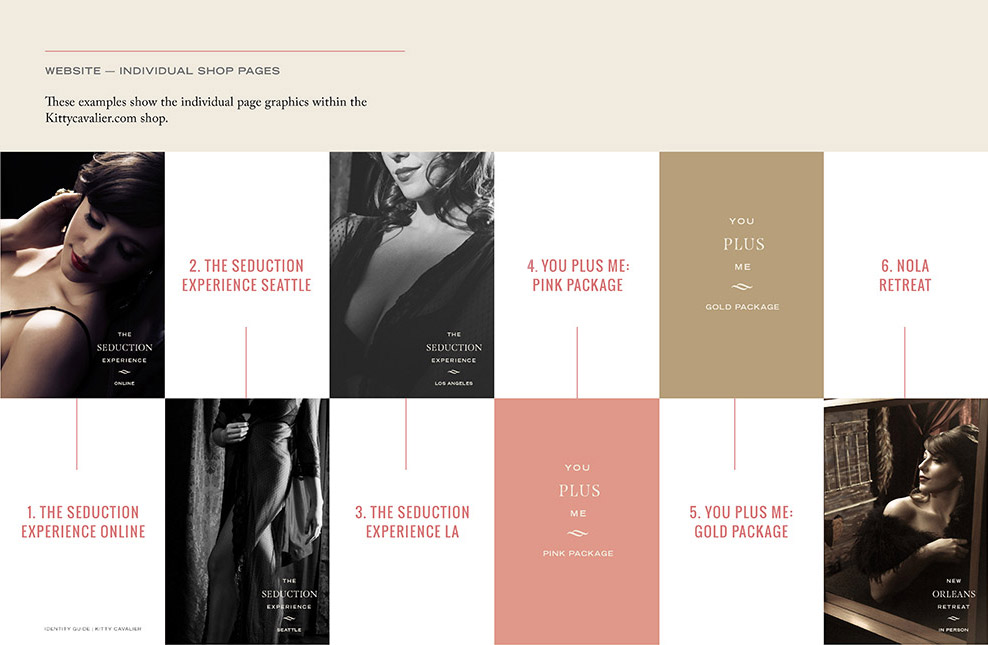
2. Make the table of contents feel premium and inviting
Yes, even the table of contents should have a little fun! I know it sounds weird but once your client opens up their guide, this is one of the first pages they’ll see. Instead of just dropping in a list of sections and page numbers, add a beautiful illustration or photograph, some columns and maybe even make the page numbers a different color.
3. Add a brief description to each section
We used to simply drop in the title (for instance, “Overview”) but that section alone can include a whole lot of different things. Now we add a brief list so they can scan it or skip ahead.
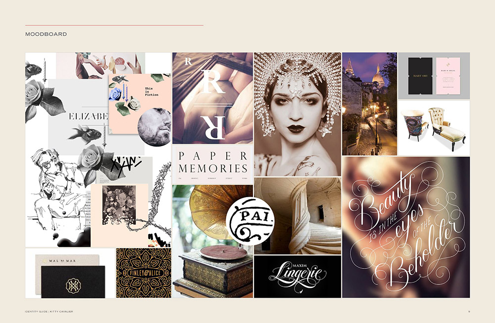
4. Include a moodboard
If you’re already taking the time to work with your client on a moodboard that defines their brand, include it to remind them of what inspired their project in the first place!
5. Add big, beautiful images that integrate branding
If your client has an arsenal of great assets, put them to use and give them examples of their imagery and branding working together. Pages of branding assets are necessary but break them up with some more visual interest.
6. Create an asset library
If your client has a series of assets that are similar in format for a set of products, take the time to remind them of what they have at their disposal.
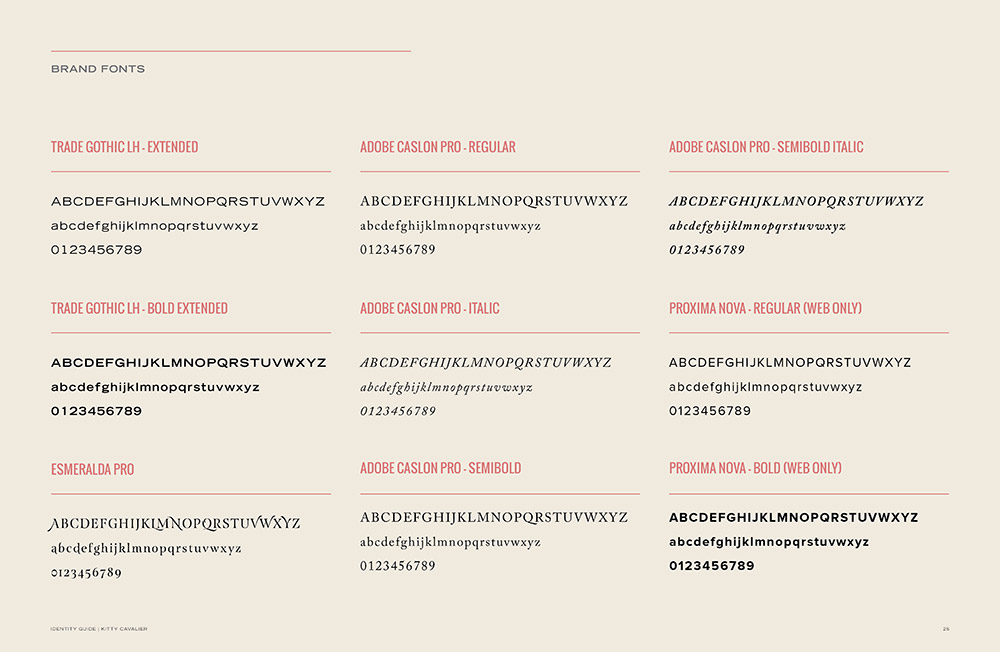
7. List font names in the same typeface
We’re veering off the course a bit with this one because most studios list the font title using the font itself but what we’ve found is that some are much more legible than others, especially when dealing with handwritten ones. Go with the way you feel best about this but personally, we prefer the legibility of having everything titled in a uniform manner.
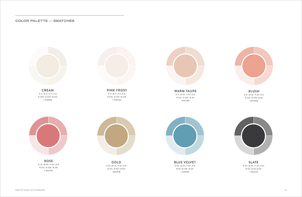
8. Give your swatches creative names
It’s not very inspiring for a client to flip through their branding guide and land on colors named brown, blue and black. There’s a reason why nail polishes, hair dyes, lipstick and crayons have creative names — they evoke a particular mood. Dress up your colors where appropriate. As a bonus, instead of just showing the swatch itself, include tints so that your client understands that they don’t need to always use them at a full 100% opacity.
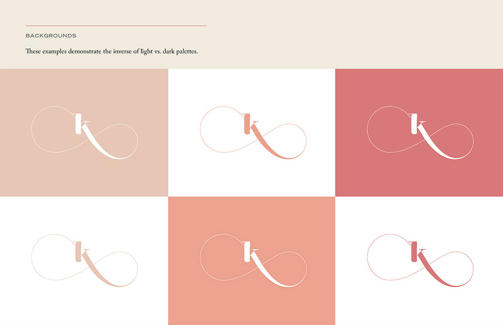
9. If you have a varied palette, show it off
Instead of just showing a logo on black and white backgrounds, take the time to share how it works across all the colors — your client may not be as visual as you are so this extra step will help them think outside of the box when it comes to their palette.
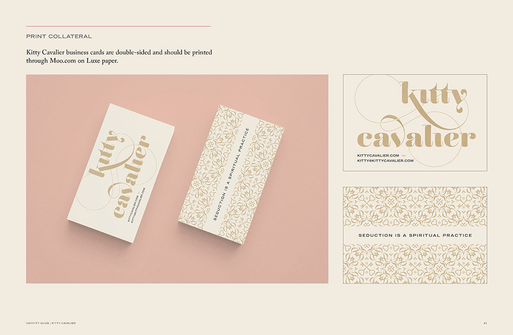
10. Include printing references where necessary
If you’ve set up production files to be produced through a specific company, make sure to include it!
When it comes to brand guides, the more informed your client is about putting their brand assets to use, the more confident they’ll be. As a result, you’ll hopefully come across less fails. After all, once you’ve handed off their assets, this guide is all they have to stay on track. Knowledge is power! -Shauna
Featured guide: Kitty Cavalier.
