Last Monday, We Are Branch went live. Less than two hours after flipping the switch, I rushed off to the airport to fly to LA for some client meetings and from there, straight to Palm Springs for Designer VACA. I barely had time to catch my breath, let alone explain the brand in more detail. Today, I’m sharing more insights on how I came up with the concept of the business, along with the nuts and bolts of the branding.
Concept
As I discussed last week, I knew that it was finally time to reach out and ask for help when it came to running my design business. In the year leading up to Branch, I’d co-launched The Blogcademy, was receiving many more freelance inquiries than I could possibly handle and struggling with the work/life balance on a daily basis. I’ve always been tight with my immediate family — every time I talked to my mom and told her how I was having trouble keeping up with emails, she’d offer to help me manage the administrative parts of my business. My brother, also a graphic designer, was beginning to see his photography career take off and had already been helping me shoot projects. I’d been working alongside Star since 2007 on web design projects. Joey had been doing paste-ups and print production since the late 90s. Everyone I needed to help me was already there, I just needed to put the wheels in motion.
Naming
When I was thinking of creating a studio beyond myself, I knew the name needed to reach beyond just me as well. The goal was to assemble a team and when you have a person’s name for your studio, the first assumption from outsiders is that the studio is just you.
I had a few other names in mind before Branch but nothing felt right — I was just too close to the process and couldn’t see the big picture. I finally reached out to Star, hitting her up on iChat one day with my dilemma. We’ve been friends since 2001 and she knows me inside and out. In less than 10 minutes, the idea of Branch was born. After all, my personal blog Nubby Twiglet has “twig” in it and the twig had definitely grown into a branch!
Branch is a great word but it’s also very common in the English language. My next hurdle was finding a name that I could actually trademark. Once again, Star came to the rescue with recommendations — We Are Branch hinted at the team component and sure enough, the domain was free.
Next, I filed my trademark application. As some of you know, the U.S. Patent and Trademark Office site isn’t the easiest to navigate so I used Legal Zoom to file. It was completely worth the extra fees and I highly recommend them (no, I haven’t been paid to do so, they’re just awesome at what they do). While my trademark application was being processed, I quickly moved on to registering the domain name and all associated social media accounts.
Branding
Any time you’re creating a new business, the name you’ve chosen sets the mood but it’s up to the branding to communicate what that mood is.
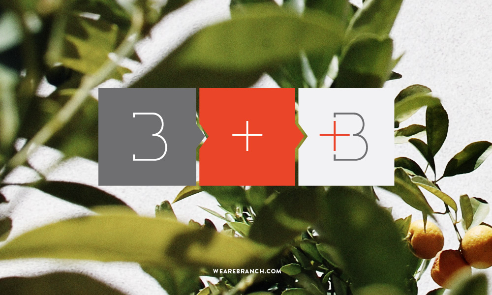
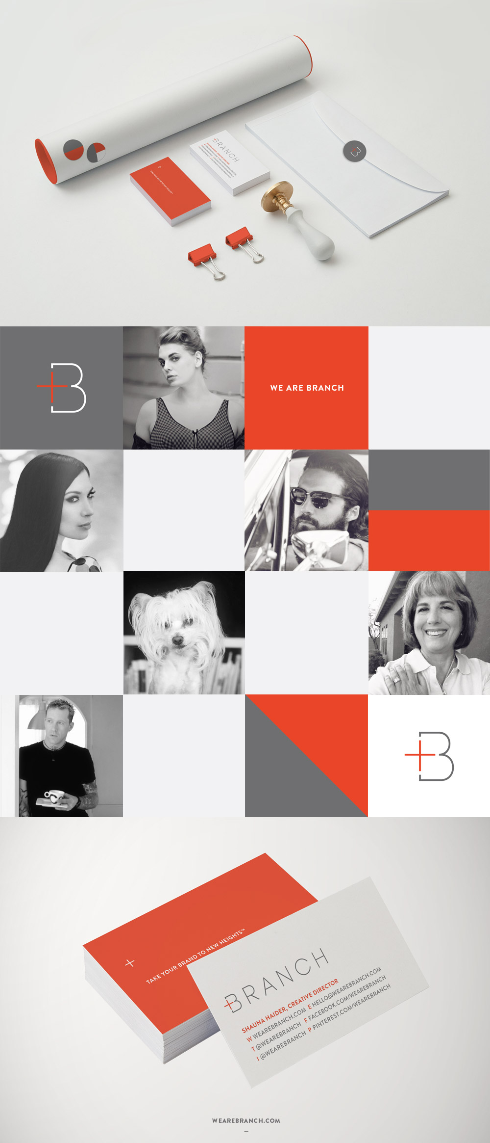
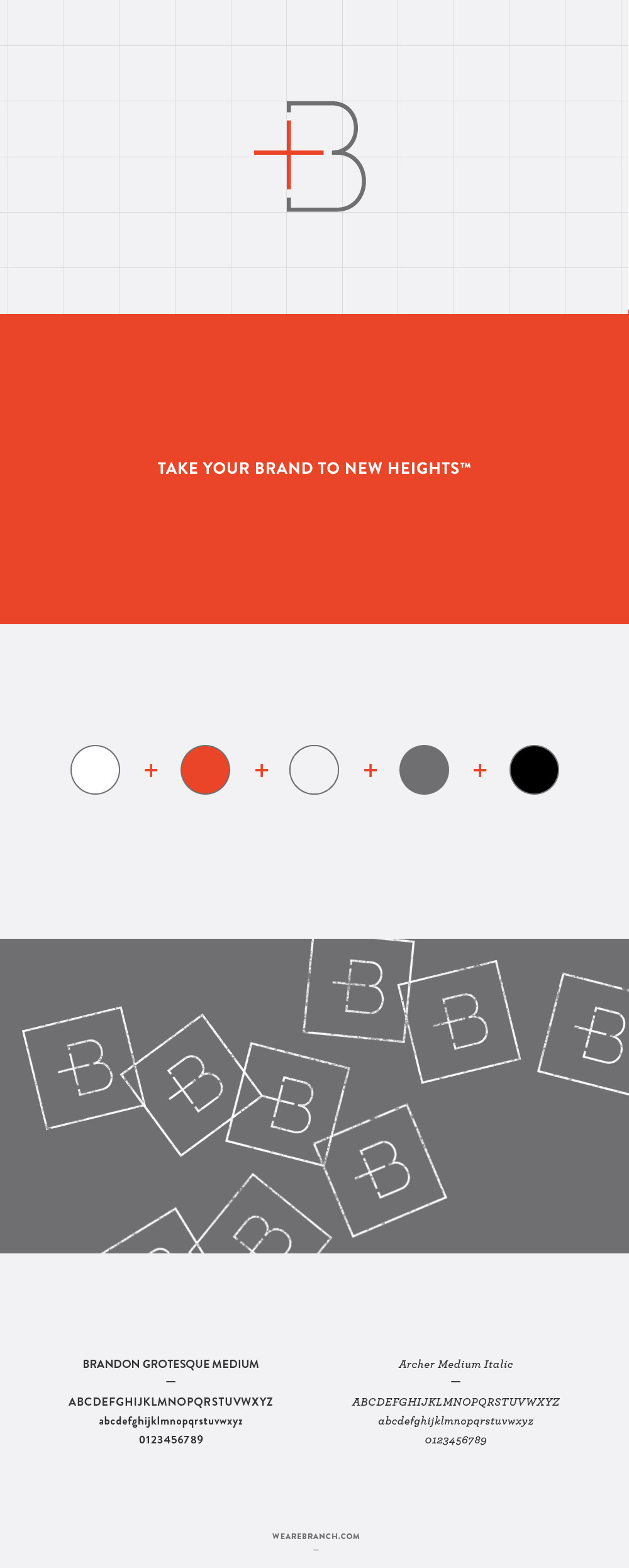
As designers, we can often be our own worst clients but in this case, the Branch branding came to me on the second try. I usually get my best ideas in the shower and this was no different. I knew that I wanted a + in the symbol because it represented so much to me. First and foremost, it stood for the expansion beyond just myself. It also represented a sense of positivity. I wanted to create a fun, nonjudgmental atmosphere my family and friends actually looked forward to being a part of. And finally, the + has been a constant favorite symbol in my life, showing up across my wardrobe, design and decor since the late 90s.
Supporting Elements
For my color palette, I’d been using red, black and white since 2001 for Nubby Twiglet but I knew I wanted something poppier for Branch. Instead of red, I went with orange (PMS 1788C). And instead of black, I went with a slate gray (PMS Cool Gray 11C). And the light gray stood in for my neutral (PMS Cool Gray 1C).
Type families were another painless part of the process — for Nubby Twiglet, I often used Gotham for headlines (and Proxima Nova as a stand-in on the blog). I wanted something a little more softer and modern and Brandon Grotesque had grown to be a personal favorite of mine. For secondary headlines, I’d been looking for an opportunity to use Archer for ages but the right project just hadn’t come along. Since Archer isn’t currently available for web use, I defaulted to Museo Slab on the website.
Digital Presence
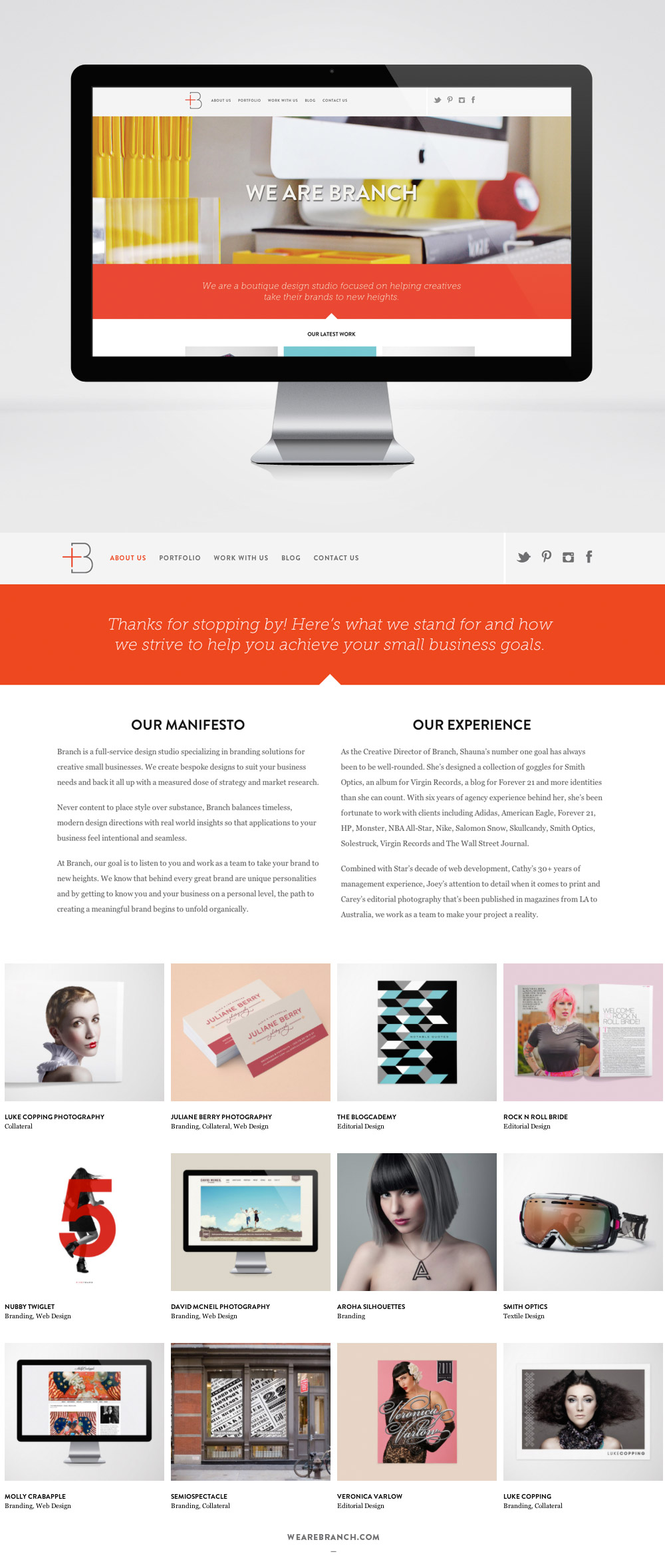
Once I’d wrapped up the branding, I dug into a whole lot of visual research for the site design. I’d been operating my design portfolio from a Cargo theme for the last few years and while it was sleek, affordable and user friendly, I didn’t feel like it accurately represented the team personality I wanted to convey.
I knew from the beginning that I wanted the Branch site to be responsive so I focused on inspiration that featured responsive-friendly elements like wide header images and color-blocked backgrounds that expanded across the width of a browser. I hit the core elements of the Branch site on the first try and that bought me enough time to refine and shoot graphics like the header images which I’d originally placed stock photography in to speed up the design process. These images actually proved to be the most difficult to nail (it’s always the things you don’t expect to take much time that do!) and I was thankful I had padded the schedule since they took me three tries.
When it comes to web design, I’m not the easiest client to deal with — there’s always a few elements I ask for which are not standardized. Luckily, Star always manages to find a workaround to make them possible. The site launched on time, looking identical to the comps thanks to her hard work.
Thanks for following along with us on this new venture! -Shauna


