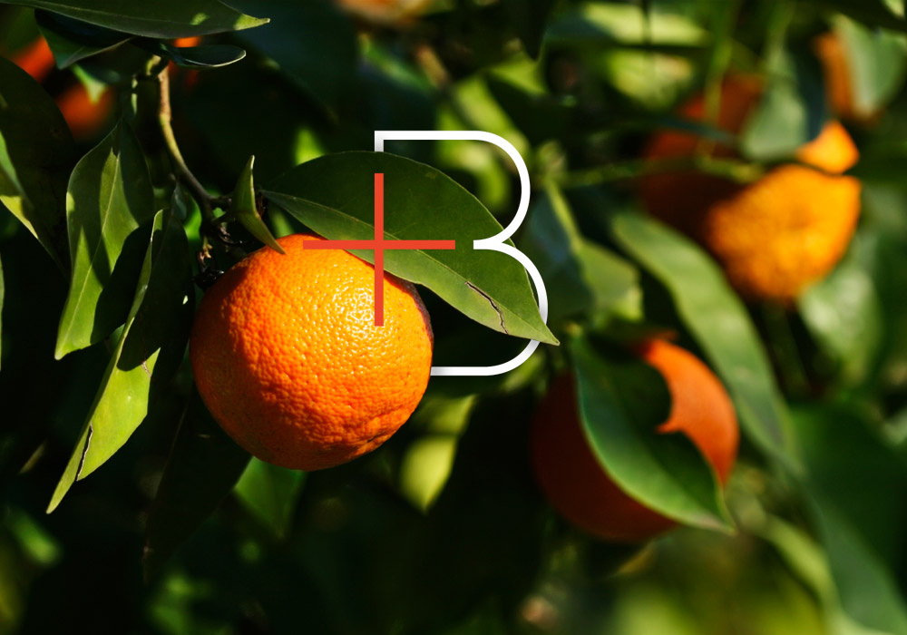
For most of my life, I loathed anything and everything orange. Any time I spotted the shade, I was reminded of construction cones and fast food restaurants (after all, orange is an appetite stimulant). I’d always thought of orange as being garish, low-budget and better suited for power tools.
But over the last year, my preconceived notions of what orange represented began to shift as I started digging into the Branch branding. As I researched color theory, orange suddenly felt right. After all, it combines the energy of red with the happiness of yellow — and that’s precisely the overlap we wanted with Branch.
If you’re rebranding your business or starting a new venture, I’d encourage you to not just stick with what you feel is expected within your industry. Sometimes, the colors you’ve long written off can actually offer the most intriguing results. Instead of blocking out certain shades because they’re uncommon for your niche, consider how you can leverage them to create a point of differentiation.
For a quick primer on the meanings behind colors, Color Wheel Pro and Color Matters are fantastic resources. -Shauna


